CONTRASTのTwitterイラスト検索結果。 10,554 件中 6ページ目


the contrast levels in the previous one was really bothering me lol
#ShiorinSketch https://t.co/bHXneRhpBD


redid the rendering on my model cuz felt like it was lacking contrast and I want details to be noticable when rigged~!


2 days until Mystic Square 25th anniversary!
This time we've got Mai. Would you trust her?
Contrary to Yuki who has the stage 4 boss background, I drew the stage background for Mai.
A huge contrast when put next to Yuki's artwork.
Mai マイ
#東方Project #東方怪綺談25周年


#SHY_hero
It's been a while since his last appearance, and seeing him again brings mixed emotions. Just like how he can appear anywhere as needed for the plot, it's a stark contrast to our Russia story. Now, with more crew members, our small pot needs to cook for a larger group


冬コミ1日目「だんご屋菟道」のお知らせです。スペースはR30b、新刊は南中カルテットのイラスト集「CONTRAST」です。既刊の「好きな人の匂い」の少しだけ持っていきます。あと、皆さまを井上さんと堺さんがお迎えいたしますので、是非いらして下さい。


@GlitchAce Wuh oh, my favorites aren't actually that saturated. These have really strong contrasts with black and white on really pretty skin tones. Seductive edge too.
The saturated accents are crucial to the composition and color balance, but take a back seat when it comes to attention,… https://t.co/e5zceLRFPK

冬コミ1日目東館R30b「だんご屋菟道」に掲示予定のポスターでけた。新刊は、南中カルテットイラスト集の「CONTRAST」出ます。グッズもありますので、是非お越しください。


冬コミ新刊情報、冬コミだんご屋菟道の新刊「CONTRAST」が印刷工程に入りました。これで一安心。ありがとうございます。あとは、輸送途中にトラックがコケなければ大丈夫だな


@pepekekeko English Translation
英訳版です!
Artist commentary : Mika, please...
In contrast to how canon Sensei reacted to gym Mika.


冬コミ新刊の「CONTRAST]とグッズ入稿完了しました~オワタ~!!気が早いですが、よろしくお願いします。なお、🍈さんへの委託及び関西圏の方は1月14日のコミックトレジャーに参加予定でおりますので、こちらもご活用下さい。


[Color Contrast]
☀️ Suncaster of Yellow ☀️
Happy Bday @KarotteRAVE !
Thank you for sharing your creations with everyone! And for sharing your love & taking care of me when I'm not doing well 🙏 I hope you like this piece I made of Yellow! Looking forward to seeing more of her!

脱肛、もとい脱稿‼ 冬コミ新刊となる南中カルテットイラスト集「CONTRAST」準備できました~っ!あと少し調整して入稿と相成ります。1日目R-30b「だんご屋菟道」となりますので、皆さまよろしゅうお頼み申します。


The color thumbnail 😊 the contrast between the warm stained glass windows and cold lighting on the character work well together 💖 https://t.co/kjYbNEb50L


I have been posting a lot of high contrast images lately, but they can be produced in the previous style as well.
Silver hair #AIイラスト #AIイラスト好きさんと繋がりたい #aiartcommunity #AIArtworks


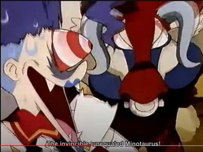
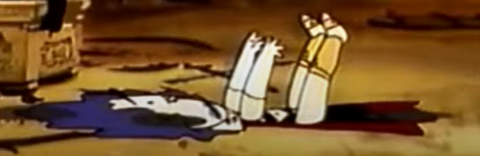
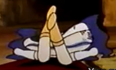
A Pokémon whose defenseless state when assaulted from behind stands in sharp contrast to its frontal protection.
#pokemon #bastiodon #art #artist #artwork #cartoon #cartoonart #cartoonartist #cartoonartwork #cartoonillustration #digital #digitalart #digitalartwork #illustrator