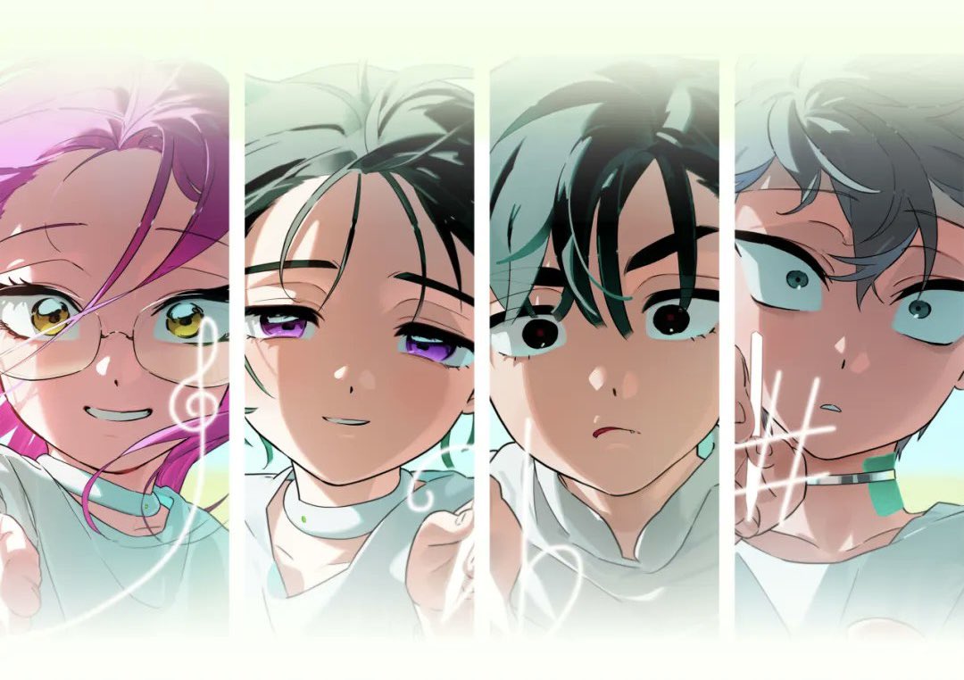
ContraのTwitterイラスト検索結果。 45,665 件中 6ページ目


I love Ms33, but I do like Ms 32 better, since it has a greater contrast. Anyway, although it might look dull according to the paint plate, the historical pictures do show a nice contrast between colors. Let's throw the painting guide away.

In this PDF version of About that summer:
- you'll find a 246 gray/colored pages story;
- I corrected all text and fixed grammatical errors. I also corrected any contradictions in the story;
- you will find new, unedited illustrations and funny sketches between chapters;


Decided to redesign/update my OC to add more visual contrast! #OC


Eu gostei de Oshi no Ko até a parte que o Aqua encontra seu pai. Daí pra frente fica um lixo. Decepcionante


Contrail taking off, and very exciting dokutah
콘트레일 이륙, 그리고 엄청신난 박사
#Arknights #명일방주


Ya había visto un panel en donde Dera daba a entender que no había querido tener un Tsugai porque ¨no encontraba uno compatible¨ o algo así, ahora en este capítulo tiene sentido. Sus Tsugai murieron protegiéndolo y no se siente preparado para tener otros. Also también dice que no… https://t.co/XKW1xn7cz8


and i love the contrast between her and Inky
baddie and pookie


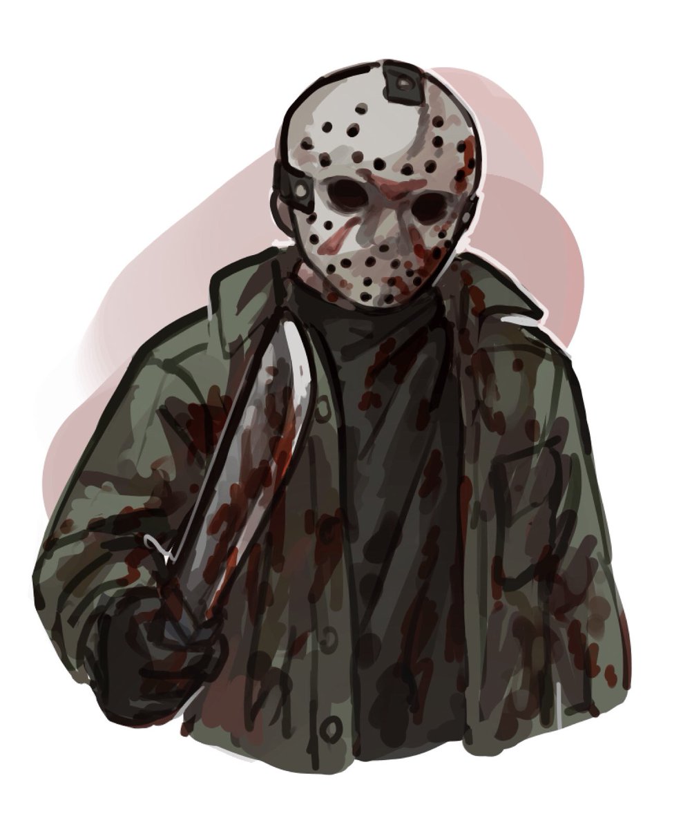
Halloween costume(?) character #6:
Last one! To contrast the other 5, Jason Voorhees


「A Familiar Contract」a short comic about a witch, the werewolf child he takes in, and an unexpected request she makes… (1/4)


#zzzero
Grace tests out her new contraption with Koleda

