comparison.のTwitterイラスト検索結果。 2,090 件中 6ページ目
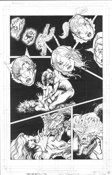
Churning out pages... The new 80+pg horror/scifi graphic novel anthology series - Unconditional Shove Volume 1. Here's another Black&White/Color comparison.
Check out and back it here:
https://t.co/z5CEBdSGbQ...
Thank you everyone who backed or promoted you are PURE AWESOME!
I just had to put them together for obligatory size comparison. See? There is not much of a difference. 😉
Roos are build for sumo! 🦘🥧✨
Here’s the version where the projects are separated and they have a more worthy comparison. Because I think in Books, and so far there’s two of them (soon to be three!).
By svala999 on fiverr. Retro anime style (left) and manga style (right) comparison.
Elana 2022 drawing and Elana 2023 quick drawing practice comparison. My goal is to improve on body shape and posture. #furryartwork #furryart #anthroart #furryartist #digitaldrawing #foxgirl
Here is another comparison.
This time of a piece that is still available.
A MEN #33 - Deceased Christ
◀️ 1st sketch - Final result ▶️
0.05 ETH ♦️
https://t.co/Hy2XHaEDWc
#NABU #s0meone_u_know #KATO
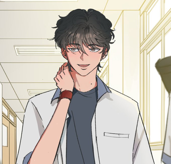
@tencoIourpen Here's the comparison. The first image is him, Childe, and the next image is his final stage in his boss fight aka "foul legacy"
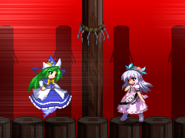
2010 vs 2023 comparison. Lady #KanakoYasaka would be proud.
#THGR #GensokyoReloaded #IKEMEN
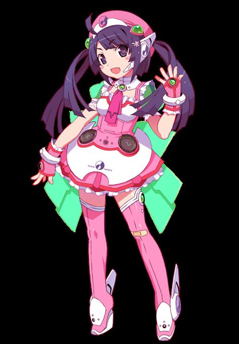
next to her v3 + v4 designs for comparison....maybe i should have made the blue parts greener but that might mess with the more muted colors she's supposed to have
My initial doodle in comparison. Honestly may be my best drawing just cause of how detailed and nice it looks. I didn't think I could manage that!
heres the old refs for comparison.
Fenna didn't change much just made the ears much larger.
Clunker I changed the anatomy a bit to make him easier to pose.
@furkan23102000 @NamiUsoppLuffy @Saintnatti @LuNami4ever I never said Nami didn't hold on to him 🤦🏻♀️. I stated that the first one is canon but still altered to what I can say is a romantic tone. Here's your comparison. I'm not saying the anime changed its whole scene completely.
Really liked the updated animation (really disliked the character designs of the new Supers though), but the story was *way* too derivative of the first movie.
Now, I don't mind things being derivitive but what TI2 copied from the OG movie fell very flat in comparison. https://t.co/zPVBcOWOkV
Finished the first of the lil snappeyfaces so far!
Does it look consistant enough with the style and proportions of the base face?
Pic on the right is the size they'll actually display ingame so it gives a better comparison.


