downgradeのTwitterイラスト検索結果。 1,525 件中 6ページ目


One year later
Do you think this is an upgrade or downgrade?


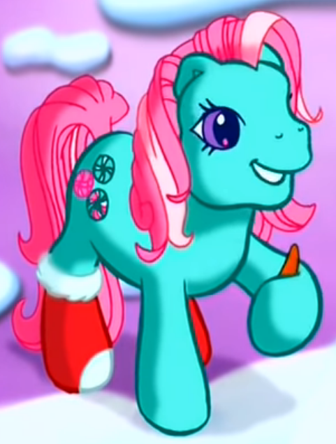
I present to you the biggest design downgrade of #MyLittlePony history
1. Way too bright and green, doesn't blend with the pinks very well
2. Why does the bubblegum machine replace her candy mint cutie mark, her whole existence is Christmas
3. Where the hell are her socks????????

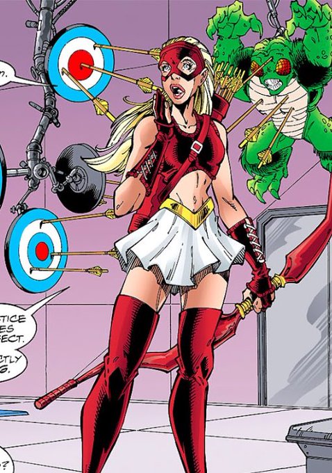
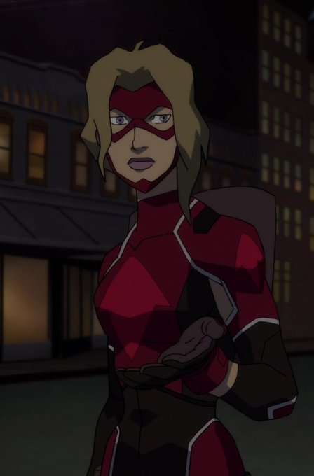


Some comic designs for some comparisons.
And omfg the Flash design is an even WORSE downgrade than the Wonder Woman one.
Batman is roughly fine IMO since the movie is basically just a more simplified version+actual batwings. Superman's design is a small improvement tho.

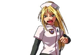


left was the very last drawing i made literally JUST A FEW DAYS before the karamatsu brainrot suddenly hit me out of nowhere in 2020 and right was the first karamatsu drawing signalling the beginning of the end LOL i feel like it's one of my artistic downgrades of all time


Kind of a downgrade, not gonna lie. Like both designs are good, but one is clearly more rad.


People always point to the ending of Beauty and The Beast as the worst character downgrade in history, and I have a much stronger contender.


Mizu tuh mostly inspired dr aku sdr krn dulu aku jadiin persona, jd ga banyak inspirasi dr karakter lain
Miesha nih ada 1 lg inspirasi karakter, cm aku gatau siapa, kayanya ada manhwa yg FLnya dia sbnrny bangsawan tp di-downgrade jd maid, ya itu inspirasinya https://t.co/sLDWPzegkl


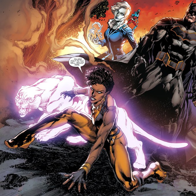
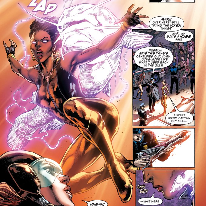
@sennaverse Supergirl really got a downgrade, Barbara coming back to being Batgirl is horrendous, Starfire should've kept her JL Odyssey suit, and Vixen's look isn't bad at all, this one is just bad art, look:


มึงฟังนะ พี่ซาเอะอะเป็นมิดฟีลด์ที่เลือกที่จะส่งลูกให้สไตร์เกอร์ที่ดีที่สุด เขาไม่ใช่มิดฟีลด์ที่เล่นตามสไตร์เกอร์ แต่สไตร์เกอร์ต้องพิสูจน์คุณค่าของตัวเองให้เห็นว่าเหมาะสมกับลูกส่งเขา he's the one who rules the field หยุด downgrade พ่อกุเดี๋ยวนี้
(แปะรูปเฉย ๆ ให้รู้ว่าใครเป็นพ่อ)


Why'd my ability to shade downgrade so hard what the fuck
I hate art🗽