impressのTwitterイラスト検索結果。 35,772 件中 6ページ目

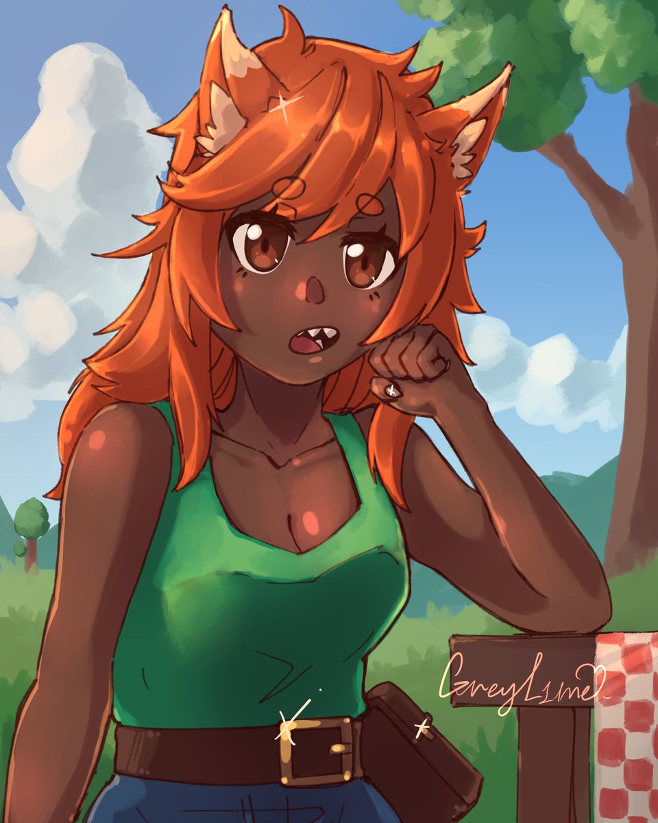


pop art style seems to have less emphasis on the nose + prefers stylized eyes. With the preference for flatter lighter color+shade+bloom filter, it doesn't help to make the impression of flatter "softer" art style
70s-80s anime had flat colors, but they still had detailed nose


Galknights sketches 🎨COLORIZED🎨 for Beatrice and Madeline, with Elisabetta for scale.
This is how I imagine them but since its a black and white comic, others might have had a different impression, so I'm curious.


Hour 1 impressions:
* CH 2H is still viable
* BL2/3 damage from H buttons is so funny now
* The 5K 6K clone loop isn't real, the stagger is mashable
* Kara Bite doesn't feel like it'll be actually needed, but other kara specials seem neat and also easier to do
#ggst_na


A girl who recreated a famous Japanese horror cosplay that was praised at Halloween a few years ago, but couldn't recapture the once-impressive quality and ended up looking like a spin-off




Veronica caught a mage this time but she doesnt seem that impress, she even look a little bored well nothing bad can happen... This is a commission
Ubel from Frieren: Beyond Journey’s End


It is often the case that colouring a line drawing changes the impression, but when I painted Berserk, it became a very scary face. He's just a mob character.
#gamedev #indiedev #indieGameDev
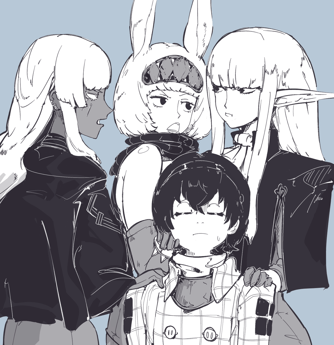


"Impressive of you to see through my camo"
#ゼンゼロ #ZenlessZoneZero #zzz


#kinktober
Day11 Crossdressing
He is dressing up to impress his dragonhubby
#tartaglia #foullegacy implied #ZhongChi
🔶*how to choose from these 🤤
MirrorMaiden vs Gawn vs Witchblade
All those smexy Tt arts dressing him as femNPC's got me thinking: How about FL in these? https://t.co/xrfWM8WW3V



@thekid_art_ I really liked these drawings I made.
Dude, your animations are impressive, especially for someone who started not long ago, I hope to make some in the future too!

