SaturationのTwitterイラスト検索結果。 2,199 件中 51ページ目


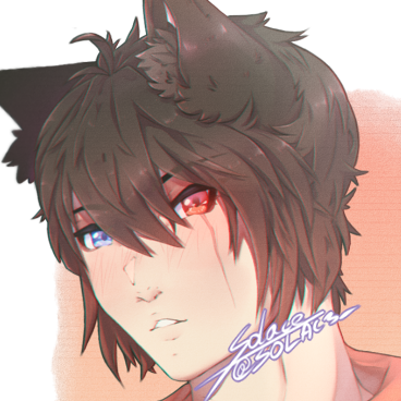
I think I went too far in a few places, like with the colors being overly saturated and the eyes having too much detail for the style. This is why I've gone back a bit using less saturation and simpler highlights, as well as the old eyes. I like this result a lot more.


slight adjustments on the letter placements, artemis' nose and hair, cleaned gura's shark mouth, and overall increased saturation


🌈 I can feel my saturation leaving me slowly. 🌈
Collab with: @Jimmy_Suburbia
•
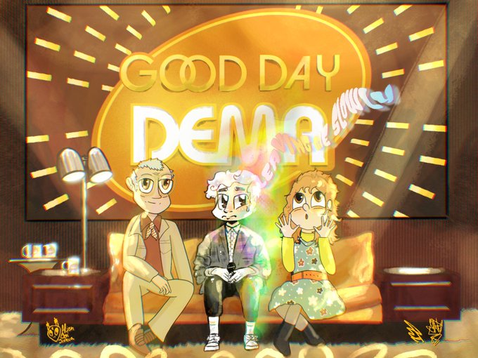
@twentyonepilots @tylerrjoseph
•
@artbytheclique @New_Era_News
#ScaledAndArtsy #ScaledAndIcy #top #tøp #TwentyOnePilots #ShyAway #GoodDay


i think i've drawn samurai the most out of all the characters.
so decided to cut out a paper drawing and since i was bored of regular colouring, i just messed with duplicate layers and editing temperature and saturation. it was a fun experiment. #RhythmDoctor
he is cool.


Wanted to revamp my shirtless Diluc pic 😋 added darker shading in some spots and that little saturation light you get between the shade and light. Not sure what’s it called lol
#GenshinImpact #Genshin #Diluc


Decided to continue with the Nono and Lal'c drawing I started a while back. I sorta guessed what to do with the pens and colors for Nono's finishing touches and I'm happy.
Only problem is that Twitter fucks up the saturation or whatever. It just turns out washed out/faded.🙃


ok my semi-gloss photo paper FINALLY came in and i'm honestly not sure which one i like better?? i feel like the semi-gloss has a teensy bit better colour saturation but now that i have them side by side i might like the finish of the matte more


Working in my new pieces all with a different concept ❤️ give me a feedback #nftcommunity #NFTartist or #nftcollector ✨ 2 drawing right now finish one ⛩ #art #digitalart #chromosaturation


I ramped up the saturation to experiment bc I thought some of the line art was getting lost and,,, it’s so much better uhm, so here’s this version too


I upped the contrast and saturation, I wonder if its better this way? Honestly i get the feeling theres a more fundamental block I should work on though.


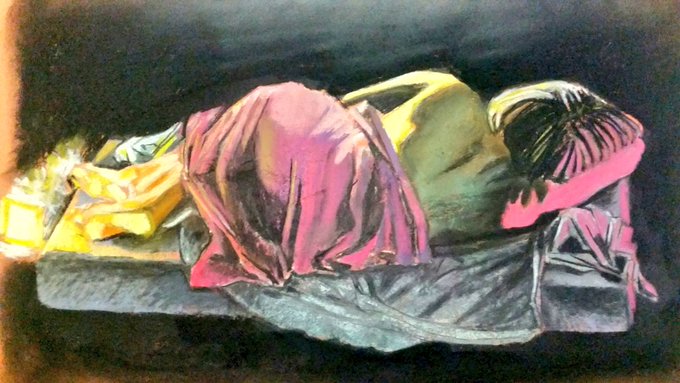

In my classes we use coloured LEDs positioned at an angle to show the subjects planes clearer.
You can achieve a lot of variation with even two warm and two cold coloured pastels with this method, starting high saturation and muting it with the white chalk and charcoal


megasaturation is interesting and all but like way too much thought process


@bebbeque color-picking from these palettes isnt really the best way to paint skin bc it looks dull, i'd suggest studying subsurface scattering and saturation in skin! lighting plays a big part of how skin looks, so you should always look at many real-life references!


Less saturation version so it wouldn't hurt your eyes www


Before I post the full pic.
Can you guys help me on deciding a saturation?
Left or right?