saturatedのTwitterイラスト検索結果。 4,883 件中 53ページ目


Boring World; Add Color!
I wanted to make something bright and saturated.
♧
♧
♧
♧
#superjail #adultswim #Warden #digitalart


@dianadep1 @1Atsuhimerose2 @ejlazar @marmelyr @neblaruz @angelicadisogno @ampomata @BrindusaB1 @Spiros209 @peac4love @djolavarrieta @vvgcabras @scastaldi9 @artmajcar @cristob45 @maluisa_3 @CristianeGLima @kamabi @albertopetro2 @alleosa @bgv_online @ritamay1 @DavLucia @ceconomou56 @BaroneZaza70 @famartinez2001 @karmendida @JohnLee90252472 @mariatontini1 @MariangelaSant8 @paoloigna1 @DublencoIgor "When the soul is saturated inside with bitterness and pain it becomes incredibly beautiful and powerful, especially of this power I am proud".
A Merini
#AmoriDifficili #CasaLettori #PensieriInAria #SalaLettura #ArteYArt E Warling
#GoodMorningTwitterWorld
@dianadep1 @LuciaTassan

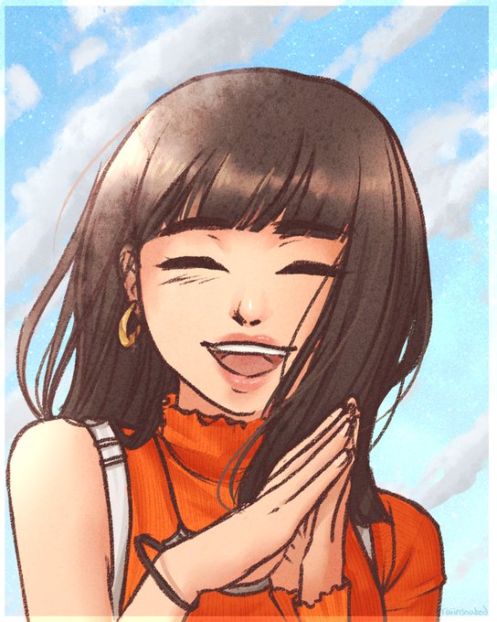
adjusted colours version - didn't like how saturated her hair was, also cleaned up a handful of spots ♥


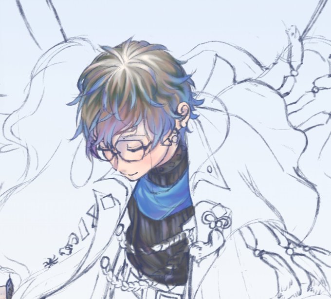
Thanks for coming to the stream! got some progress down~
tho weirdly enough the color when i export the file is a bit less saturated compared to in the program itself. I wonder why...


Lyko was originally going to be a more desaturated blue, scars, as well as a Blue Team logo. I don’t really draw his SoS tattoo on his forearm though since it really serves no purpose. I’m so happy how it gets looks now! The brighter blue was definitely a good direction.


technically dull de saturated colors suit him- but heres a more vibrant tone-
#monkiekid #lmkmayor https://t.co/2YTHy7y5Wp


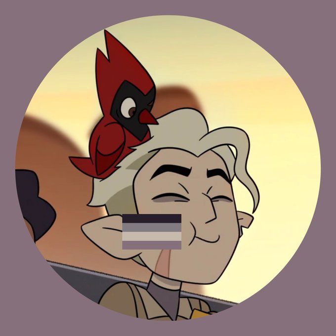
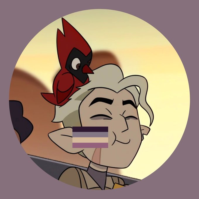
hunter pfp with regular ace flag or hunter pfp with ace flag color picked from the same photo? or the second option but the flag is more saturated??



there was originally gonna be a much more saturated version with framing but i decided that greyscale was better

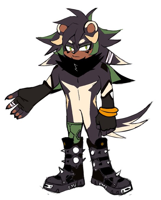
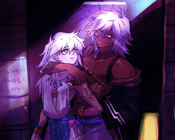
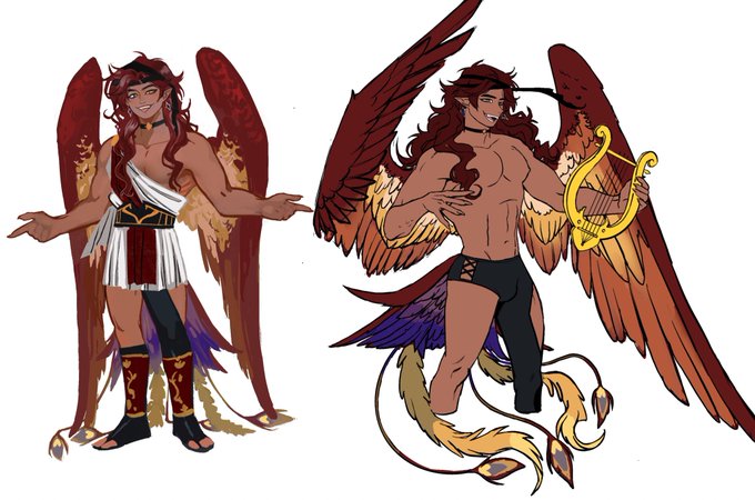

ART TRAIN! What colours do I used a lot ? …warm/saturated colours ? When picking colors…it’s more like what colors I find appropriate to set the mood for a character/environment. It’s never the same. @DarksStars @alpatcha_ @Nikoyoart @koutone9

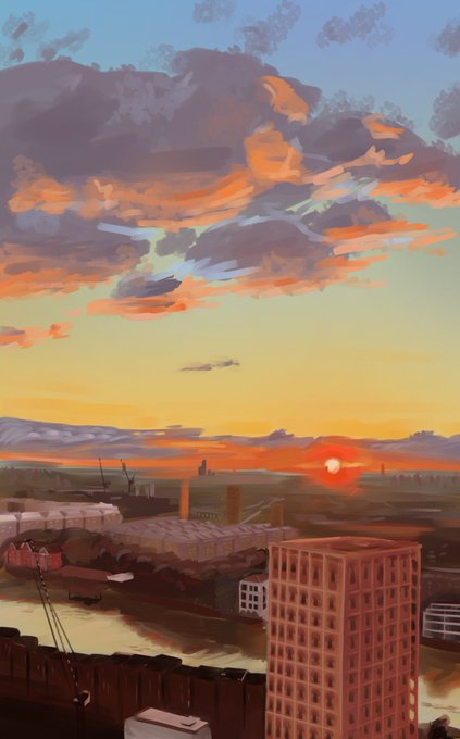
It's done! Pretty pleased with how it came out in general. The real photo is more saturated. Although I do like desaturating things, I think I possibly overdo it... so I should try and correct that tendency of mine.


@webtooncanvas I have a mix of saturated a teensy bit of desaturation :D


My journey in to saturated colors continue...
Keeping my dark concept with vibrant colors
Zoom in and let me know if you like what you see.


dribbles of oil paint over saturated in thinner is a thing i love about deadass painting 👾


different dark colors depending on what I'm shading, For ex bbh's dark purple skin is good with a dark saturated purple at a med-low opacity, while gold rings I'd use a lighter red-pink at a low-ish opacity. * still using round mixing brush btw*


Based on the card designs for Ham and Iwasake where they have Sun and Moon Imagery in the background!
When looking at their palettes on the image preview in the rambling records store, they’re accidentally saturated, but I love the saturated palettes so much, hence two versions

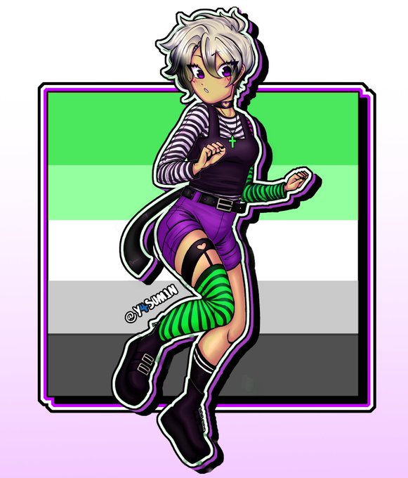
ok i have to ask. do these colors look mega saturated and warm toned to you guys?? because when i was drawing it in sai it looked completely different from how it does on twitter and my phone