comparison.のTwitterイラスト検索結果。 55ページ目


Concept art for Louie, from Lighthouse Louie.
The final design is also included for comparison.
SUBMITTED BY: @LukeVaughnV5_


Redrew some, and I got satisfaction indeed. Enjoyed redrawing some of my OC's in chibi arts tho. 😊
Included the old reference photo for comparison.
Original Character: Keiji "Kerru" Murakami
Status: Complete.

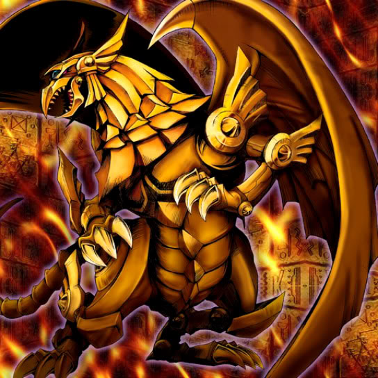
regardless, the main reason i'm examining them is that i think the winged dragon of ra's art is quite good in comparison. it looks particularly regal and traditional artworky in a way the other 2 don't quite have. the well defined face profile, the twisted body, the wing, etc

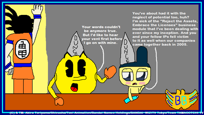
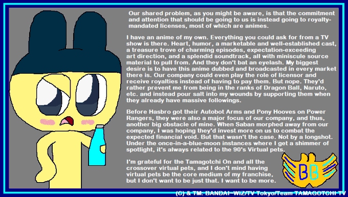
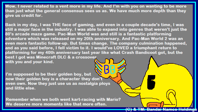
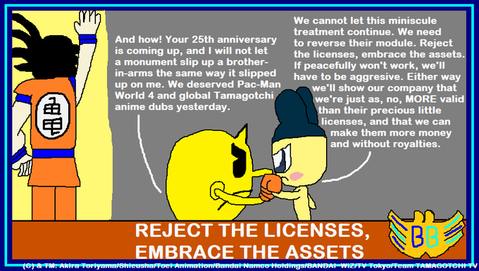
Made a mini-comic called "Reject the Licenses, Embrace the Assets", where Pac-Man & Mametchi vent out on the company that spawned them giving IPs that they have to pay royalties for special treatment while they & other wholly-owned IPs get miniscule treatment in comparison.


i find it absolutely hilarious how locals will say fate ruined winx club then pull out a picture of butterflix as side comparison. that's how i know they're braindead.

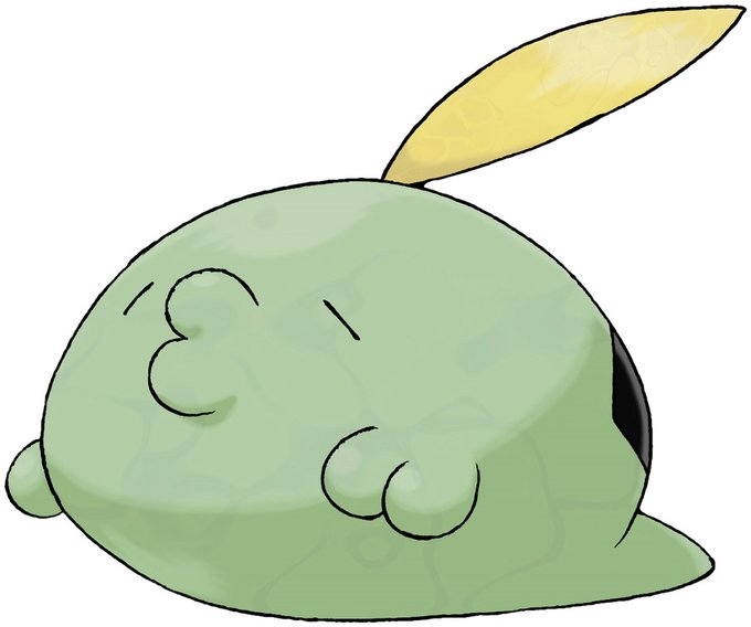
316 - Gulpin
Type: Poison
Most of GULPIN’s body is made up of its stomach - its heart and brain are very small in comparison. This POKéMON’s stomach contains special enzymes that dissolve anything.
#Gen3

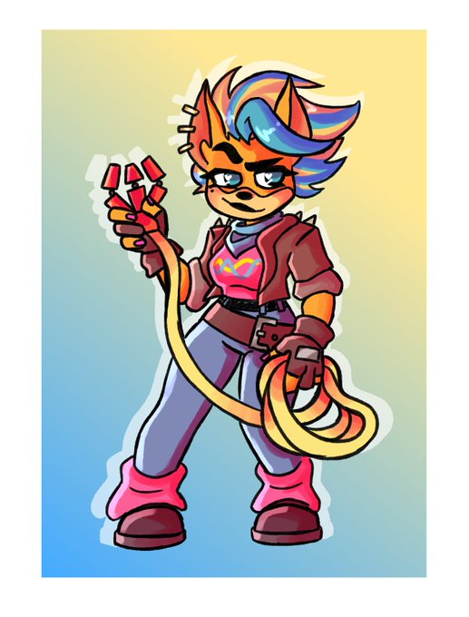


My Queen Arthur OC Redux
2018 vs 2020
Old vs new comparison.
#artistsontwitter #digitalart #CLIPSTUDIOPAINT #OC


On a side note. This is a bit of a redemptive drawing from when the event first ran around.
Before and after comparison.


Now I made the redraw more "handsome". Blegh. 😂
Done with the redraw. Posted the old reference photo for comparison.
Original Character: Heihachiro "8-kun" Aoba
Status: Complete


Shading style comparison.
I think I like the right one more, but god is it harder to do (for me)
#CLIPSTUDIOPAINT #digitalart #colored #pilot #mechanic


for comparison... kinda regret not drawing the other hand in retrospect -_-


the oldest art I have is a single pic from 2001 of my tenchi muyo oc RoKKia and her space boyfriend Nyx. So I redrew them in 2011...and then I drew her just now for comparison.
The main difference is that I put in, comparatively, SO MUCH LESS EFFORT on the newest one lmao.😆✨


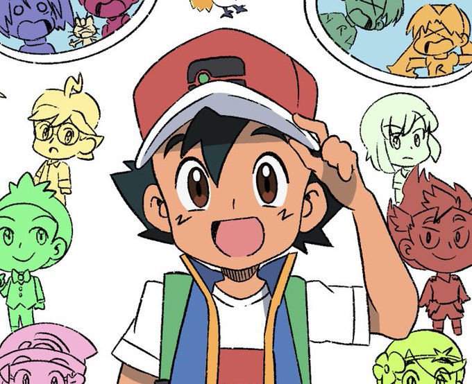
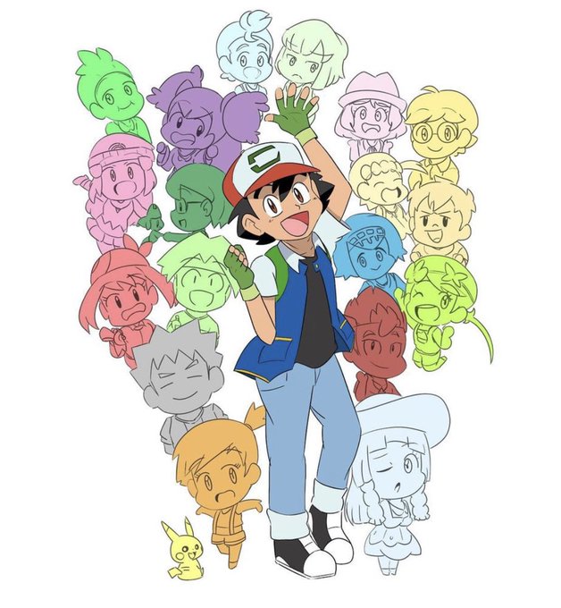
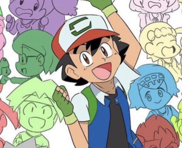
For #Pokemon25 I thought it would be fun to redraw/update the picture I drew for the 20th anniversary! I made it the current Ash with all of his friends! Hope everyone likes. I put the original I drew here too for comparison. #Pokemon #PokemonJourneys @Junichi_Masuda


My art at 16 and my art at 18.
Tho I'm already 21 xD and I experiment with too many artstyles, like my most recent hotspring piece is not that detailed but I can if I want to.
So, let's have anime render style comparison.


// Quick comparison.
Left: The original sprite, size increased without change.
Right: Uprezzed and upscaled sprite, with cleanup applied
Middle: Textured sprite, current workload most recent version