paredのTwitterイラスト検索結果。 27,475 件中 55ページ目


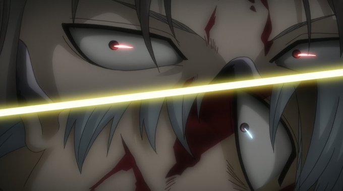

Gintama se tornou uma série popularmente conhecida pelas suas referências e quebras da quarta parede, porém quero me focar em outro aspecto: como sua animação de ação nas lutas era incrível!
Hoje, vamos conhecer os excelentes animadores de ação de Gintama!
Segue a thread 👇


my art compared to others be like #evade #evaderoblox #evadefanart #robloxart


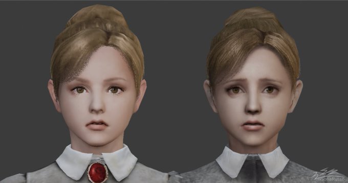
@SamaelsTuesday Yeah might be, i remember the first Jennifer model was ported bad and looked pretty off compared to the og one. Thats why in srs curious and gonna look more into it because i truly hope there is around the chu models. (Old used jen model vs the actual in game one).


“You want a bite too? You better be prepared to pay the favor back, if you can handle it that is.~” 😈🐺👾
~~~~
“Quieres un bocado? Estarás preparando regresar el favor, si te lo atreves ~” 😈🐺👾
🎨@CherryBombVT
#GlitchSaki #SakiWoof #SakiWoofArt


🔥Peeps, get prepared🔥
In about an hour the auction starts.
Highest offer: 0.0065 $ETH (Poly) by @katas_art
https://t.co/OFEQmD3y2W https://t.co/lAG1KWTreO


I have slept so much in the last couple of days then I have in so long. I've been binge sleeping and I know I shouldn't be over doing it but it's just so nice compared to not being able to sleep at all.


@Ragtimeugly Pit’s an adorable angel compared to these abominations! These are Fortitudo and and Iustitia from Bayonetta, where angels look pretty terrifying


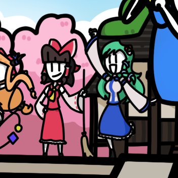

Sanae Day! I haven't prepared anything so here is all the Sanaes I have ever drawn thus far #東方Project #touhou #touhouproject #3月7日は早苗の日


Lilia was the first TWST character I've drawn digitally! My current artwork of Lilia is different compared to my first artwork of him...😳
✨🦇✨
#RayArt2022 VS #RayArt2023 https://t.co/1Stw5R8KaX


I don't get why his art looks wrinkly but ig they were trying to make him horror-esque, but he's one of my favorite designs. I like that he has a less cyber aesthetic compared to other vocasynths and more of whatever you call this aesthetic.


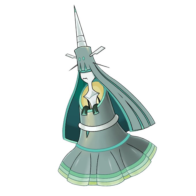

I used to do the design fix~only to UB though. That's how the impact was done to me but nowadays it's just compared with other tasks this isn't really something major. I'm learning to appreciate more but on the other hand it's also like...I'm never gonna fix them all lol


@regrattores him <3
he's james moriarty's younger brother and compared to his older brother, he's more of the "kill first, ask questions later." he's also very malewife, takes care of their big ass mansion, makes tea for everyone, acts as a butler most of the time, and he's v protective.

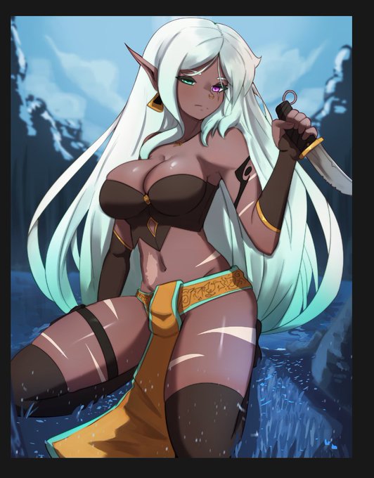
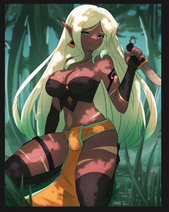
This is a challenging commission with the lighting and background alts. Had to change my methods a bit, plus this file size is huge compared to my usual. Still i absolutely love how its coming along ^^ still gotta do the spicy alt though OWO


@daylightafterhr I don't know if I'm very clear, sorry, but in the image her breasts are not fully visible compared to the drawing


ummm i dont think there are any pre existing characters from shows that melody gets compared to. however i have gotten many many comments that she looks like a starbucks worker (and tbh i can see it . thats my fault) also this info kind of outdated https://t.co/gdjhJK9OsL


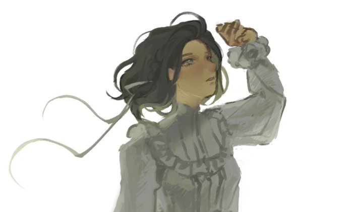

I've always relied too much on filters because in the past people told me my work was too dark. But because of that I noticed that the filters ruined the values and depth. To be honest, I really like how moody these are compared to my usual stuff. What do you guys think?