ContrastのTwitterイラスト検索結果。 10,512 件中 56ページ目


@ritchiesacra @brushes_stunts @NikiLeSunshine1 @ResetNft @artcrushgallery @Ellii_art @parsa_mostaghim @ImGlassCrown @PhoenixFawkes25 @KatalinaOoma @madebygdirons @OsbaldoSegura @lightyshut @LizaHawthorne Thanks for the tag, Ritchie 😀
I'm intrigued by the contrasts in your piece, but art should make one think 🤔
Here's my
Lady M says
Inviting @__Maya_S__ @ekavibes


can’t get over the contrast between the two heart of depth figures
parsifal: vigilante, exiled aristocrat, pirate, died tragically without seeing his lover
childe: aspiring world conquerer, fatui’s resident wild child and babygirl, is just here for a good time


I love her calm expression contrasted with how tense her hands look!…. Why does she have spikes on her hands https://t.co/O4oYWIMtHG


Genuine undead is famous for its aesthetic and colour.
Some combination is just better, here's one 👇
Sakura + Zombie (Type)
The sharp contrast between red and green makes the zombie face super outstanding regardless of the background.
#Undeadarmy @GenuineUndead


🤔🤔🤔 #ガンダム #gunpla #形部一平 #ガンダムR作戦 #ガンダムワールドCONTRAST
Source: https://t.co/YGWeoZQA1C


i made a pokemon exe because @pikemiser told me to
names: pik-x, pika-x, pikachu.exe
i just lowered the contrast of his colors


MANO KKKKK O CONTRASTE MDS, SUMIU MEU LADO GÓTICO 😔
app: faceplay


Slinger Quality Inspection: PASS
Green hair / eyes ✅
Contrast of Flesh on Midnight 🤌
Smiley Jacket 👀(his shoulder - @tMAIS0N's favorite)
Result: BOUGHT IT


Meet Clara, my version of Nero's mother.
I have chosen the name because of the latin origin (it is also very common in Spanish/Portuguese).
Clara means "Clear", "Bright". It contrasts with "Nero" and also with Vergil's theme "Bury the Light" ☺️.
😇 #DevilMayCry


Didn't post it the other day because I really love the contrast between the orange of the original and Saku's more bluish color palette but I also made a purple version of the hoodie


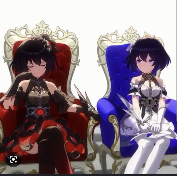
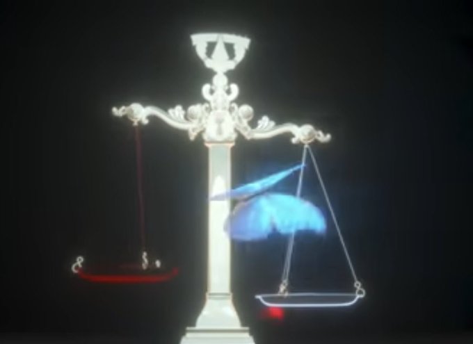
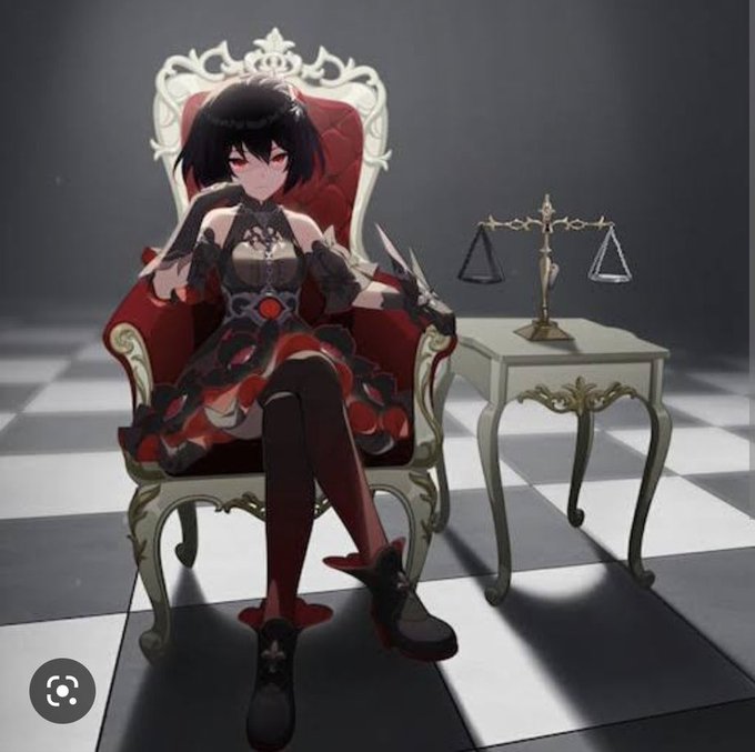
Hydro archon expy is seele makes somewhat sense
The scale of justice
The contrast of good and evil


“To yearn for affection”
I liked the contrast in the second one as I was working, it was very interesting to me.
(@ginsays said Calamity!MuQing and I say ‘LOUDER FOR THE PEOPLE IN THE BACK!’ I love their design so much 💖✨)


Stubborn swine.
Transitional or digital, neither am I good at colouring in.
For my fifth guache painting, I wanna do more contrast :D
(And use watercolour paper lol)


Reducing colors to B&W and only playing with contrast is a great way to check the aesthetic level of a composition. If it looks decent in B&W, it almost certainly looks great with color.


Okay looking at this again the contrast and saturation is too much, so here's an updated version that I feel is better.


Small but intense, delicate but strong. I feel like these drawings are full of contrasts - not just visual but in their meaning too. I don't like to impose my interpretations, I'd rather you made your own for these trees. But there's definitely a message..
https://t.co/dtTlskEtwu