adjustedのTwitterイラスト検索結果。 56ページ目

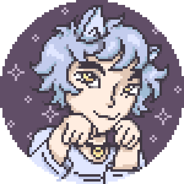
Nightowls icon was an ice blue when i first made it, but was quickly adjusted both to better fit his character colour scheme, and to be more distinct from quest's light blue icon


@thatsmaik certainly, have a look. Also I adjusted the clouds a little so they fade near the bottom


adjusted the colours so it's more visible.
now this is truly the best
hire me 343i https://t.co/AYGmBtA7PQ

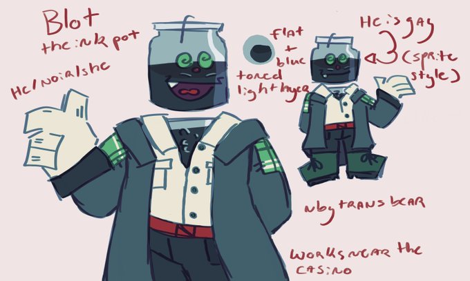


Still not use to only 4 hour streams but needed to stress test all the new parts, sadly need to take her back in to get adjusted but should be better tomorrow. Thank you everyone who came to the test stream still had alot of fun tonight love you all so very much!


D'manic #6
"Endless stare, yet can't see through mind"
~
Auction: 21st JAN | 4 PM UTC
Period adjusted to 24 hours (apply for following drop)
Starting bid: 0.5 | Tick size: 0.1
https://t.co/ZRyvFuGv9I
@holaplex
~
#Solana #SolanaNFTs #holaplex #NFTs


My final ratchet redesign attempt, im happy with how this turned out. Im going to work on redoing Shin's design next (same concept, just adjusted)

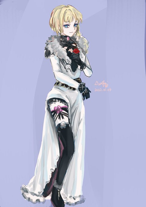
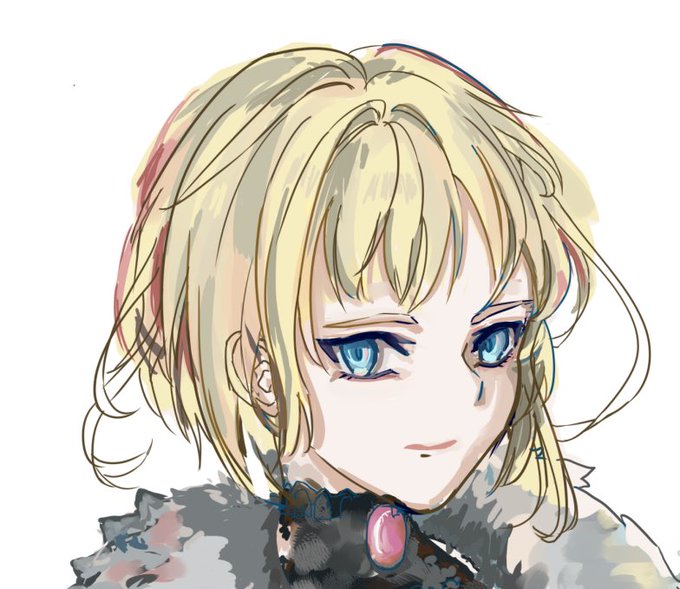


@Wife0fMany i have an edit of her render from a while back adjusted w/ proper skintone, im still pissed they whitewashed her so bad :/ same with drift, even tho his skin isnt lightened they made his face into adam who is. white. while his og head is asian american

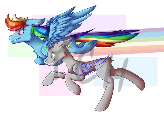
Heyo! Got another YCH here! I can draw any pony species into the slot c:
Flat colors: $15 (Rainbow dash will be adjusted so it won't look weird)
Shaded: $25
Payment via PayPal, Venmo, or CashApp!
(This is a multi-slot YCH)
#mlp #brony #mylittlepony #ych


made the snoot shorter and adjusted the slope of the forehead, and better eye connections. Just minor adjustments. The sword and tail are still wonky, but I'm pretty satisfied for my first sprite turnaround.

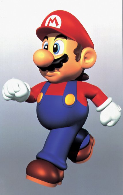

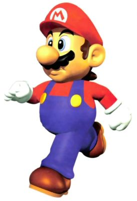
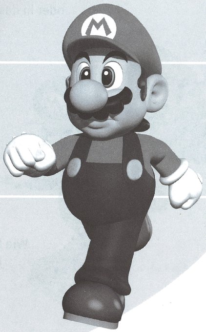
@macroy64 @ThePACNATIC @DrogieSR Very surprised you noticed this! two versions of each angle exist for this render, each one has the foot slightly readjusted

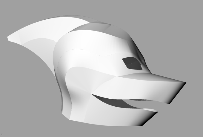

Whew, took a while for me to get back to this. As expected, I was unhappy with the muzzle shape, and I adjusted/rebuilt every panel. But I think it's nearly ready to lay out and cut.


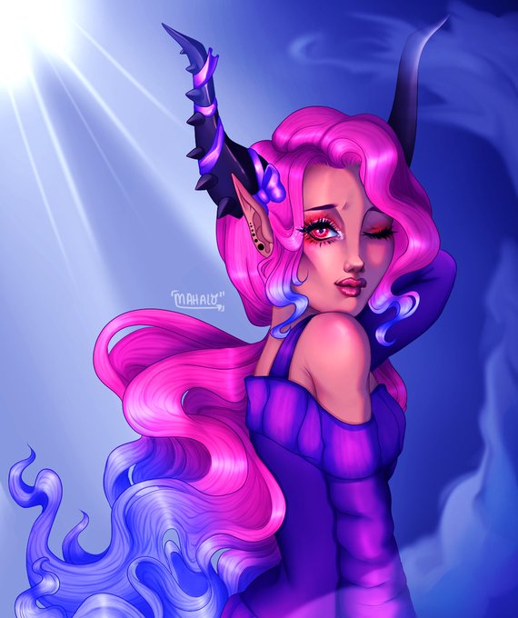
I adjusted the tones on my last art piece and I like it much more than before! I just felt like the colors clashed so hard and now I feel like its much better!!
#Robloxart


I went and adjusted this one
the tiddi's were bugging me lol https://t.co/zSLlVkvkdM


WIP
I keep going back to this,
Added more elements, adjusted the colors,
"HQ"
Still trying to find the strength to animate 😅
🤘🤘
#pixelart

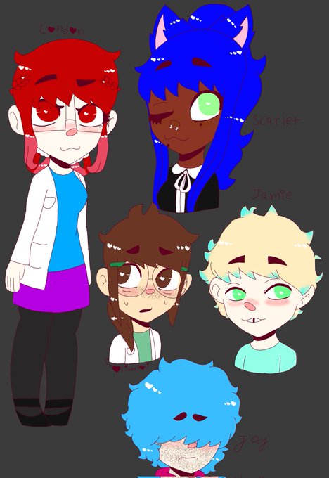

Trying a new art style, i adjusted some of them. Normal & oppsite gender

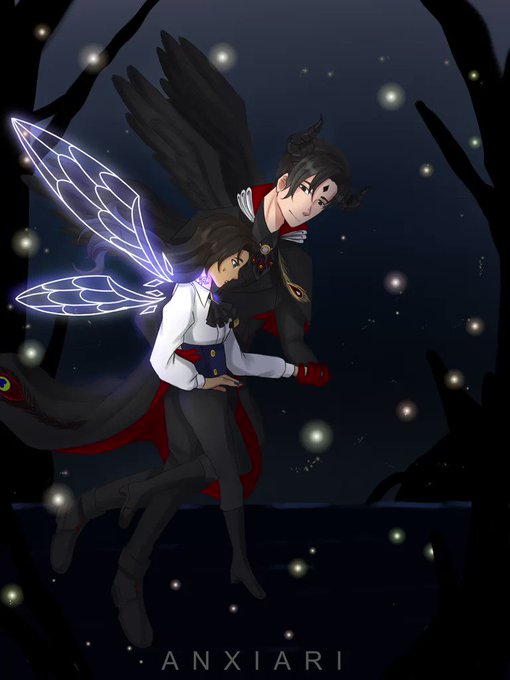
Timelapse that I forgot to post @w@
I think my eyes has now adjusted to Ibis Paint X
I have this love-hate relationship with this drawing app 😂

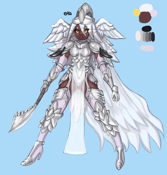
I adjusted Stasya's ref. Many things were bothering me with the old version, mainly how I rendered the skin. It looks way better now.