thickerのTwitterイラスト検索結果。 58ページ目


I have done an eyes pen sketchy.
Trying to find my fave colors to sketch with.
And I feel this cranberry black works nice.
I seriously love thick brows.
The thicker the brow the sexier the forehead (LMAO I'm a loser accept it!) #artshare #JennyjenocsJKBarts


And while she may be longer and thicker, she's still just as wasp-waisted as before! You just can't really see with how big her breasts are now. 🙃
And here's a detail shot of her face!

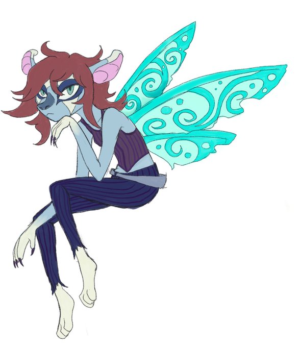


Snit was originally doodled as a string bean and not a short lil chibi. After drawing her Smoll and arguably a lil thicker, im like "this is BETTER"
AND SEEING HER OG ART IS WEIRD NOW.
Her curled ears were more vuage too. Im glad i fixed that.


“Fire burns brighter in the dark.” -Suzanne Collins 🔥🔥🔥
Forgot to post the finished product here! Here’s my attempt of pulling in a traditional sketch into digital art with my main OC. I think I’m more in favor of thicker lineart. #ArtistOnTwitter


Now here is probably the style I hated using the most. I STOPPED using force-fade and had thin lineart. I actually CANNOT use thin lineart because I'm more comfortable with a thicker lineart, but yeah. The witch turned out great, but the proportions were crap when I continued...


Testing out some thicker lines and shading. I think I'm liking these thicker lines better then some of my previous attempts.


i should draw with thicker lines more often
(forget hair highlights had to repost hfjf)


Made some small changes to my thicc gal. She's getting thicker with each pic


‘Hiding In The Blue Light’ 60x90cm. Enjoyed going a bit looser with this one and a lot thicker with the paint! On show at @artwavewest 3rd-31st October!
.
.
Source image by @suffomoncloa

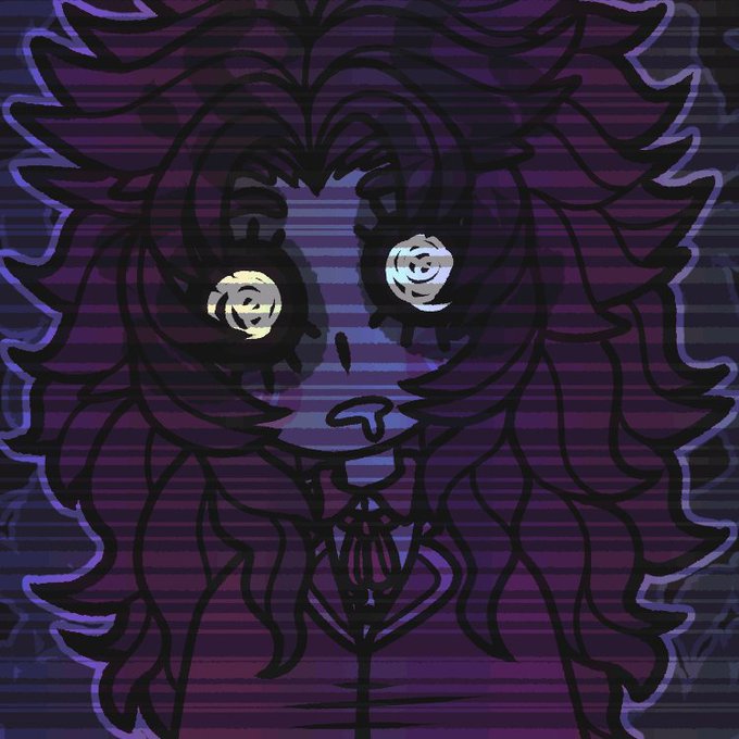
CAN YOU GUESS? LET'S PLAY A GAME
WHO'S IN CONTROL? NOT YOU NOR ME
I LOOK INTO THE MIRROR
BUT THE MIST GETS EVEN THICKER
IT'S LIKE I CAN'T LOOK ANYWHERE
WITHOUT LOSING MYSELF FURTHER
/ly


how this years kinktober art will look! oolas piece was supposed to have thicker outlines but i was tiered
second piece is for @LessThan3Draws and last for the loveley @LeenieLewds


ive been wanting to redo those old icons bc theyre all a tad bit bad looking. tho maybe i shouldve stayed w the thicker lines lol


trying to sketch with thicker lines is weirder than I thought it'd be lol, liking how these look overall tho. :0 Some commission wips :)

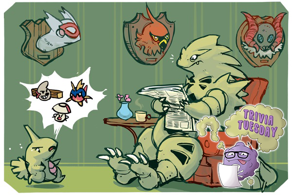
Blood is thicker than water: Can you name Pokemon from a evolutionary family that contains two or more base-form Pokemon in the UU tier or above? #triviatuesday
Art by Bummer: https://t.co/hEPQMc0EB0


Here's some pics of my raptor form/character I got in a YCH scene.
First having his default look.
Then having vorish noms.
Then after gurgles with thicker haunches/rump.
Artist is https://t.co/aP3fZBWIDa

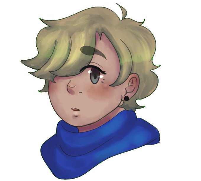
the lines are thicker than I would normally make them in sai, but I actually? Kinda like the look lmao
anyways, rendered


I tried another coloring way.
Thicker, more mixed colors
I start from gray tone.
I am so lazy, so I finish her face only.🤫
But It's enough to know this is a good way if you want to skip the line step.🤣
#風花雪月
#ベレス #Byleth
#Fe3H #FireEmblemThreeHouses
#FE3Houses


Bullseye Joe and Pigasus💥!! Ol’ BJs even got his best suit on! Trying a thicker lineart style. Hope you like it :) #procreate #characterdesign