FontsのTwitterイラスト検索結果。 59ページ目

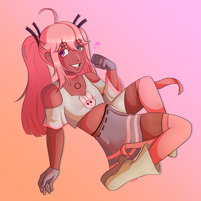
ok i wasnt planning on posting any of my #artfight submissions until the end of the month but i am VERy proud of this one so,
it's alterfontsp on artfight's character 🥺 this char's design was so fun to work w


I have a question.
Can anyone read this? And/or is there one font type thats better then the others?
#art #digitalart #fonts #comics #artistontwitter

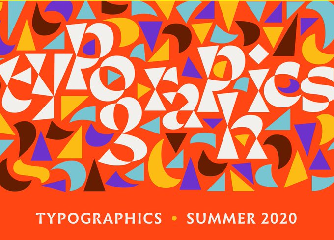
Typographics is coming, July 24/25/25! It's free! It's online! Talks, tours, books, fonts! https://t.co/mNBlSaTwve sponsored by @cooperhewitt mt @ellenLupton


FRIENDLY FIRE for @netmocha 's four characters!!!!! i got to use really cool fonts and also draw four of them! their designs are really good i love them


DESIGN FOR SALE III $$$ERPENT
PLACEHOLDER III SUPPRESS
- - -
text/fonts/colours/layout can be changed, message me for info
- - -
been wanting to do a more bootleg styled piece for a long time, so this was a little experiment
- - -
#bandmerch #merch #hardcore


Day 57: Having a lot of fun with working on the item commission I mentioned in the previous day. Here's a preview of the format and look of these cards:
He was fine with fonts from https://t.co/6xtbDXV70e since my friend only wants them for personal use.

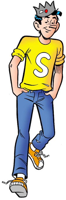


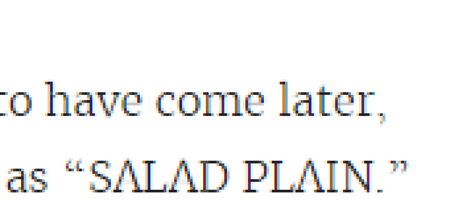

here's a screenshot from @Kotaku. this is what i am angry about when i talk about how awful thin "modern" fonts on the web are. the bar in the capital A may as well not exist!


ARTWORK FOR SALE III LEFT TO SUFFER
PLACEHOLDER III LOATHE
- - -
text/fonts/colours/layout can be changed, message me for info
- - -
#albumart #graphicdesign #artwork #albumartarchive

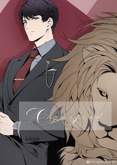
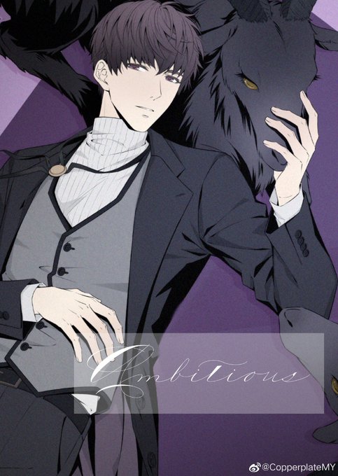
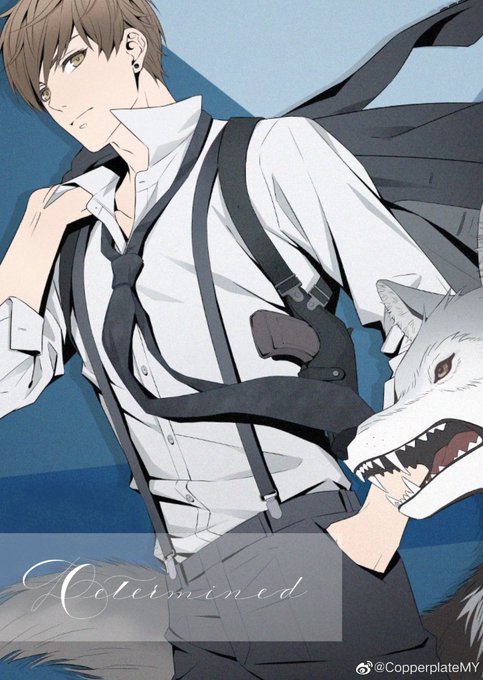

『Authorized Secondary Upload』😭I like this version very much💕The fonts are very beautiful🌟
Warning⚠️This player does not allow any kind of secondary uploads, only be used as your own head portrait or wallpaper✔️
‼️Please respect the works of others‼️
https://t.co/WqLoQdEmNB


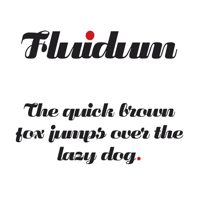


In the design world fonts are important. Use the wrong font, and the whole design can be compromised. The correct choice of colour, font and text size can prove to be vital for attracting your target audience.
#CreativeAgency #Hertfordshire #Marketing #StAlbans


“Loretta” (https://t.co/WnSfsPZ7Mn) by @joanatype & Abel Martins for @novatypefoundry, published with @futurefonts, is a straightforward, calligraphy-influenced serif font—delightfully restrained for a FuFo release. Give it some extra tracking for great body copy! #366fonts (181)


“Approach Mono” (https://t.co/Dvj13bmvTW) by Eduardo Manso for @emtype is the monospaced companion of “Approach”. Like its proportional Neogrotesk counterpart, it has got an all but neutral (never dull) character. Comes with a distinctly pronounced punctuation. #366fonts (178)


Ya’ll keep talking about Kageyama in different fonts but what about TSUKKI in dif fonts👀


