visuallyのTwitterイラスト検索結果。 3,311 件中 59ページ目


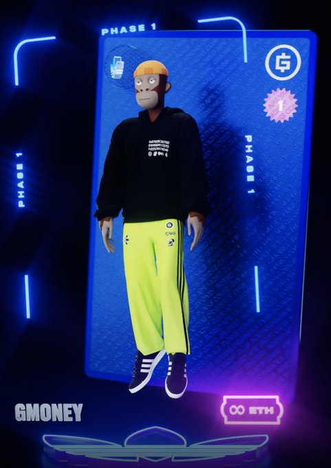
Put on my best Tuxedo with an orange #beanie to celebrate the launch of #adidasOriginals. Nice to have the utility from my #BAYC for the whitelist. Also added descriptions for #visuallyimpaired.
@adidasoriginals @bullsontheblock @boredapeYC
#botb #bullsruntogether #gmoney


I feel like this guy right here might just be the *one* Pokémon to be no one's favorite. Design-wise it's literally just its evolution but with a few less parts, I don't think there's any other Pokémon out there that's literally just an inferior version of another visually


@finnaboo Hey! My name is shade and im a visually impaired trans artist with autism! I do alot of furries and love drawing animals

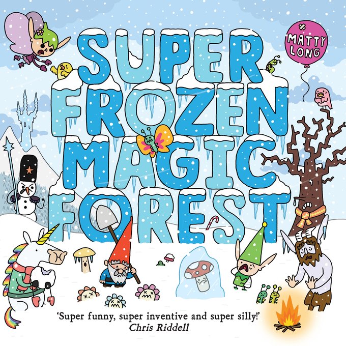
SFMF was published in 2018 by @OxfordChildrens and
I think it might be my favourite of the three picturebooks, at least visually. The winter theme was so fun to work with and I felt I could really push the characters and setting as it was mostly based in one particular region.


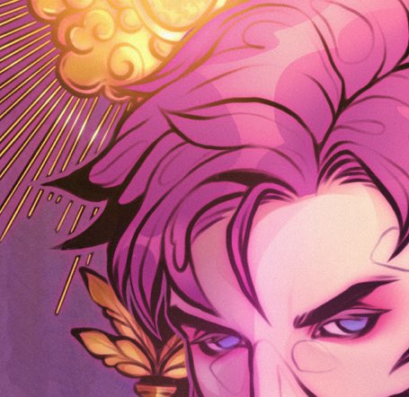
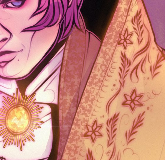
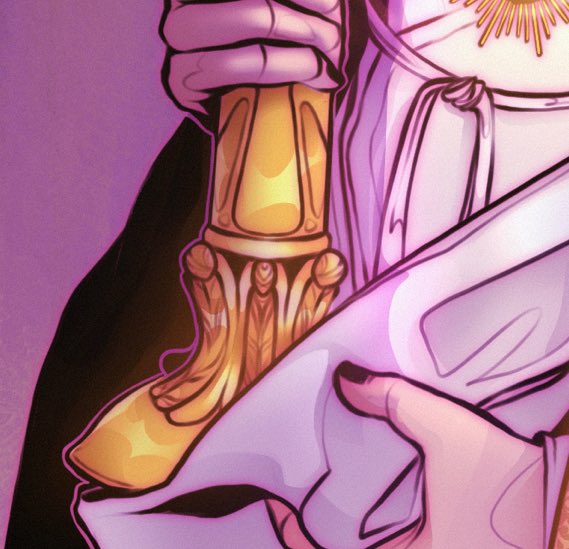
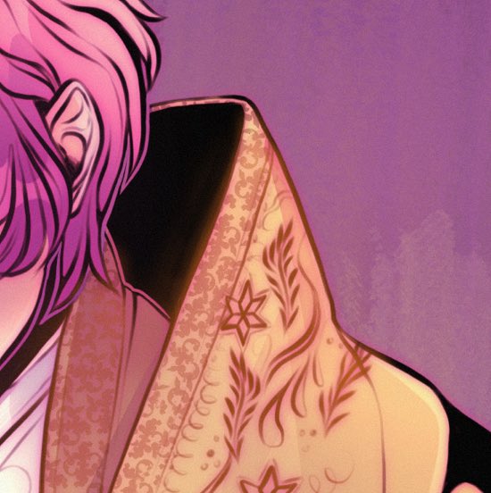
Visually interesting design.
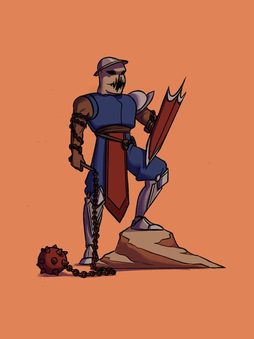
This was done like a week ago. But, what are your thoughts on this design for someone I've hinted to redesigning.


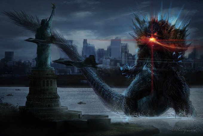
Artist Cheung Chung Tat's take on a Godzilla universe would be the scariest, yet visually most stunning incarnation if it was brought to life with the seriousness of the Gamera trilogy or Shin.


I realized d you can't see some of the detail so here's a scan. So much love and pain went into this painting. It's not visually my best, but it means the most to me. 💙 https://t.co/cxw4a4BEtS

Favorite little pieces! either with the colors, shading, details, or just visually pleasing.


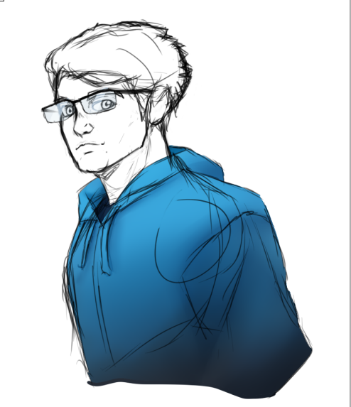
Funny how time works. I was checking some loose files I had of unfinished stuff or just sketches and concepts and I found this attempt at finding the aesthetic for my own original story, which at the time I HATED, and now with some reservations I really like visually


Here's the special art i promised. Arzon (Typhoon Mode) is showing off his three new moves: Bandana Attack, Ring Assault, and Vacuum Manipulation (It's visually similar to wind manipulation but technically they're both invisible). More information in the comments


Another commission with two versions - a neutral pose, and a battle pose. A small change visually, but covering up the face (how we mostly relate to others, and where we see emotional cues) can take away some of the character's "humanity", making them scarier or less personable!


Here's Iris! Another skin like wavebreaker, this one is a little less strong imo. I love the outfit but at the same time it isn't as visually interesting as other fortnite skins. Also strangely her face looks way different from the render?? idk why that is. good enough, 7/10

MFW (My Face When) I am visually impaired
[it is harder for me to see things far away] https://t.co/SLEeW0Bapy


Sometimes I forgot that I make good art.. (at least visually appealing ones) why did I stopped drawing again?🥺


@drinkperfy hello perfy! fan of your soda cans. (visually. ive never been able to taste one)


Nothing is better than having a character getting their first animation and the episode is visually stunning with so many beautiful shots.
Hoping Blue gets good screentime as well later #PokemonEvolutions


Treasure Planet is probably one of the most visually pleasing films I’ve ever seen. Like look at this

‘The Windshield Wiper’ Reveals the Many Sides of Modern Love: Six years in the making, Alberto Mielgo’s new animated short takes a visually dazzling deep dive into an eternal mystery. https://t.co/HtqYIkCr1Z