comparison.のTwitterイラスト検索結果。 2,014 件中 60ページ目


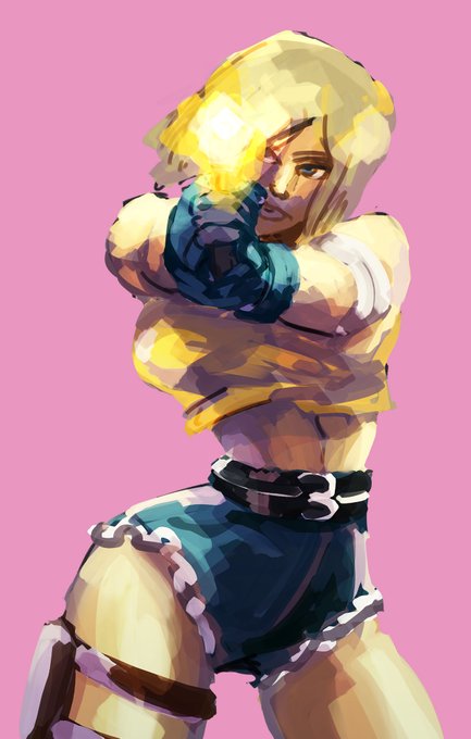
Rework of Linda Rotta from last week for Patreon! Old version shown for comparison. #karnovember


Dear #ComicsGate there is no comparison.
The mainstream (left) is dead.
Sign up for RED EYES 2 instead (right).
RED EYES 2
https://t.co/vF1aGqE6NM


A 2020 version of an old build i did in Minecraft of a commission by @AkuOreo for someone named Rismic and i think it turned out nice. Since there wasn't much of a real vision or so of her room i had to exaggerate a bit. Here's the art by her for a comparison.


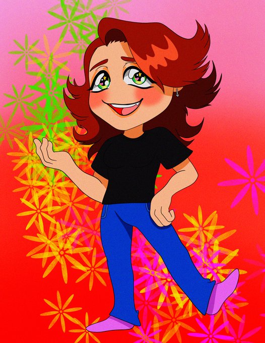



I was trying out a new style in January and the May piece took me actual months to finish so they're not a fair comparison.... though I think this pandemic has made me draw more for myself so I've enjoyed myself more?
Feels weird to see art from almost a year ago now wow...

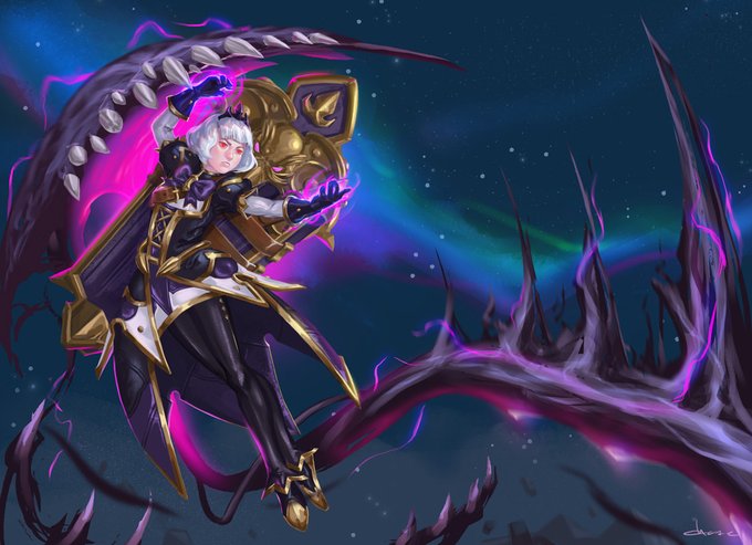
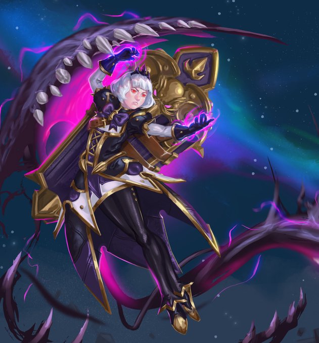
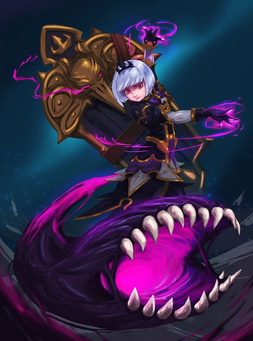
Sharing this again, this time with the full version. Painting Orphea again was one of the most satisfying endeavors I have done this year. Added my 2018 attempt in there for comparison.

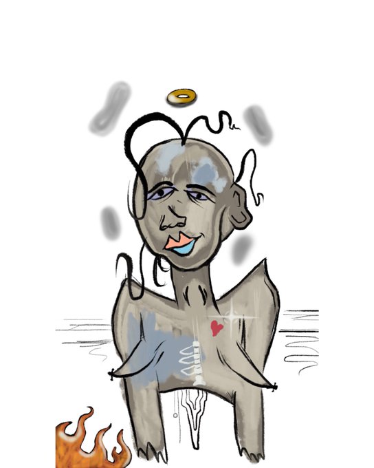
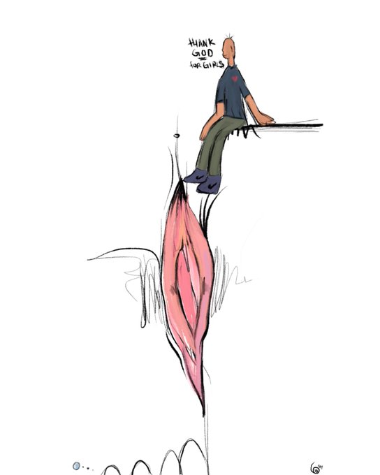
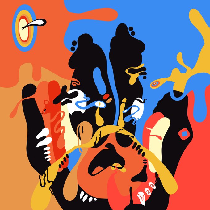
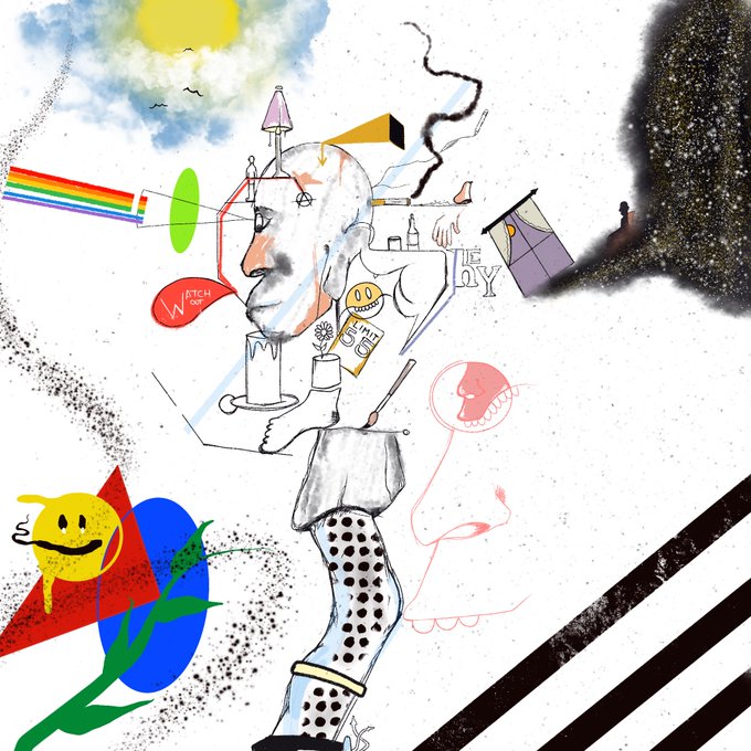
Ok ok better comparison. This is my digital art from January vs the last two months 😬🖤 still drawing off the iPhone tho https://t.co/ZQmNWe1s3o

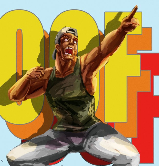
Rework of Santos for Patreon from last week, old version shown for comparison. #karnovember


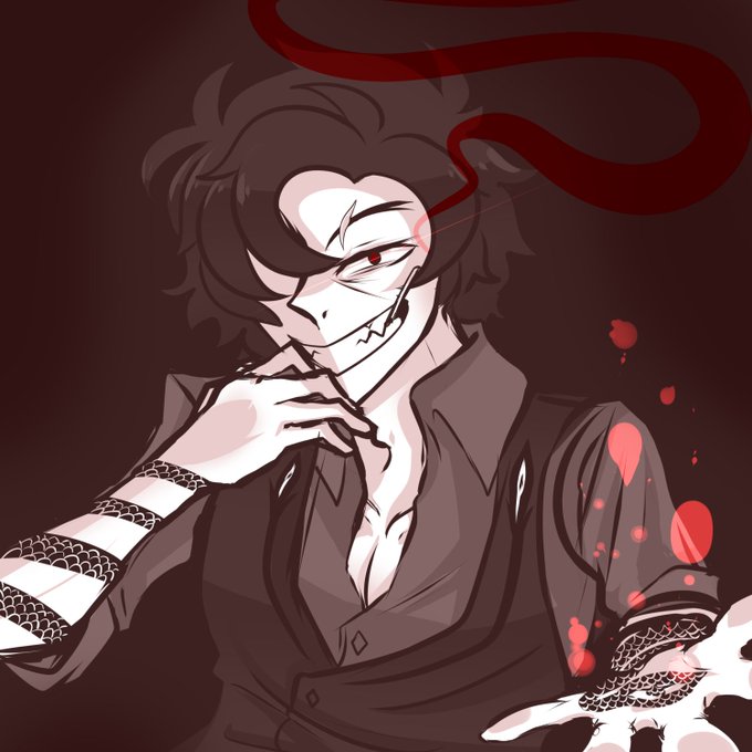
Playing dino's games really just made me fall for their style plus lineless in general... drew an oc in the vincent style for fun last night here's a side by side of my imitation of dino's style plus mine for a comparison...


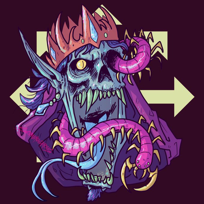


Here are the originals, for comparison. The Lich tier was retired and the Laser Sphynx tier is new


Ok.
So "Easy-Coloring" only takes a hours.
While "Try-Hard Coloring" takes a couple days.
(May need further comparison...)
#AnimeArt #animememes #drawing #ArtistOnTwitter #art #hololiveEN #artwork


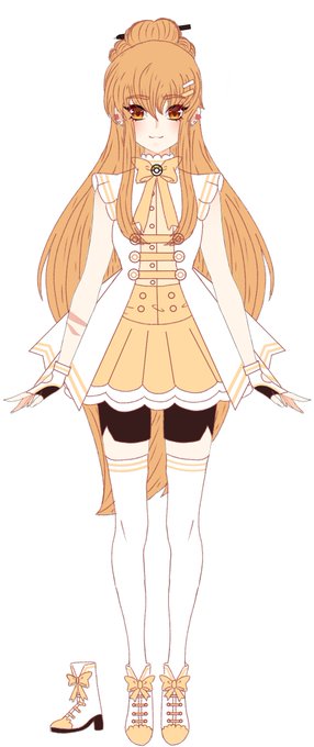
I still have to design her new wheelchair, but my baby Miya's new designnn~ Base is by @.Johdaa_!
Original art by Riiahime at DeviantART for comparison. She's all grown up 5 years later. The yellow is her new look!


✨Crystalline Version of Mephiles the Dark and Prism the Light!✨
anyway I just wanted to draw the two side by side as a comparison. Enjoy! 💖
#mephilesthedark #mephiles #prismthelight #sonicoc #sonicoriginalcharacter #sonicfc #sonicfancharacter


Here's the old and the new next to each other for comparison.


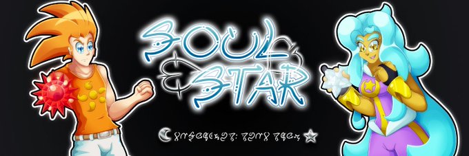
So, this is a two-parter:
I wanted to update the banner for Soul Star because for a while I'd not liked how Kaumudi and Hacim looked. Hacim was a lot thinner than he's supposed to be and Kaumudi looked... The best way I can describe it is "squished".
Here's a comparison.


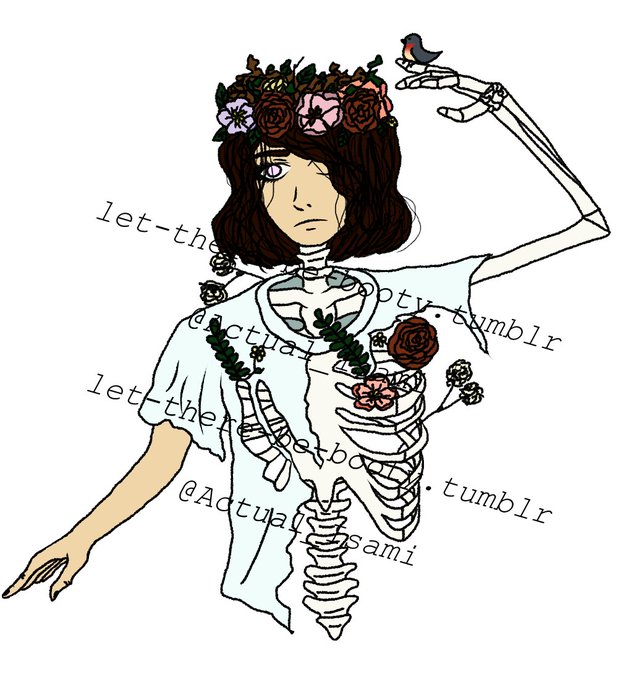
Welp it was a long time coming (mostly because boyfriend came up to visit for a week lol).
I made a #dtiys #dtiyschallenge for the fun of it.
If you do it tag me and put them side by side for comparison.
Have fun.


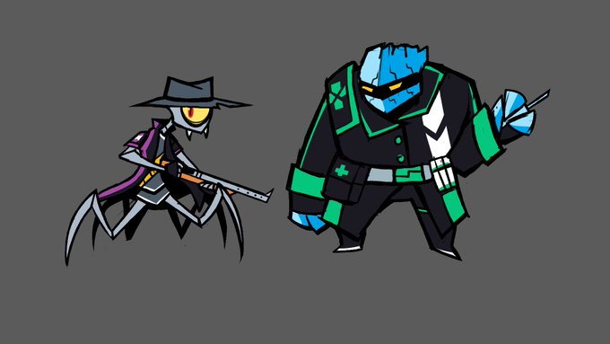
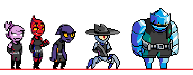
Alien bounty hunter team redesign.
old sprites for comparison.


Adapted Evelyn into 5E as a Forge Cleric Triton and I'm absolutely in love with the design! Just a quick before and after as a comparison.