ComparisonのTwitterイラスト検索結果。 22,251 件中 7ページ目


since this post gets lots of likes here is a full-comparison of active orbital launch vehicles of the world in march 2024


physically unable to draw, so here is a redesign of my precure ocs that I made some time ago.
I'll put the comparison below.


For comparison, this is the same one from the first game, with all the required detailed textures and some effects applied


Almost forgot to post...
Here's what I was working on stream today with a bit of a comparison of how much i got done


[ original ] quick moe/anime art style replication/comparison thing i did lol


Image quality comparison: Both sides may increase
From my experience, people who are serious about their work use the lowest resolution.
画質比較 両横が増えるかもしれない
経験上、ガチ勢は一番低画質を使う


You vs the character you get compared to
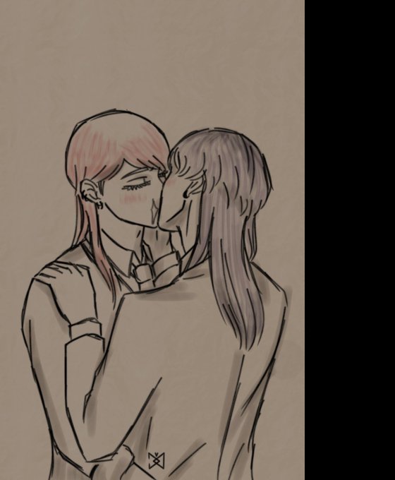
Most noteable and recent comparison, had to draw it
https://t.co/i9Z6qbRjJh https://t.co/3OZQ8obFZs


@Greninjasn Has nothing to do with "color correct"?
I am talking about the LINES
They've been redrawn with a computer, which is VERY obvious if you even just look at it slightly, and it looks ugly as sin
Comparison (ignore the aspect ratio change)
LOOK at the fucking line art and tell me… https://t.co/CYRBkk9vTK


Dunno, only one time people told me "the story behind her is Maya.
For the rest, I guess nobody ever made comparison to any of my characters. https://t.co/uA8wiwMQAr


Here's for the comparison of the previous sprite and the rework one as well.
Thanks for the support anyway. gonna improve more on the attempts next time.


A comparison between the comic and visual novel versions of the same scene in Xerxesian Chronicles.

