font,のTwitterイラスト検索結果。 256 件中 7ページ目

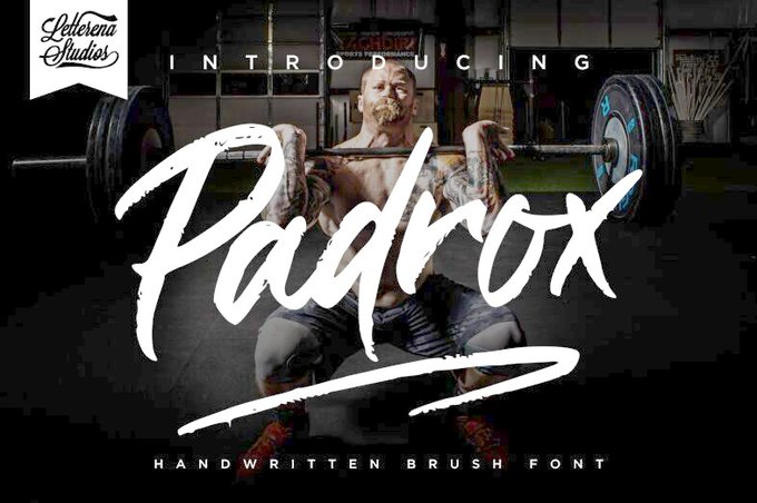
Padrox by Heru Utama Putra
https://t.co/Gh1Cuui0WS
#typography #freefont #font #scriptfont #handwrittenfont,

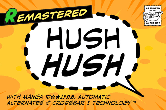


Comicraft’s classy balloon lettering font, Hush Hush now features four weights with support for Western & Central Europe, Vietnamese, Cyrillics, automatic alternate letters, improved spacing & kerning, Manga characters and Crossbar I Technology™. https://t.co/BJM3T0Kf8J
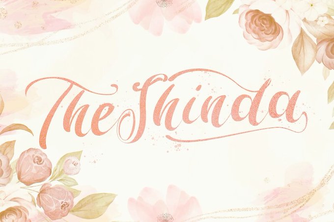
The Shinda by Stringlabs Studio
https://t.co/xodVUWpyKj
#typography #freefont #font #brushfont #handwrittenfont,

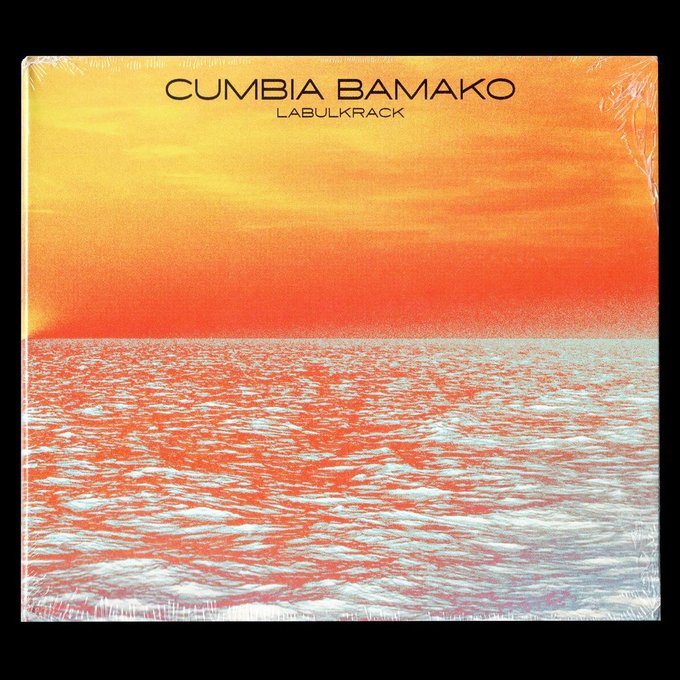
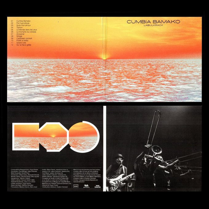
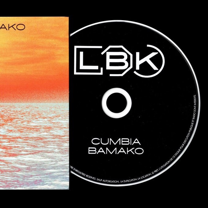
Cumbia Bamako ✨💫
Our font, the Ace, used by Superterrain for the last album of LBK : Cumbia Bamako.
The Ace is available on : https://t.co/UOFqrx15eR


good afternoon! one of the recent updates in valheim added cyrillic to their cool stylized font, which is a small detail for me but it was pretty exciting to see that my sign is finally not in the default cyrillic font!


Trying to figure out a title treatment for the cover. I'm really digging this font, but I have no idea if it's actually any good or not.


I’ve been playing a cute little game called “Bear Heart Defense.” The looks of it are similar to Cookie Run because of the sweets theme and the fact that it uses the same font, and it’s very simple to play. All the bears in it are adorable! 💓


Something useful, for anyone who wants to make anime-style screenshots or similar things for their game.
Crunchyroll, by default (at 1080p), uses Trebuchet MS font, set to 105% width, in white, with a black 7px stroke border.
https://t.co/2G01kB0Zjm
#VNdev #Visualnovel

Barroomba by Deedeetype
https://t.co/leWmRJo06j
#typography #freefont #font #comicfont,

Armelo Dianovista by Ochobot
https://t.co/hcIMxWalCi
#typography #freefont #font #calligraphy #handwrittenfont,


An irreverent, contemporary neo-Grotesk font, Grotta has strong geometric accents and sharp contrasts in its form - characterised by tight apertures and dynamic feel.
Test + buy - https://t.co/L9Rt9KxxMG #typedepartment #type01 #fonts #typedesign #typeface #font


Unearthing the Quake color font, by @ThomHendrik → https://t.co/SUuyYgjp1u Some fine digital data archaeology going on!


Il est sur Insta 🍄
https://t.co/IZRKzMwve6
Les commandes de portrait se font, soit en DMs Insta/Twitter, soit à l'adresse mail inscrite dans ma bio 🤍


Gaia... a high-contrast and experiemntal display font. The use of this font in headlines allows for the emphasises of the characteristic feminine shapes and fine lines of the font, giving a strikingly beautiful finish. Test + Buy - https://t.co/UeGrC3fSnQ #typeface #fonts
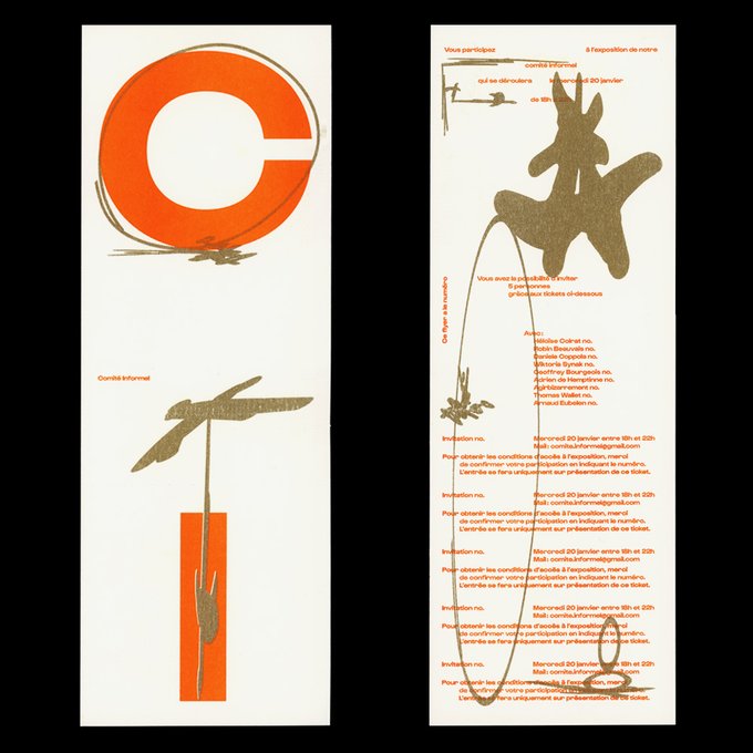


Our font, the Gustavo, used by Loup Lopez & Geoffrey Bourgeois for this cool exhibition invitation design ✨💫
You can find the Gustavo and all our other fonts available for purchase & licensing on our website ⚡️💫
https://t.co/UOFqrx15eR


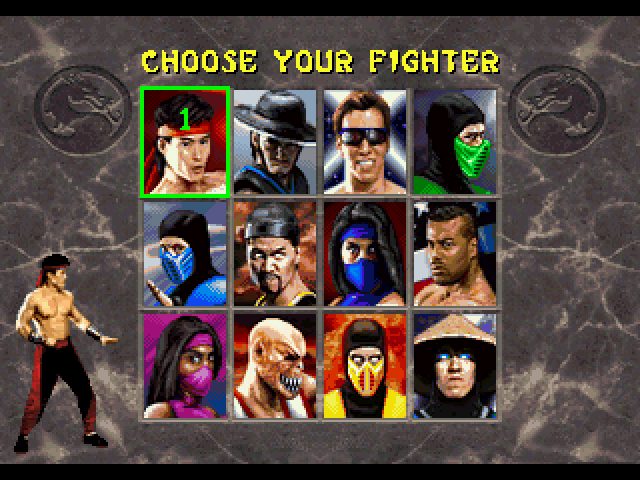
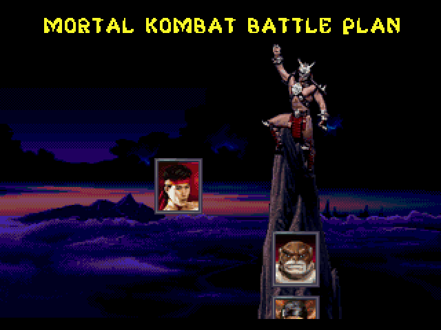
Looking at some of the often overlooked Sega ports of Mortal Kombat II - 32X and Saturn, to be exact - I realized there's a couple of fonts that I haven't ripped yet.
To the untrained eye, they're similar to the original MKII arcade font, but different enough for me to rip em!


Some character I made long ago, the cartoony look is inspired by @vanripperart even the font, the other is inspired by No more heroes maybe. Wooo

Gilbertho by Fina Fadlilah
https://t.co/YCCexd3bu9
#typography #freefont #font #handwrittenfont #scriptfont,

Gilbertho by Fina Fadlilah
https://t.co/YCCexd3bu9
#typography #freefont #font #handwrittenfont #scriptfont,

Black Rocker by Letterara
https://t.co/M467dI2Bfm
#typography #freefont #font #brushfont #handwrittenfont,