proportionsのTwitterイラスト検索結果。 7,927 件中 7ページ目
I feel like I should enjoy this pokemon because it's a fun aggron godzilla dinosaur, but something about it really annoys me. I tried to keep it mostly the same but squash the proportions a little
#pokemon
#baxcalibur
#mossworm
The other route is a similar approach that was taken by Eddie Smith for the cancelled 2005 Halo movie. Notice how he adjusts the proportions? He interpreted Chief's armour almost like a small space ship, while still be INCREDIBLY faithful. THIS WORKS IMO despite not being 1:1
I took a break from drawing for a week now, but I'mma slowly get back to it. I feel hella rusty
Here's a quick Morrigan warm-up. (I didn't reference much, so proportions are MESSED)
@pk_kenzie Can any character designers out there let me know if I’m doing a good job or not? If so, how close/far am I to being professional? /genq
(I know I suck at anatomy and proportions, I also suck at side views and stuff, but how should I improve in general?)
Update! I've fixed some proportions and started rendering
#acotar https://t.co/YvC6lhkm96
This is the bigger/neutral size, it doesn't look bad on its own, but it's so interesting to see it shrunken down with the eyes narrowed, in more realistic/mature proportions
Aaand here's my attempt. It was a bit challenging because I'm not used to draw younger character proportions. https://t.co/30z3K6b25o
Sorry if the proportions looks like shit I kinda did this late at night eughh.
It’s a Connie x Spy crossover concept thing (or whatever you would call it)
@Monochrome_St4r @DeadRatto @ViviVidette @DialMforMac @nyxnoxxvt Id probably play around with more of a hunched back and longer arms. Maybe extending the spines on back? If you want something unsettling its sometimes all about taking the base human form and extending proportions until they're just slightly off. Think midnight lycanroc's shape
Kidnapped kings are sacralized through forced drinking of ammonium. These entities grow to unnatural proportions, their feelings diluted, their opaline skin carved into crystals that will house the souls of the next Windfolk generation.
Pre order Zephyr:
https://t.co/svGJdxsvoS
@Menou_Riptide3 Didn't recognise that name. But on finding "fu-ta" though-
How can you *not* love this. You just can't, right? Right?
This. This OC. Just love, love. Angles. Blush. Proportions. I mean, 🧡
Old and new
Slight birbification happened, a wardrobe update courtesy of a cool spider, also definitely proportions uwu https://t.co/EcY9zZltZk
OKAY I FINISHED 😭🌸 IT’S STILL THE 23rd- so hAPPY BIRTHDAY FLORIAN! Gave up with the proportions
He’ll be less creepy eventually I swear. But he’ll always be lame tho, and that’s ok #HeroicEternity #WebtoonCanvas
Happy to add “grand slam.” another 1/1 by @thenoodie Tbh I feel like hitting the highway til I find a Dennys in the bad part of town to scarf some grimace proportions.
@Carameru_dani nahhh that would be impressive to so drastically change my chibi style that quickly 🤣 This is what they give you to draw on! I did the face myself but over the bases one to get the proportions right! ur right tho their base makes my art look so good :')) ahh man
Changed the design of my skulldog OC a little, mainly proportions #pixelart #characterdesign
@GigiD_Sonic Ugh..Eggman for me…his weird proportions makes him look weird every time. And Silver’s quills too haha. I’m always surprised people answer “Vector” because I love drawing Vector! I think he’s not hard at all and lots of fun to draw 😊
@Sophee_Jay This is me now! Character artist are amazing. Because while I think the model looks decent in Blender it looks bad in Unity. Understanding shapes and proportions like they do is just amazing!
Also modeling hands scares me.😅
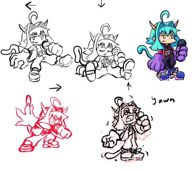
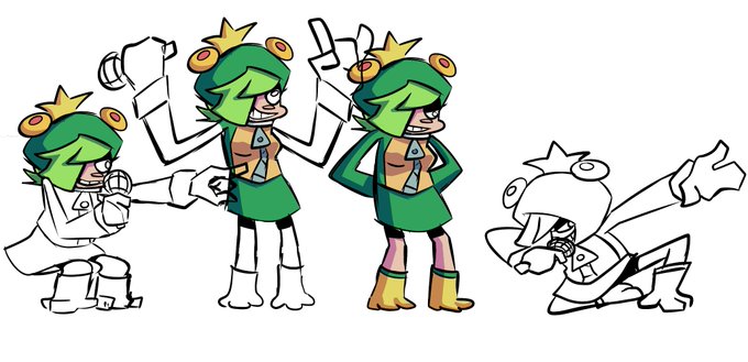
Making fnf spritesheets might sound easy but it's actually a lot of work, characters with bf proportions are already difficult af to make, charas with normal proportions are even worse
At this stage I was way more focused on Soo-Won references. I see how much that helped me to improve proportions.
Also added some visual effects for the void.


