ComparisonのTwitterイラスト検索結果。 22,248 件中 61ページ目


Doubt anyone will see this but thought it nice to see the comparison between new and old icons I have done in this style
Still like the older ones


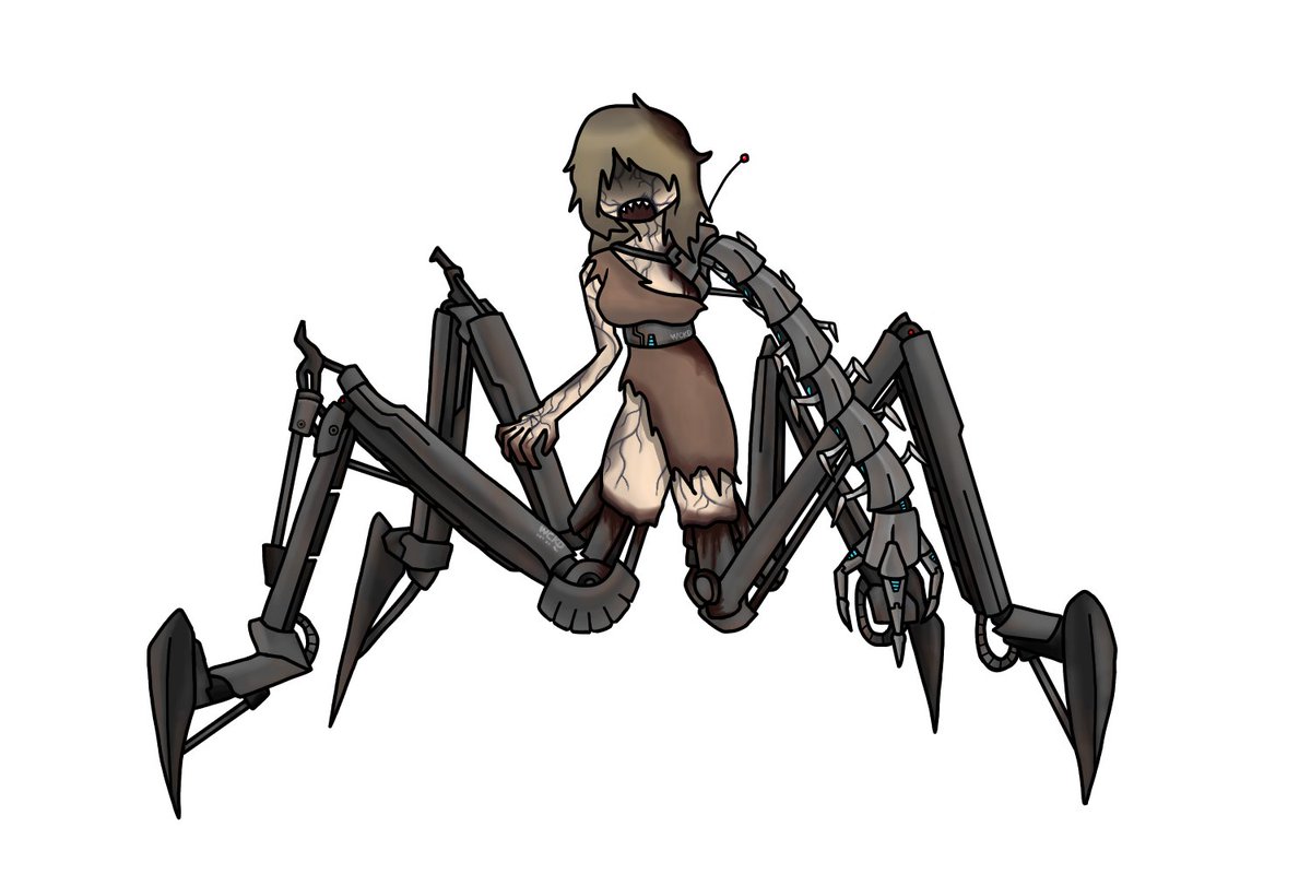
Wanted to make a villain Sam based on this:
https://t.co/zvv4ivgUGI
In this version, Sam can also steal the size of other people/objects, as well as control her own size.
Is it redundant? Yes.
But does she enjoy stealing sizes? Definitely XD
Comparison as well


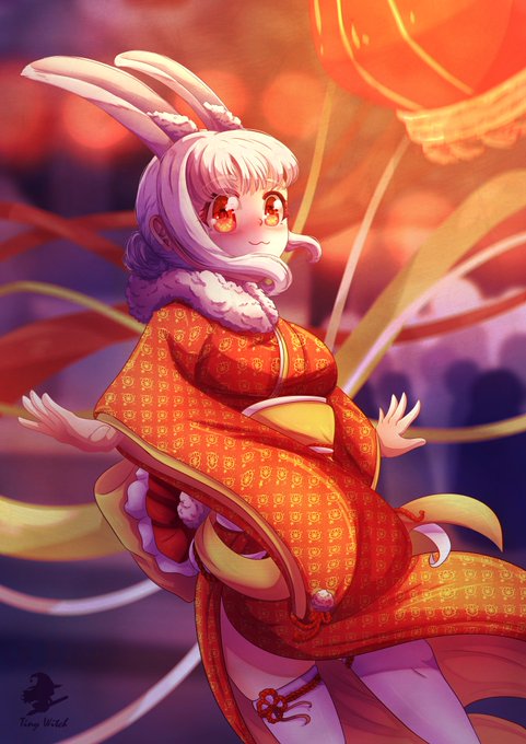
And a little comparison between all the Lunar New Year drawings of the last 4 years! >w0


The main reason you’re probs seeing lots of MGADD and TOH comparisons is mainly bc of the POC rep which MGADD does WAY better imo based on the trailers alone! But we’re not saying TOH is all bad seeing as it’s done a lot of good for the LGTBQ+ community. (1/2)


and for reference, here it is in comparison to the original dragon of unova!


Comparison of one of my most recent comm for @palmetto_pret and one of my very first paid commissions from him nearly 2 years ago, happy to have been here so long! hope to draw more pretty ponies in years to come


Some other comparisons for Tabrienna at her tubbiest include cloud, snow bank, mashed potatoes, and melting vanilla ice cream ☁️⛄️🥔🍦
Are you partial to any particular one?~
🎨MrSpiffy9


This new update will also modify the Navy Blue and Dark Green tints to look a bit lighter and more pleasant. The comparison is shown below.
#DoodleWorld


I used the tweet by @IvanDashSmith to make this side-by-side comparison. @evergreenqveen original is on the left, your cover is laid over hers on the right. The ONLY change was the moon.
This is a clear case of stealing & your creative team knows it. Pay her for her work! https://t.co/V0zUX3Stxj


seems we have a new namek goku asset ( first image, the rest are comparisons )


I tweaked my style a little.. i love them sm
(Old pic for comparison)
#identityv

