comparisonのTwitterイラスト検索結果。 22,164 件中 63ページ目


I love how, despite pretty much every single other love live character being quite light-skinned already, sachiko somehow manages to be so pale she looks dead by comparison


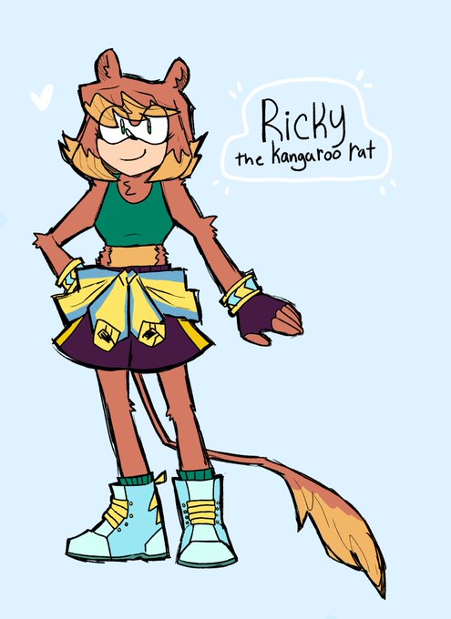
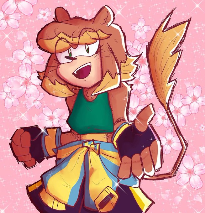
I love Ricky’s design but looking at her design next to other people ocs design she looks so simple in comparison LOL




⚠️SPOILER ALERT⚠️ I was caught in a moment of weakness and inspiration and decided to draw my number 1 waifu again. I really like the way my art style has improved so far, in comparison to when I drew her last. 🥰🥰🥰
#BLEACHTYBW #Yoruichi #catgirl #AnimeArt #animefanart #anime



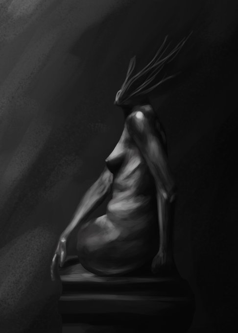
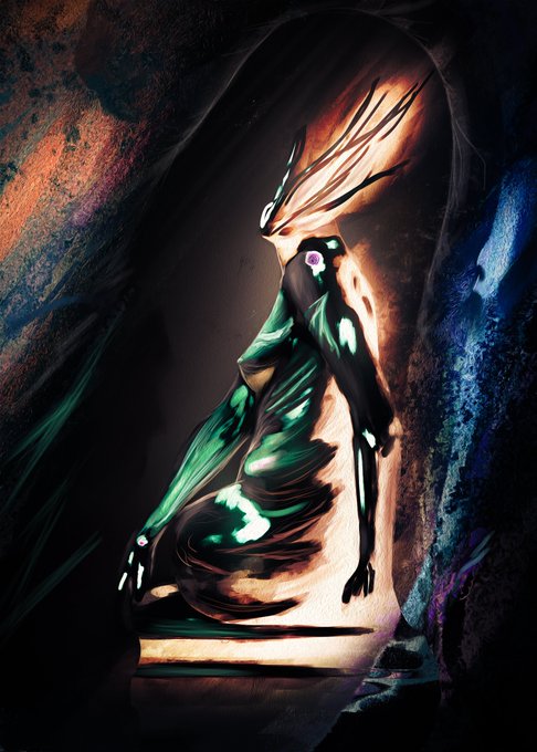
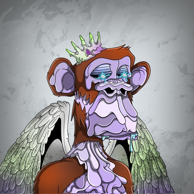
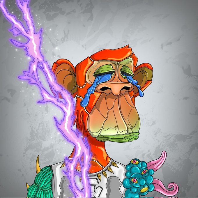
Here it's the comparison between the first and last stages of "The Shape of the Abyss"
Open Edition Available right now at Nifty Gateway for only $1!
https://t.co/nuNK5JU8XI
Before VS After https://t.co/eBHBqylFVn


This is the immediate comparison point I thought of. Very similar proportions but the approach to the key art is different


While still a little doodle this is a fun comparison of the same drawing with and without reference + a bit more time spent it


New comparison, original game / my art
#kingoffighters95 #kof95


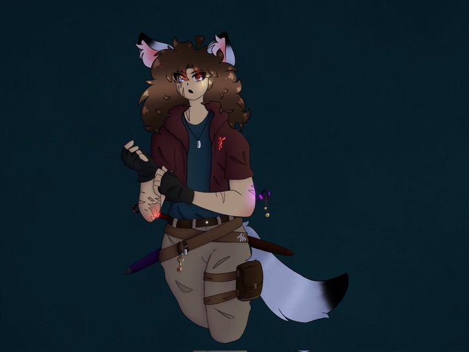


*contains leak
Finally done, together with comparison
(even though I’m still unsatisfied with some parts but too lazy to do it… )
#归终 #Guizhong #Genshin_Impact #Genshin #原神


Here’s a comparison of my fanart of her from last year to my current one.
#Adoart #ArtistOnTwitter


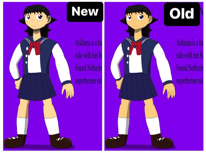


👈October 2021 👉 January 2023.
One of my goals for this year is to improve at drawing. Looking at this comparison makes me feel more confident, especially because it's just the beginning of the year 💪 #art #drawing #Sketching



드라마 '사랑의 이해' 7,8회 리뷰, 원작과 비교, 드라마에서 삭제한 부분 정리-1
(Comparison of the original work, The part that the staff deleted from the drama.)
전문은⬇️
https://t.co/4WMQjvCpzQ (ENG)
#사랑의이해 #TheInterestofLove #TheInterestofLoveEP7 #이혁진 #YooYeonsuk