FontsのTwitterイラスト検索結果。 65ページ目

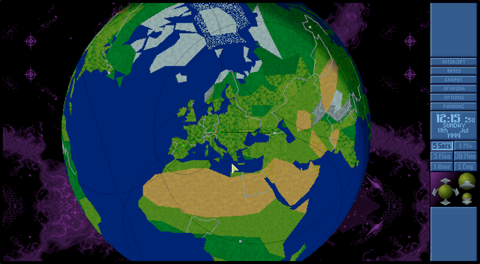
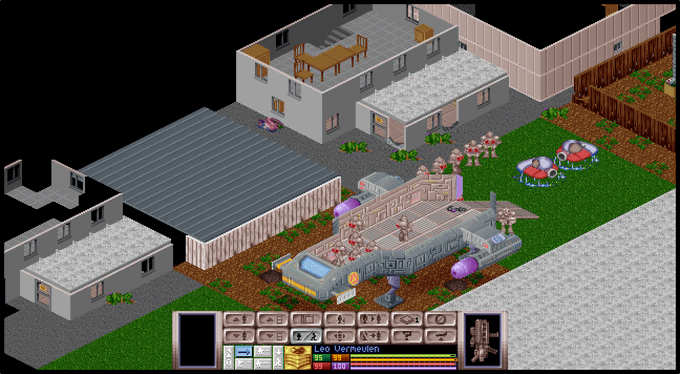
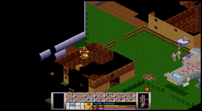

@Bhaal_Spawn @ComChia430 The nice thing with using OpenXCom these days is that I can mod it with the Amiga/PS1 music+fonts and it feels like a beautiful merger between the DOS/Amiga games. There's even an option for "all day missions".. I really did get sick of having to throw flares everywhere. haha. 😂


Now that the 16 Thunderclap fonts are done, I’m going to refocus on that condensed manga dialogue font. That’s still in very early stages of design.


From the CM Archive
—
Auscultation du coeur
—
CM73
Artefact Type: 10″ LP
Year: 1966
Designer: Ernst Roch
—
Full Write-up & More Images:
https://t.co/TDMVhheEzl
—
#canadamodern #ErnstRoch #HoffmannLaRoche #DesignCollaborative #canadiandesign
—
#fontsunday @DesignMuseum


#albumart for Beerfinger's upcoming 3rd album "Heart of the Machine" ...still not sure about fonts.
https://t.co/DyBpD7JgAJ
#digitalcoloring #drawing #artist #albumartwork #music #rock #heavymetal #heart #art #ArtistOnTwitter


“Referenz Grotesk” (https://t.co/xDQ7YiruPg) by @StefanieBlack & Dirk Wachowiak for @sudtipos is a neo-grotesque typeface “full of references referring to the type design history of Stuttgart State Academy of Art & Design”. Lots of stylistic alternates, 4 flavours. #366fonts (70)


hey #TTRPG and #indiegame developers: have you heard of the 'Mira calligraphiae monumenta'? it's full of beautiful public domain #calligraphy and illustrations, all available under the @GettyMuseum open content program. fab inspiration for fonts or decorations for games!!


A / B / C / D for @36daysoftype 2020!
Follow along on https://t.co/Ud1MpC5VJD
#36daysoftype #36daysoftype07 #36days_Adobe #contest #36days_Fontself #36days_NVIDIAStudio #AdobeDesign #MadeWithAdobe


idk what to do with this info but i found all 12 fonts used in the bad ass temple logo

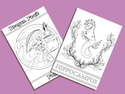
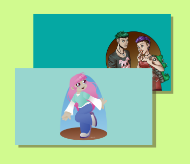
Hey everyone! I now have free colouring pages and Desktop wallpapers on my site! More will be coming soon. There will also be some mailing list exculsive freebies (including fonts) coming soon! Make sure to sign up! https://t.co/FVaCCBNdCu
.
.
#artistontwitter #art #freebies


“Eklektyk” (https://t.co/86DBPi65Jr) by Maciej Połczyński for @LaicType is a dynamic display typeface that ticks some of the current type trend boxes. Alternate glyphs make for eye-catching headlines. A “stencil” style is free for personal & commercial desktop use. #366fonts (62)


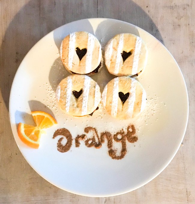

With a #weekend of #baking #orange being the theme, some more #homemade #vegan #glutenfree meltinthemouth #jammiedodgers with #homemade #berry #jam #handmadehour @HandmadeHour #lettering for #fontsunday


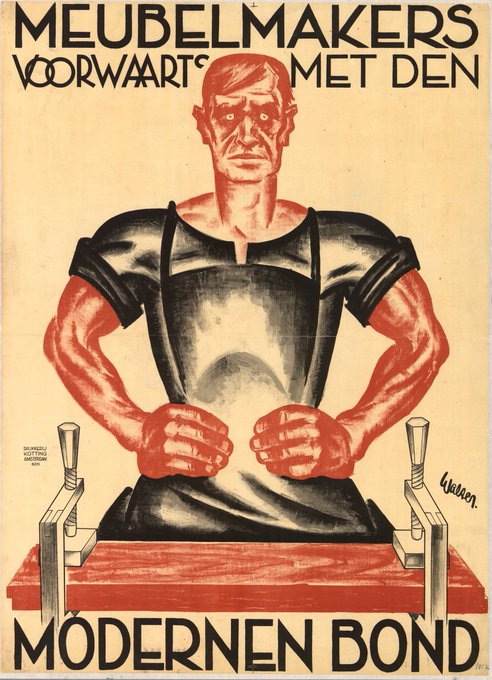
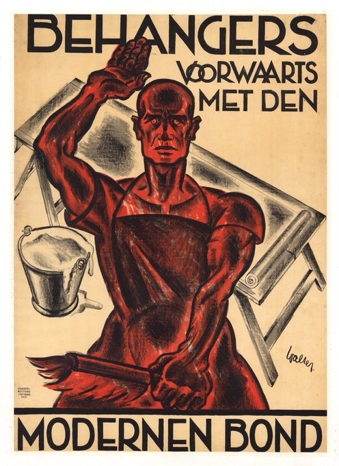

@DesignMuseum @antiqdigitalis #FontSunday More #persuasive posters by Walter (K.A.H. von Wenz zu Niederlahnstein) #GraphicDesign


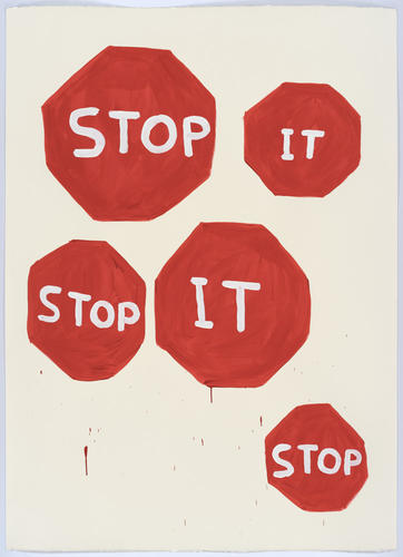

David Shrigley's persuasive posters #FontSunday #Persuasion #GeorgeHim @DesignMuseum @illustrationHQ @davidshrigley


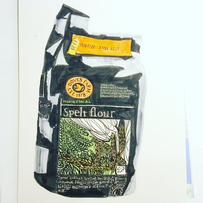
And #drawing whilst #baking ! Reflecting key #PancakeDay ingredients and implements! @Dovesfarm #speltflour #lemon nonstick pan #billingtons #muscovado sugar @CASSART1984 pens #fontsunday #illustration #typography #lettering


10 Free Modern Fonts That Will Spice Up Your Futuristic Projects https://t.co/5O3UJr4xl8


Oh my ... "The Adventures of Rocky and Bullwinkle" show.
What a rich cast of characters and segments to capture a kid's imagination. #FontSunday #HalfTerm @DesignMuseum


was playing around with fonts for future stuff and hmmm
i might use this one? its close enough to my actual handwriting i think 🤔


“Plaisir” (https://t.co/IDikd3fv7H) by Dusan Jelesijevic for @tourdefonts is a serif font family with sharp edges and long, pointy serifs. Quirky details like the warped /o /O, the almost-toppling /s /S and bent terminals in the italic make for some personality. #366fonts (53)