appealingのTwitterイラスト検索結果。 2,734 件中 65ページ目


I found @AleenaMao's drawing of eyes is so appealing and decided to commissioned them to draw Reine. It's pretty I love it! #Reinessance


I want to start making videos again. I want to post more useful stuff then just speed paints.
I'd like to do one using saturated colors together in an appealing way.
I was going to make a unappealing pic and fix it as a test, but it came out nice right off the bat. Like, bruh...

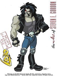


@jessisupreme Everyone draws like a sum total of their influences. Stephen E Gordon’s style is just one of many approaches to stylizing American comic art in an appealing animatable way (which inevitably includes anime influence), that he’s been drawing like since the 80’s.


Tabitha just makes being turned into a frog sound appealing....
#rule34 #harvestmoon


i honestly don’t know why theres not that much fanart of her unless im not looking hard enough shes got a pretty appealing design


the only characters from pokemon games that were appealing to me and theyre both alt boys with eyeshadow & black n white hair.


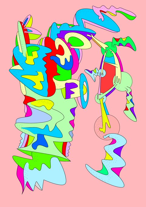
Icing Ornamentation: strident graphic design print of delectable and appealing icing sugar sculpture.


Attacking @Ringebell!
Bug themed characters! Such an appealing color palette, too!

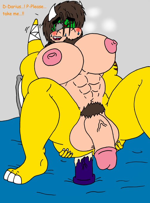

Hmmm... Between mine and @Chokeylover version, don't know which one is more appealing. Any thoughts?
(Mine was done before I commissioned this from him)


Something a little low effort for Fi Friday this week. Been having trouble with Fi’s hair for a while now so I figured it’s time for a change. I’m kinda leaning toward B although I and L are oddly appealing. Feel free to give your thoughts. Hell I might even put it to a vote.


My next Art Fight attack features @neetclown’s persona Sakayume! 🦄💓💟💭🌈💜
I really loved the vibe of this character/persona so I really wanted to try my hand at drawing her! The dreamy aesthetic and her color scheme are both really appealing to me.

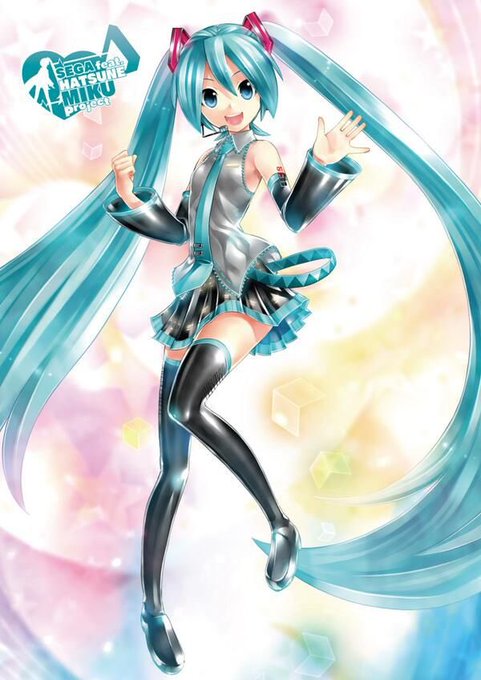

Miku’s official design is memorable and appealing because it makes better use of shape language, color hierarchy, and has a stronger silhouette! I love Miku’s beta design too, but I’d argue it’s even cuter because we already know it’s supposed to be Miku.


@ArtShareHub First one I love the angle and colors! Second one I felt was a little stiff and didn’t portray the character the way I wanted. Third one, the colors clashed and made it unappealing. Fourth one means a lot because it’s an important project to me!


todoroki best boi
got to watch and read bnha / mha and i had to draw shoto cause i think his character design is appealing 🧊🔥


@NateTheChipmunk "Ya' smell like you've been digging through the trash again..."
She covered her nose. She understands why he foes it-Nate collects odd things. But it definitely makes him less appealing to her.

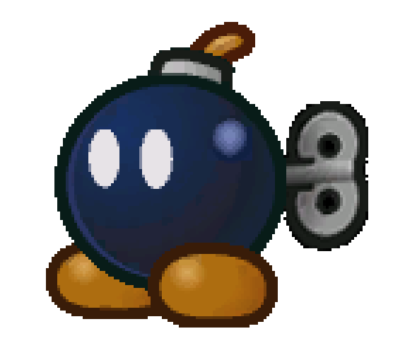

Probably a pretty controversial take, but I think a lot of characters designs in TTYD go too overboard on being creative.
Bobbery is my example. Very appealing, memorable design, but he's so unique that I can barely tell he's a Bob-Omb.

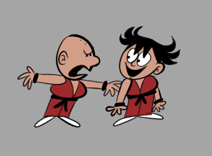
Been considering getting more into #anime someday, but don't know where to begin. A lot of the older stuff looks very appealing. #deeisbrowsing #cartoon #fanart #dragonball #goku #krillin
https://t.co/jUNPcjVLru


I don’t really have one? But here are the ones I find most appealing. The first ones eye is off but I love the angle and the lighting. The Killua one I would say to lay off the the glitter but it passes well with the lightning. The last one I just enjoy cause of the style. https://t.co/PPMD6NuOLc

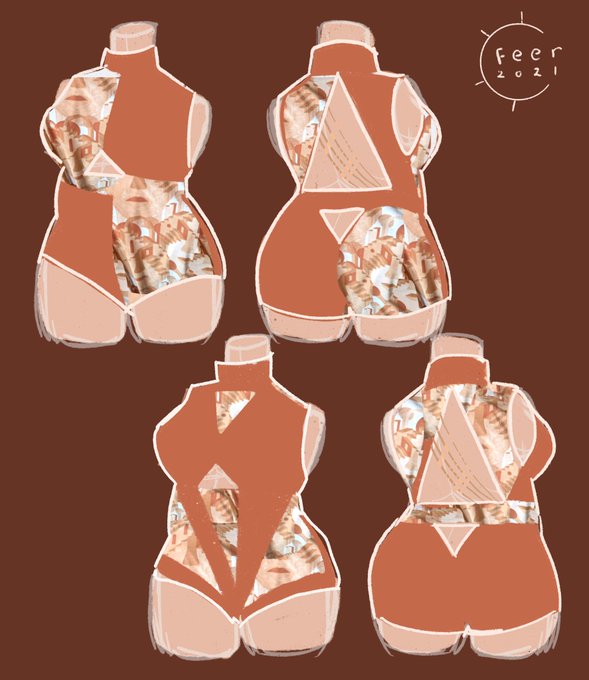

Personal project for later because shopping for an appealing plus size bathing suit is painstaking. Every bathing suit i’ve ever been able to afford is either pretty but ill fitting or fits well and has a crap pattern. Tired of it so im concepting my own😤✨