CONTRASTのTwitterイラスト検索結果。 10,536 件中 66ページ目


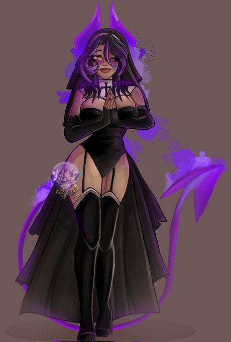
Good morning everyone! I show you the finished drawing of my Oc Lila dressed as a nun and her contrast as a demon shadow)?. The Ibispaint couldn't stand hahaha but it happened. I hope you like it
#spookymonth #drawing #ArtistOnTwitter #Halloween2022 #artist #artwork #digitalart


@Bishokuyaa La colo est vraiment cool, mais le titre ressort pas assez je trouve (jaune clair sur orangé), pourquoi pas le contraster. Mais pour moi ce qui choque c'est la pose du mec à poil: son bras ballant en pleine diagonale, on comprend pas ce qu'il fait. Une simple suggestion ⬇️


The Orange/Blue Contrast Trope:
“the 2 stand out individually but are also each other’s complement and work together to enhance the other’s traits, making the other even brighter.”


Last day to catch 2 contrasting exhibitions. Waves have been lifetime fascination for surfer and painter Nick Paden, whilst sculptor Paul Bonomini uses the sound of crashing waves and ticking clocks to warn of the impending chaos caused by climate change.
Open 11am - 4pm


Watercolor #painting of the dramatic #storm sky, titled "Sky No. 6'" (30 x 40,8 cm, 2017). I just love those contrasting colors!
You can find the original watercolor and signed art prints of it here:
https://t.co/BO4WBzUoE0
https://t.co/cSVqObweKm


@iwillluvs THEY LOOK SOOO CUTE :(((((( the contrast between the red and blueee :(( I LOVE THEMSSS :((( 🫶🏻🫶🏻🫶🏻


Dragonrend Yi, an interrogator of Ordo Xenos, a blank with a sword which has defeated an alarming amount of daemons in contrast to xenos.


@DemonioGone @objktcom Master of drawing. Light and darkness in a sensual game of love and pain. Beautiful contrast and adventure of lines! Perfect balance in the mystery thread. 🖤


Character glow up!!
I redid an adopt I sold to a friend of mine and I absolutely love the contrast in style haha


One detail I absolutely love in the event, is how Ace's grumpy face when he can't go contrast with Malleus's smiley face when he got invited
In other words, I love these boys so much 🥺
#ツイステ


contrasting impact
#moodboard #inspo #ideas #adesignexcursion #interiordesign


Heres their individual images!
patch notes:
+ Beans got a minor palette change, changed the light yellow to a light cyan for more contrast
+ Billy now has a fluffy fringe covering his eyes!! His eyes underneath are still tiny and beady


@AiKoBeanArt @projectgreybird @darkestdollx @ohchelllo @gNomeFTs It's always a pleasure to see your work. Colors and contrasts are always amazing ! Thanks for the mention☄️💖💫
Tagging : @NaeNagara @wd_kuyokuyo