CONTRASTのTwitterイラスト検索結果。 10,494 件中 67ページ目


"Suspended" - #wip
Improving the brightness and contrast, viewing angle variety, and more variability with the size of the flock of birds.
#nftart #tezosart #codepainting #genart #nftCommunity #nftartist #p5js #generativeart #tezoscollectors


NEW on #LitLinks 👀 a lesson to help Ss practice observation and perspective -- keys to scientific inquiry
👉https://t.co/DD1xIX9pMf
@senickel @LernerBooks @2021derfuls #comparecontrast #homeschool #kinderchat


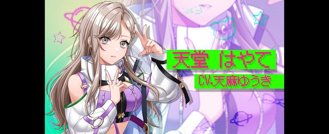
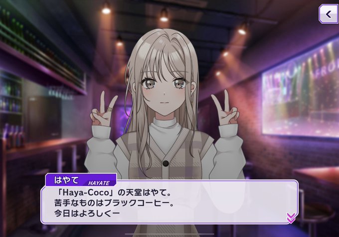

Hayate in initial promo art: cool sexy lady
Normal Hayate: 😶😮
Hayate to Kokoa: ☺️😳
i just find the contrast & differences funny & cute


@DevinElleKurtz oh OH that is a fun art share! Here is a WIP master study of Première rêverie by William-Adolphe Bouguereau that I've been noodling on
I've been using this as an exercise to learn how to paint shadows with less contrast, rather than just defaulting to my usual intense shadows


intimidating fantasy horror portrait, ronald mcdonald, mcdonalds, grim, extremely detailed, sharp focus, smooth, digital illustration, high contrast, 8 k, high detail, emil melmoth, deathly tones, 8k
#AIArtCommunity #AI #AIArt #Art #Technology #DigitalArt #Midjourney #dalle…


Since recoloring Juna in the Persona 5, high contrast, art style worked so well, I thought I would do the same for Chibi Juna. I think it turned out really well! What do you guys think?


I was commissioned to create this piece titled “Self-Love.” This piece took time and patience; from creating all those leaves to finalizing a balanced contrast.
#digitalart #art #love #selflove #Procreate #illustration #nature #digitalpaintiing


CREEPY CRAYON! is the latest funny/spooky #picturebook in the best-selling series by @areynoldsbooks + @itspeterbrown. The LOL text + high-contrast art make this a must-have for #Halloween + beyond. @SimonKids #bookreview by @ChristineVZ @SimonKids #kidlit
https://t.co/xafxxd1IzC

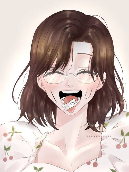

the full image of #NaoyAlsi doing the trend! the contrast is absurd lol
art by the amazing @kalajengkinky ! thank you so much 🥺🫶❤️ https://t.co/4CGuYSQYiX


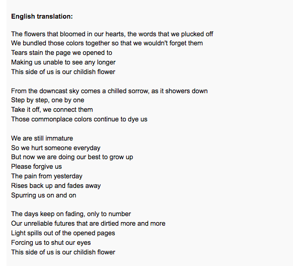
October is coming to an end! Hang in there, everyone!
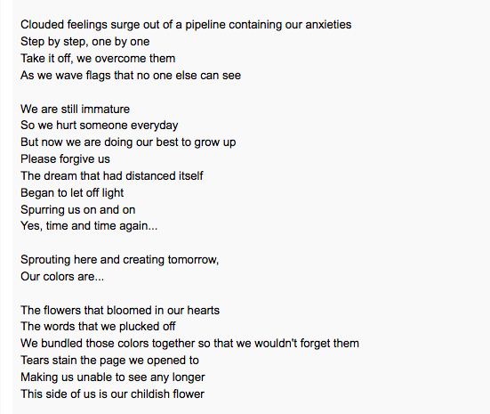
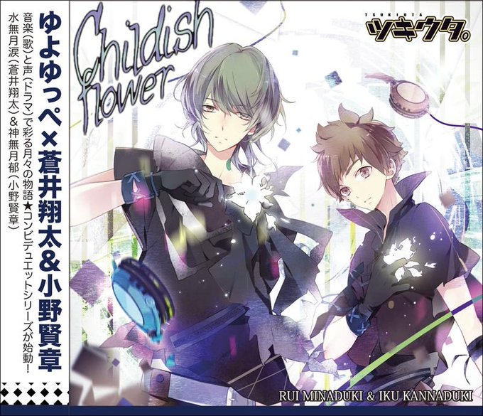
Here's a translation of "Childish Flower," the duet by Iku and Rui. The chilly, bleak worldview contrasted with their rich and colorful voices is sure to color in your worlds as well!🐈⬛🧸
https://t.co/jgJGw02KTC


Let's go spread the beauty #TRIBE 💯🔥
@tribeodyssey 19 SPECIES Breathtakingly beautiful in design, attention to detail, contrasts, color combinations.
Please spread the word . RT
24 Carat Species


i just realized that these two main color resemble the contrast of fire and water

@tribeodyssey 19 SPECIES Breathtakingly beautiful in design, attention to detail, contrasts, color combinations.
Please spread the word . RT
Acid Species


✥ Figure Limited color version ✥
Figure Limited color version with a beautiful monochrome look, highlighted by pink accents.
The pink contrasts life and the monochrome contrasts death.
#LAM Designed
250 premier pieces
Only 𝟐𝟏 hours left until ends!
https://t.co/mPuVMHvkPD

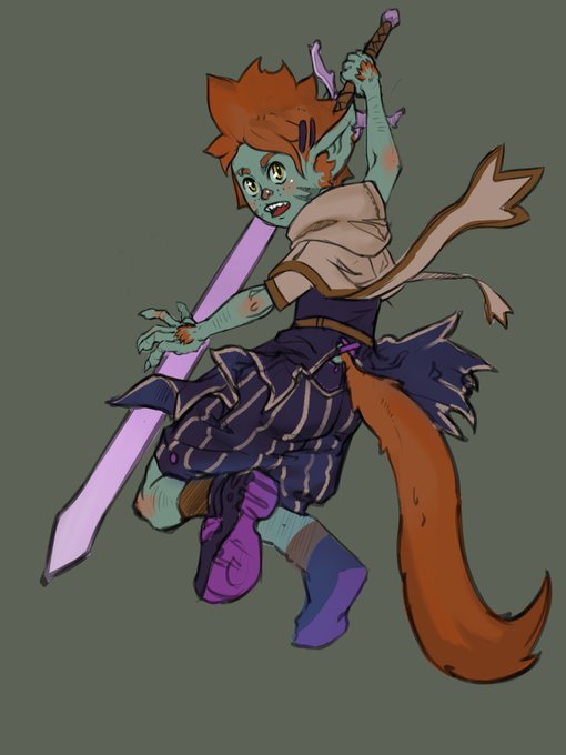
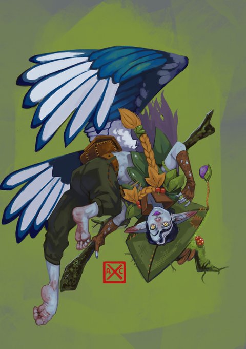


@AdrianRegaladoN hey im detoria and my work is super colorful cause im a little contrast blind XD draw dnd characters and monsters mostly


Abstract contrast #patterns. Flat, simple geometric #design. Vector seamless pattern for textile, wallpaper, wrapping paper, prints, fabric, web background or another accent etc.
#red #abstract #natural #background #editable #patterndesign
https://t.co/c4LVHWljZA


Rig is finally done for now, time to build him some outfits and props.
I also need to invest in a monitor that actually has a decent contrast so I can tell if I've completely botched his values or not..

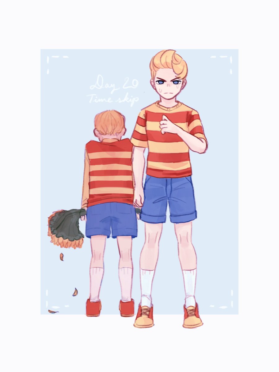
Took my change to contrast young Lucas and post-timeskip Lucas.
#mother3