ContrasのTwitterイラスト検索結果。 10,818 件中 68ページ目


contrasting impact
#moodboard #inspo #ideas #adesignexcursion #interiordesign


Heres their individual images!
patch notes:
+ Beans got a minor palette change, changed the light yellow to a light cyan for more contrast
+ Billy now has a fluffy fringe covering his eyes!! His eyes underneath are still tiny and beady


@AiKoBeanArt @projectgreybird @darkestdollx @ohchelllo @gNomeFTs It's always a pleasure to see your work. Colors and contrasts are always amazing ! Thanks for the mention☄️💖💫
Tagging : @NaeNagara @wd_kuyokuyo


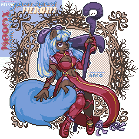
Since everyone enjoyed the Chibi Juna, hard contrast recolor so much, I got a request to do one for Sara. Well, here she it. I really like how this one turned out.


I was always dissatisfied with the original version of this piece (left). I'm self-taught & always struggling, but after a year of learning a bit more about color & contrast, I'm very happy with the new one (right). The journey is long. Hope you like it!


Because I was talking about them before, here are some of the #paletteswap versions as well~
None of them have undergone any great amount of fine tuning and I chose the ones I thought had the most interesting themes and contrast.
In all cases, I am glad the swaps worked so well~


Ironic how mc has a darker contrast while the antagonist doesn't. At the same time, the antagonist has rose thorns behind her I think perfectly reflects her character. Whereas the mc, has a body of water behind her, representative of her dreaming


@riotatttherite I'm crying at the bodybuilder HP au, I would give anything to see one of them😂😂
And definitely bleach; I love the stylish way kubo uses heavy contrast + 'solid' colors in his art! I also read a lot of horror/guro manga, so that was probably a big influence too. You? 👀


"Suspended" - #wip
Improving the brightness and contrast, viewing angle variety, and more variability with the size of the flock of birds.
#nftart #tezosart #codepainting #genart #nftCommunity #nftartist #p5js #generativeart #tezoscollectors


NEW on #LitLinks 👀 a lesson to help Ss practice observation and perspective -- keys to scientific inquiry
👉https://t.co/DD1xIX9pMf
@senickel @LernerBooks @2021derfuls #comparecontrast #homeschool #kinderchat


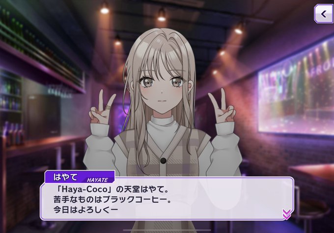

Hayate in initial promo art: cool sexy lady
Normal Hayate: 😶😮
Hayate to Kokoa: ☺️😳
i just find the contrast & differences funny & cute


@DevinElleKurtz oh OH that is a fun art share! Here is a WIP master study of Première rêverie by William-Adolphe Bouguereau that I've been noodling on
I've been using this as an exercise to learn how to paint shadows with less contrast, rather than just defaulting to my usual intense shadows


intimidating fantasy horror portrait, ronald mcdonald, mcdonalds, grim, extremely detailed, sharp focus, smooth, digital illustration, high contrast, 8 k, high detail, emil melmoth, deathly tones, 8k
#AIArtCommunity #AI #AIArt #Art #Technology #DigitalArt #Midjourney #dalle…

Since recoloring Juna in the Persona 5, high contrast, art style worked so well, I thought I would do the same for Chibi Juna. I think it turned out really well! What do you guys think?