appealingのTwitterイラスト検索結果。 2,734 件中 69ページ目


Adding a darker color between the base color and the shadow is very appealing to me😌💝


Such happy vibrant illustration style for La Mercè, a celebration of Barcelona's patron saint of the city, and its Festa Major, a festival of festivals. These coloful funny beauties definitely reflect just that. They're so well done and very appealing. https://t.co/RbUG8t45oW


A little teaser image (yet again). The full image will show the pencil sketch next to the coloured version. It's a good example to show how even a bit of colour can go a long way to make a rather rough sketch a bit more appealing and easier to comprehend. :)


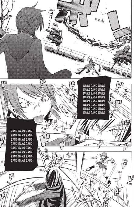
Its a manga that has good sense of style and well drawn characters even Okubo when he made Soul Eater struggled to make the characters look visually appealing early on


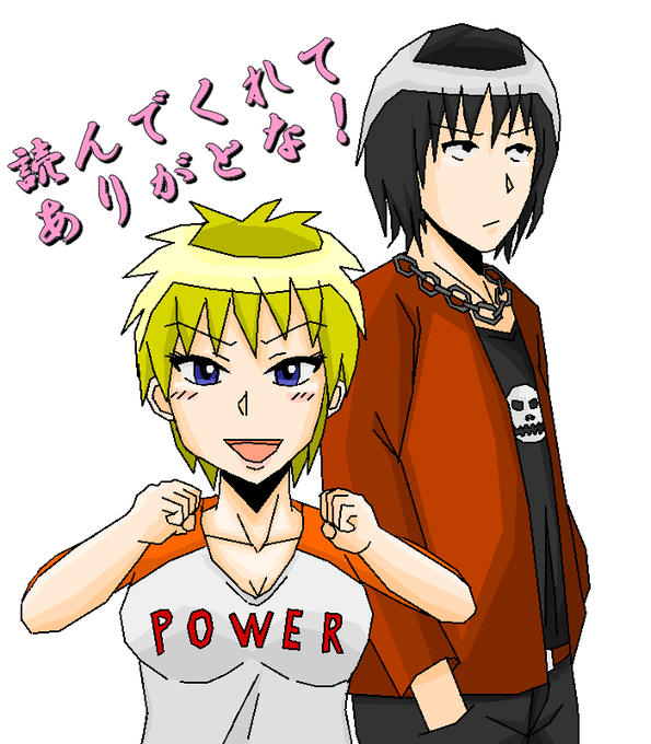

@Battybuddy Thank you! She(He)'s TS'd with a solid remnant of her(his) original male form!
Her(His) original form was very strong and masculine, but she(he)'s been TS'd to make her weaker, which is what makes this piece so appealing! XD


This one is also fair - better quality (except hands feet) and still no nip-nops but there was a visible peepus (which now has a star sticker over it for posting here). Not appealing it.


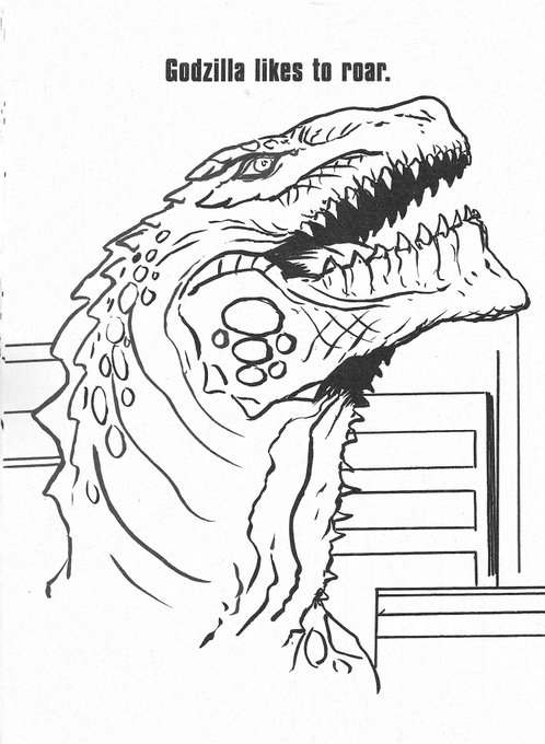
I get a little mad when people draw Godzilla 98 ugly on purpose. You know you can make him look appealing, right?


I got shown this cutie a while back and her design is just so appealing #lovelive #rinatennoji


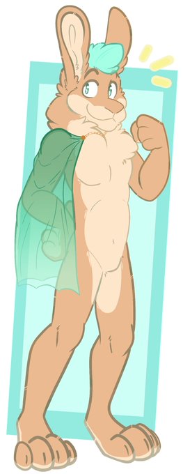
Full body commission from @CryptidGrizzly featuring myself. Very visually appealing and a good artist, so go check them out. c:

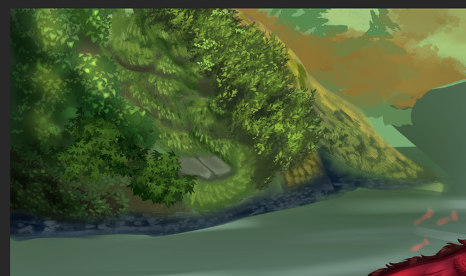

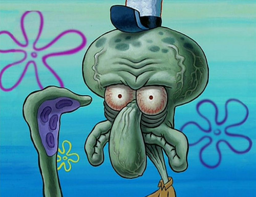
Rendering a cartoony design with superfluous realism is almost exclusively done for a comedic or uncanny effect. Because it looks hideous.
Pokemon designs are appealing in their simplicity. Deliberating adding a bunch of realistic bump maps and gritty textures misses the point.

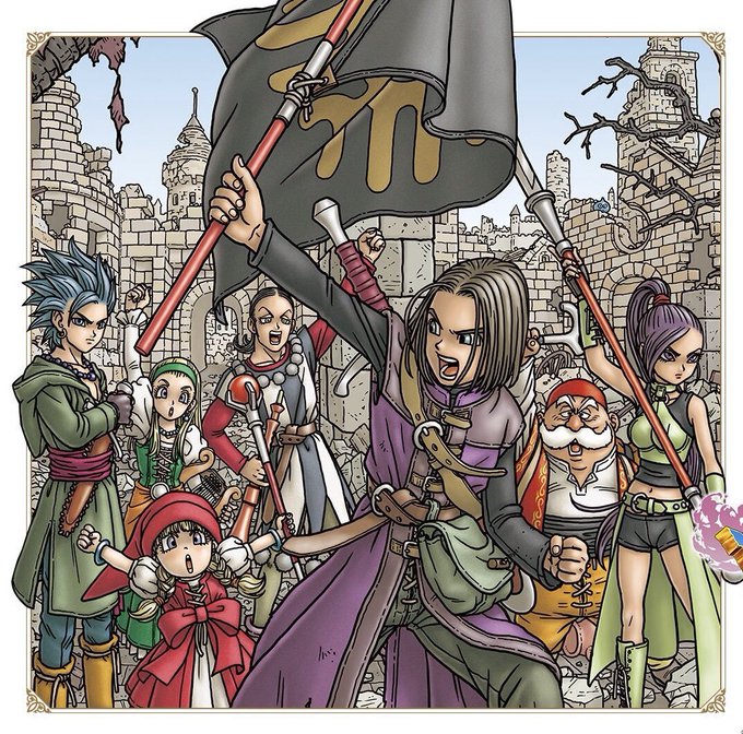
I understand that Dragon Ball's art isn't as focused on things like armor or magical beasts while being more angular as the series progressed, but you honestly can't look at this style, tell me it's not appealing, and still expect me to take you seriously.

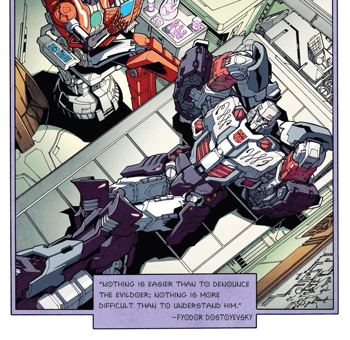
If you are wondering why I find Transformers so appealing, this panel of Megatron over a Dostoyevsky quote should explain a lot of it





Rushed the hecc out of this for #30DaysSonic
The prompt was Title Screen. Had to do my most beloved game of all time. #SatBK doesn't have a very appealing title screen, so I decided to take my own spin by using Tales of Knighthood as inspiration #sonicartist #ArtistOnTwitter

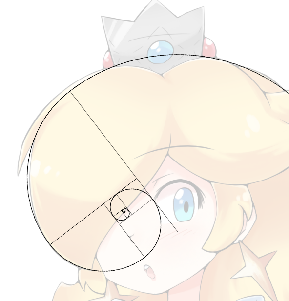
Mathematically speaking my Rosalinas are visually appealing :)


okay just a few tiny changes to make itmore appealing

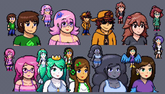
@MattMixer18 well if you need ideas you could pick anyone that looks appealing here


@marchdragon11 Bigger, wider, thicker, and more appealing ;)