comparison.のTwitterイラスト検索結果。 69ページ目


Thank you all for the very positive response yesterday to the Beasts of the Mesozoic Tyrannosaurus Rex color design reveal! I'm very grateful for all of the support already. :)
To follow up on that, I thought you all might enjoy this comparison.


Rework of Infinity for Patreon! Old version shown for comparison. Patrons get access to PSD file as well as full size images. #mecha #mazinger
https://t.co/trKEBN12dC

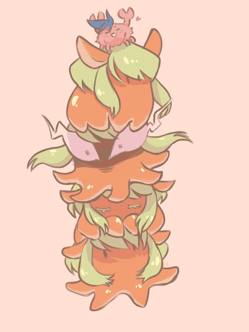

In love with @booodon octopus Lio. They are so cute and make me smile. A stack of flapjacks and a stack of flapjacks, for comparison. ❤️🐙🥞❤️


whats funny is hes always had the same horns heres a pic of him now for comparison. he was also the antagonist for the early concept of aperion which is even weirder now


After countless hours- minutes of searching. I finally found it. My profile picture on DeviantArt from the year 2016-Idfk.
I can now do a comparison.


@SephirothIsSexy yeah but in the grand scheme it's not a huge gap (I added Gladio on the right for reference) so the sword is still massive in comparison. Now in the second pic we have Zenos who is between 7'6-7'9 based on where these models line up (maybe I should give it to him)


Sketched out more members of the Mob Goblins! Added the little guy again for size comparison.


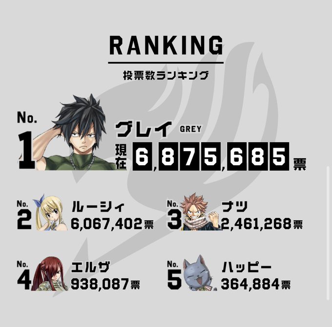
For comparison. We worked too hard to let this happen. KEEP TAPPING UNTIL 7/21/20! #gruvia


Genga to Final Comparison. I might upload this to LINE or Telegram.. Hm.
#rkgk


Quick art comparison. First pic is from september 2018, second is from today (july 2019, red lineart) . I tink I improved


@LacrimaArt Hello! I'm Sheby, and here is my comparison. The first one was made in december when I started drawing, and the second one is from a week ago. A lot has changed, specially since I don't have to draw with a mouse anymore. I will tag @choccorink because I like their art


TASM 2 poster comparison. The Russian poster is left while the international poster is right.


Had to draw my mans Vael again. It's been like 3 months since the last time and here's the side by side comparison.
#digitalpainting #digitalart #art #characterdesign #cartoon


like, i cant have a proper portfolio because everything i draw makes all my other art look old and ugly in comparison. i look at this stuff i did literally last week and it feels like it was drawn by a middle school version of me. it'd be like using crayon drawings as an example.


@Sharpecostumes I do 2D and 3D art. I try for a more painterly style in 2D but a more final fantasy-like style in 3D, if I had to give a point of comparison. Been drawing since I was a kid, 3D art for about 2 years now?

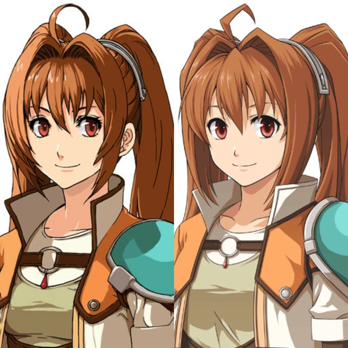
@asteRiesling @MrFry_ Yep! And also the use of shadows.
Here's a side-by-side comparison. EVO's colors are less saturated compared to Zero/Ao which I think makes the colors look really dead to me. Left one have heavier details in eyes and hair, colors have more saturation and looks lively 💕


As the first post on this dedicated art account, let's hit up those #OriginalContentArtist and #under1kgang tags. Hello friends, I am SESauvie, a NB hobby level artist who draws mostly OC's or those of my friends. Some fanart but it's very rare in comparison. <3


