font.のTwitterイラスト検索結果。 274 件中 8ページ目


I absolutely adore the fact that Nøkk's dialogue has a specific, gothic-like font.
I've been doing that in my loreposts as well, where mine is she never capitalizes letters due to the fact she prefers to speak softly


I found a funky font app for adobe and saw a comic font. So here's Ruby. #digitalart #photoshop


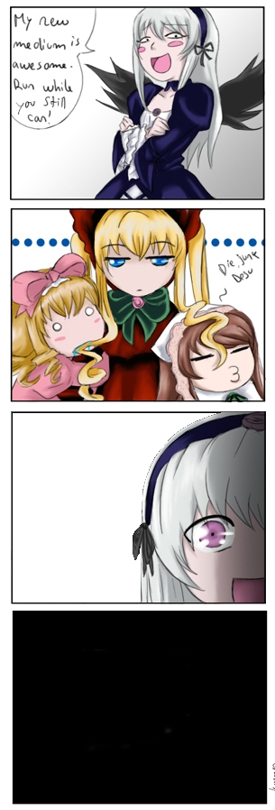
#RozenMaiden #水銀燈 #SUIGINTOU
#水銀燈のミーディアム_マスターがこいつだったら
#If_Suigitous_Medium_or_Master_is_this_Person
この画像と、画像ソフト、あとフォントのArial Blackがあれば、誰にでも作れます
Use this image, Graphic Soft, and Arial Black font.
You can do it!!


Every character in WarioWare Touched and Smooth Moves has their own logo, with their own, personal font.
Wario's font, for all his forms, is the old-school Wario font from his earliest outings.


Sin Eater vs Voidsent.. too lazy to redo the fancy font.


I George Lucas'd this drawing a little bit. There was a line i missed on Crash's arm i needed to remove. also i removed the ugly font.
#MarioKart #CrashTeamRacing #SonicTheHedgehog #CrashBandicootFanArt #SuperMario #DiddyKong #CrashBandicoot #SonicTeamRacing #FanArt


Don't cry Misaka 😢
I don't really like the font... I don't know maybe because the color or It's just the font...
#railgun #とある科学の超電磁砲T #MisakaMikoto #ACertainScientificRailgun #Wallpaper #Wallpapers


【お知らせ】
立ち絵の配布に伴い、イラスト利用ルールのニコニコ動画への投稿必須条件を緩和し事後報告を任意としました。
YouTubeのみで活動されている方やTwitterのみに気軽に短めの動画を上げたい方にも自由にお使いいただけます。
ttps://coefont.studio
#結月ゆかり #CoeFont #CoeFontSTUDIO


Proof of concept? I dunno.
I'll have to figure out what to do with the font. Do I want all caps? Serif or sans serif? Should it be at an angle?
Should the controller be moved to a different angle? I dunno! Design is hard!


Recently flooded with projects with tight deadlines that I forgot bout this one
Not the one I submitted but an overall improved version of Montana Stealth, especially the font.
Speaking of which, would anyone be interested if I put the font up for sale?
#shouldvewenttoworx


Sometimes @comicentral92 is busy so instead of bothering her, I just think, "What font would Katie choose?" and choose that font. Then @fertessa is happy that I actually used a good font instead of the trash fonts I usually use.
Fonts are hard sometimes.
https://t.co/Q1wz1Cxvcy


Mes dessins sont très différents de mes références parce que je suis une brèle en copie. J’avoue que j’ai une certaine admiration pour ceux qui font des fanarts quasi identiques à l’original, je me demande bien comment ils font.
La référence Le dessin

[huge WIP]
Found some Evangelion font.....gonna use the hell outta this for the title cards


@SuperRADLemon 12 pAgEs?! nO wOnDeR tHe vIdEO iS tErRiBlE! ALL BOW MAINS KNOW THAT BOW SCRIPT SHOULD BE AT LEAST 87 pages with size 3 font. I cant believe you made a slight understandable mIsTaKe!