DullのTwitterイラスト検索結果。 2,548 件中 72ページ目


#ArtsOfVibrancy I remember being told you must have very dull colors for the piece to look good, but I always loved the intensity some added vibrancy can give!


Looking back, I really am proud of how vividly my artwork evolved ;;
It used to be so dull and grey, so exhausted & devoid of hope...It surely is a transformation, and I'm so happy I get to share this journey with you folks ;_;) I couldn't have asked for a better crowd 💕


#ArtOfVibrancy 🎨🖌️
I Always think that my works are somewhat dull but a few of them are so colourful for my standard 😂🙈


Btw, ini pertama kali nyoba di pakein overlay. Aslinya dull banget kalo ga pake overlay...


// body horror //
Uhhh hi #ArtsOfVibrancy My stuff's either very vibrant or super dull with no in between but hey coin tosses are fun, right?


I tend to dull my bright colors just slightly but I still really love using vibrant palates. #ArtsOfVibrancy


Good Morning .
Starting a little later so not as many pictures today. I have a lot to get through though.
Cathy Horvath-Buchanan paintings are fabulously colourful and never dull. Needlepoint kits of her work are also available


👀
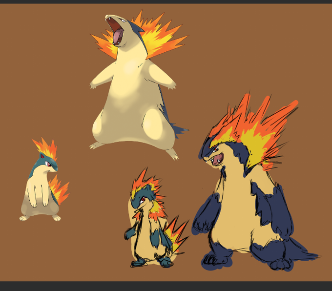
Typhlosion always felt very feral and I wanna emphasize on that a teensie bit more
and Quilava I always felt a bit unsure about
For me Gen 2 pokémon in general feel very... soft ? The colors always seem to appear a bit dull for the most part, a bit barebones if you will


"It's all dull and gray— this talent of mine is borrowed and unreal but someone's voice tells me not to give up because my life isn't over yet"
#prsk_FA

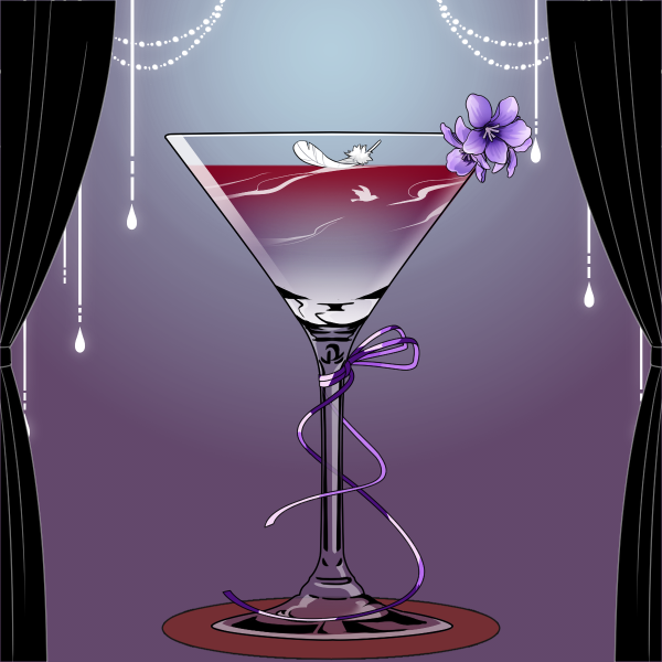
Sarnai's personal drink
Seems to be very dull and sour on the first look, but actually is very sweet on taste, you almost can't taste the alcohol.
https://t.co/ZPVzHlGk43 https://t.co/u85jHwI30T


The creation of their #WebTV motivated me so much.
Since then, I don't know how to manage my daily life because I'm illustrating all day… So THANK YOU @GraphiqueTV
Gonna sounds dull, but I'm grateful and appreciate what they did.
(Some of my newest #illustrations)


the first color test i realized was very dull and flat. it also didnt highlight the two characters enough, so i increased contrast and added more detailed shading to eda and laurent


spending hours trying to think of something, anything to draw and all i can see is a wall of dull static.
most days thinking just feels like a sisyphean task anymore.
i miss seeing all of those colourful characters and fantasy worlds. i miss younger me.


Experimenting- because when I feel stuck and dull, it usually means I need to spend a few weeks making ugly, unsharable experiments- but I come out refreshed and usually a better artist.


I started Mando Monday early, so here we have my first Post-Imperial armor as seen in #TheMandalorian! They thematically have dull colors, and I think it looks great!
Thanks to @Bionisguy for the color suggestion!
#StarWars #myartwork #artistsontwitter #Mandalorian #digitalart


Small personal sketch of one of my characters. Might turn it into a dull artwork at some point


Side by side. I wanted a vest that was a bit easier to understand and tbh? An outfit that was overall something that'd add a bit of a femininity to him. I wanted to up the saturation on his hair as well to make it a lil' less dull and made his hair overall thicker.


(duplicating the layer of this drawing will make it more saturated colors--- and not dull as my usual coloring....)