comparison.のTwitterイラスト検索結果。 2,018 件中 72ページ目


When I was researching the height of the characters for no specific reason and it made me want to make this comparison. Why? Well, bizarrely some have already confused Nemari with Caulifla.
It is strange that few draw Caulifla at the right height given its physical proportions.

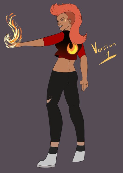
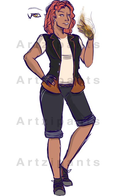
Need some help with this one. Redesigning an old my character of mine, Fotia, and want to know which colors you like better? She's a cousin of Artistica, so she is there as a comparison.

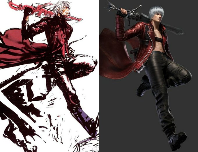
DMC1 concept art & Pinnacle of Combat art comparison.
Nice! 😁❤
(although I must say that the DMC1 art does a better job at showing Dante's personality)
#DevilMayCry #DMC #Dante

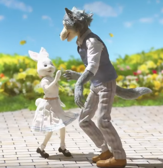
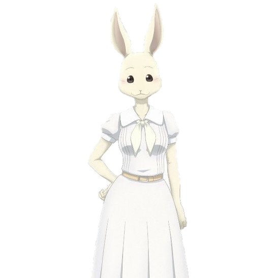
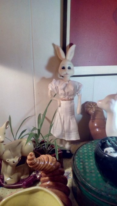

Okay, mad respect to the original poker of Haru, because she's SO good, and mine pales in comparison. But she's done!

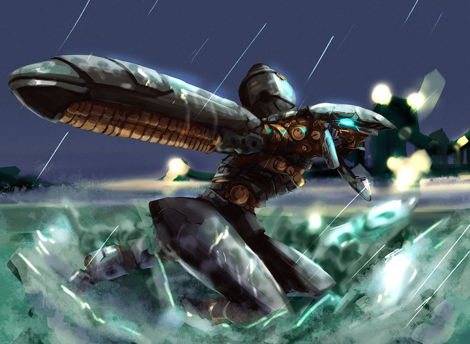

Rework of RAY for Patreon! Old version shown for comparison. Patreons get access to fullsize image as well as psd file! #konami #metalgearsolid
https://t.co/MLXAeYrnl8


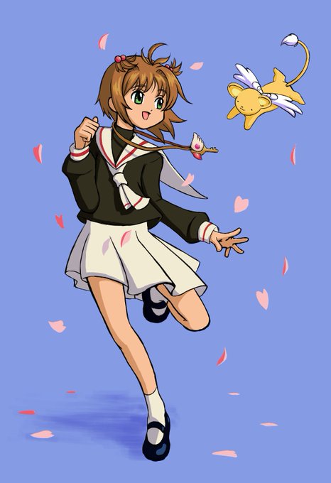


I revamped and renamed my old Wei-affiliated DWOC, who is now identified as Liao Tian~ :3c I've included the old design as a comparison. uwu She too is still being developed so I don't have anything to share yet other than she'll be paired with Xun You!


Aside from some minor alterations to the posing, this is the same image, mirrored from the original.
Another example, also sadly missing from her FA:
(Original) https://t.co/gPHrEQsvzs
And of course I've included a comparison. I believe this to be a more recent piece, so ......


Finished this card redraw for Satan! I couldn't find the template so I hope you guys don't mind a side by side comparison.
#redrawobeymechallenge #obeyme #obeymejp #obeymesatan #obeymefanart


I wanted to do some pixel art(?) to show more detail of the characters in my First RPGmaker Game Ever(TM), with their initial sprites for comparison. They're a bit derivative but I still had some fun with it.


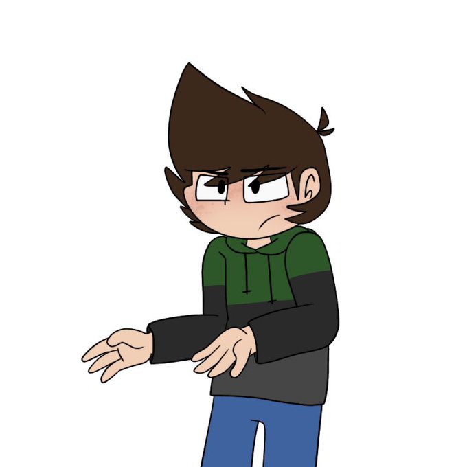


The four horsemen of the apocalypse- I drew in my friend’s styles and I’m realy proud of how the drawings came out! First style is mine for comparison. Second one is @\Triple_JPG, third is @\jasterh21’s and fourth is @\claykid12345’s. Please go check all of their art out! 💞


Bayou was first created in 2011. She's an artic wolf/tiger hybrid and yes I know she looks like a peppermint candy cane. I got it so often xD.
And now sokee, the spotted hyena bby who's a total grouch. Also this doubles as a then and now art comparison. 2011- 2020


Comparison.
1st is January 2020 after months of drawing every day.
2nd is June 2020 after 3 months of not drawing


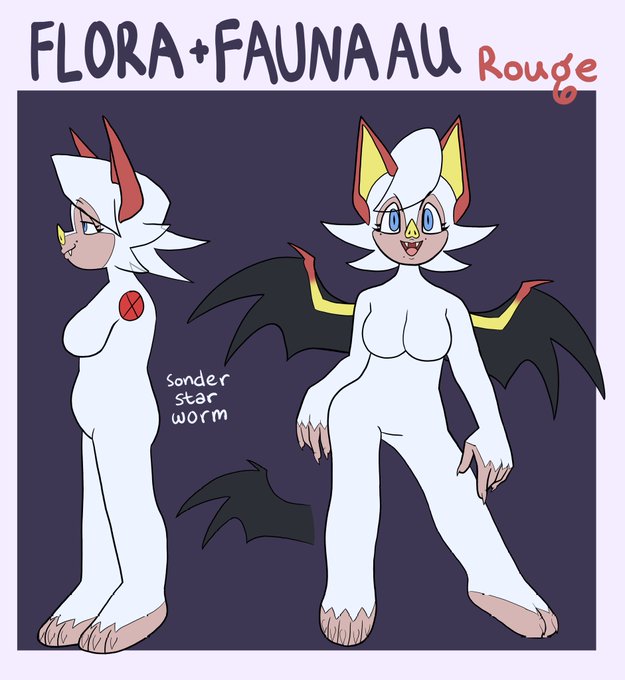

Rouge design for my Sonic AU + my old, old AU Rouge from last year (the meme reference dates it big time) for comparison. I'd say my design skills (and anatomy lowkey) improved dramatically. #SonicTheHedgehog


Obligatory beach episode if I ever get a show 😃👍
Atlas has never been to a beach so they went to show him the ways of summer fun. I used the thor and ironman parent comparison. It was too good to pass up 😂
.
.
.
.
#drawing #digitalart #slaytheprincess #summer