saturationのTwitterイラスト検索結果。 72ページ目


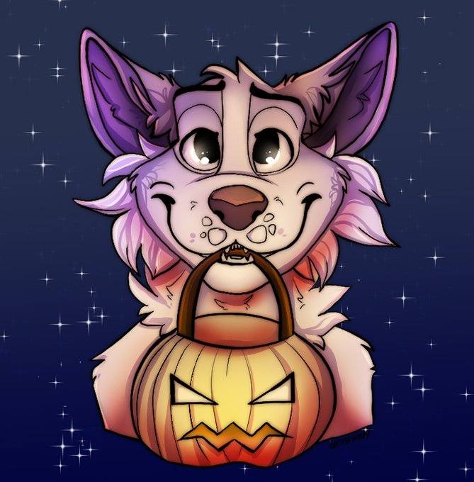
Change shading to suit your character by pressing CTRL+U in Photoshop, or bringing up Hue/Saturation (also in CSP!)
+ optional colour layer for that extra glow up!


someone who's good at color theory help me out: i always just plop in whatever colors look good for each thing but the results are often really muddy looking. i think variations in the saturation is one issue? i guess i just dont know how to make a cohesive palette

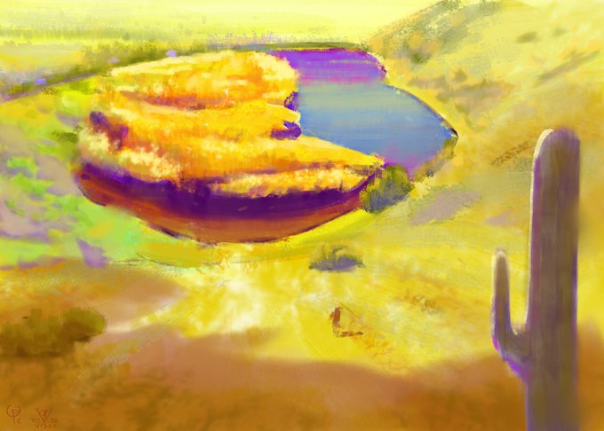
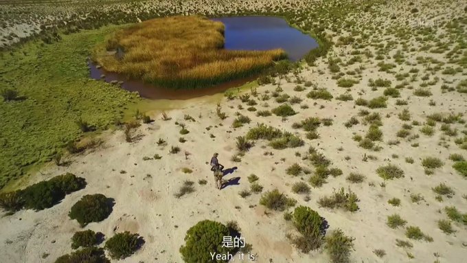
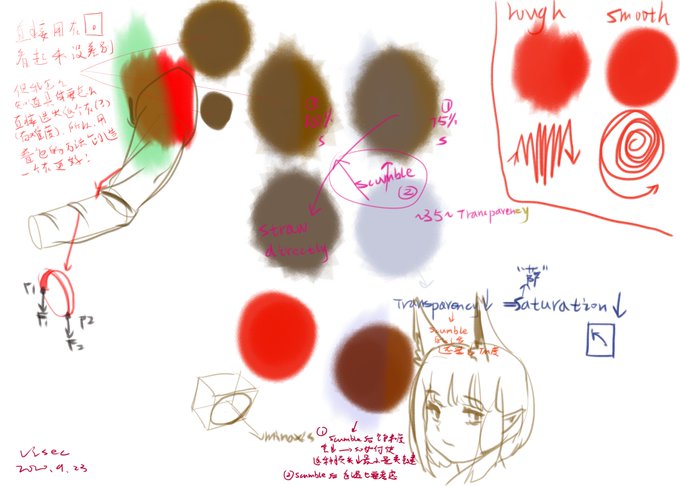


Have a toxic boi!
(Hoping the export doesn’t fuck up the saturation this time lol)
#Procreate5X #pokemon #PokemonSwordShield #toxtricity


I've found that, in order to keep the integrity of the base flat color, using a saturation layer like color dodge with dark tones works well. It's subtle, but the skin stays warm and realistic here.


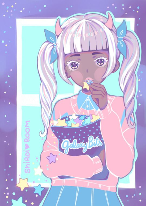
@PlumDelta @pastelperyton *sigh*
im showing a closer representation that all colors are lightened.
and hues and saturation also sometimes shift depending.
here is an example from some artists who are not me.


My goodness the saturation is INSANE on my other monitor.
Thoughts?
Left or Right?


Trying to experimenting with low-saturation color. Original Art in FFXIV-esque universe 🌸
Axl Rosenkrants (left) - Me
Abel Canopus (right) @AHikarinyo
#drawing #digitalart #AnimeArt #illustration #kanadekana #semirealism #talesofsnakeandbird


@Maxx_Chee
wanted to see Vin with his saturation turned right up so I decided to go with #gore and ended on this.
With his normal colours for comparison.
MY EYES BURN!


y'all I'm so mad 😭 I drew a really good looking Yoshi in CSP and they did me dirty and killed my saturation AAAAAAA

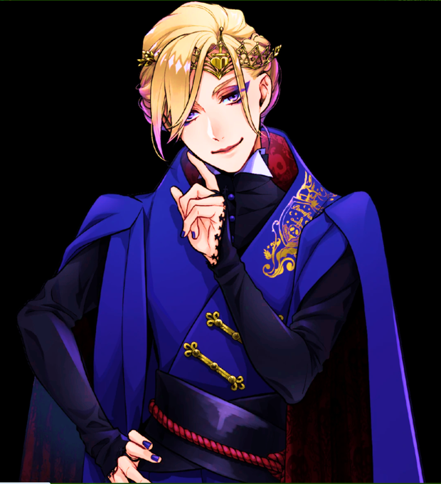
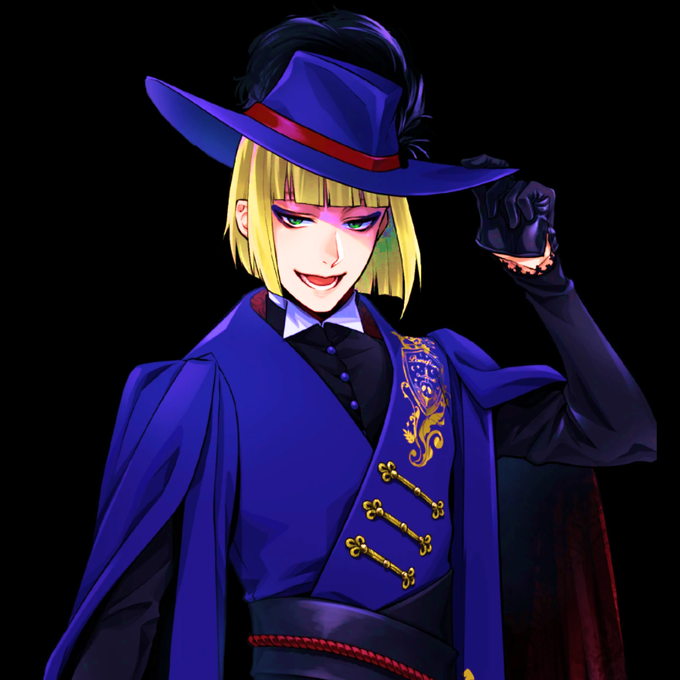


so I wanted to play with my shading layer today. Bunny has a nice, unnatural skin tone so I could play with the all around saturation of the colors just a bit, kinda looks like pop art in a way #oc #monstergirl #experiment #art #digitalart #color #baseball


Tutorial!
1. Line art
2. Base color
3. Base colors
4. Add a “multiply” layer and use a gray pink color
5. Add shadows
6. Color line art (alpha lock the line art layer)
7. Add highlights ✨
8. Play with filters (sharpen or noise or Gaussian blur or increased saturation)
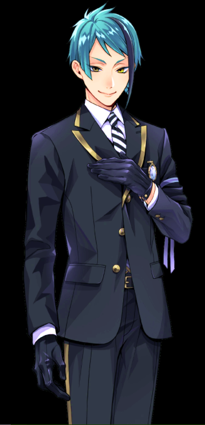


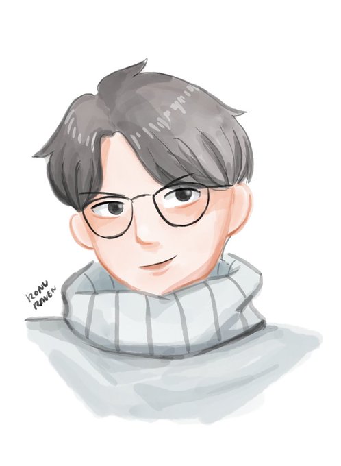
aku bawa gambarnya ke photoshop buat di-retouch (level, saturation, color balance) dan kutambah noise biar ada texture nya aja wkwk
u can see the differences, yg di-retouch warnanya lebih pink


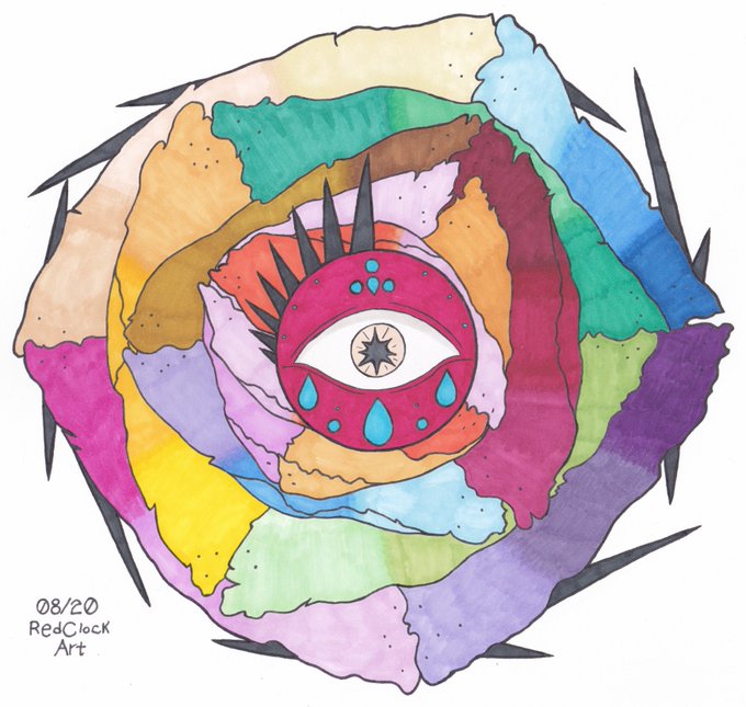
► Floral Sight
Practicing with #ParKoo alcohol markers — first piece on ~30gsm copy paper, second piece on 199gsm cardstock. I mostly used a single coat of color outside of blending to test saturation.
(08/20.)
#redclockart #traditionalart #originalart #coloredart


@sapphicnarwhal @catrxsdelle Sorry, I used a season 4 screen cap for colour picking and my usual lower of saturation. I’m guessing the screen cap I used was a bad one. Will make sure in the future all screen caps show darker skin. Was not my intent and I apologise.