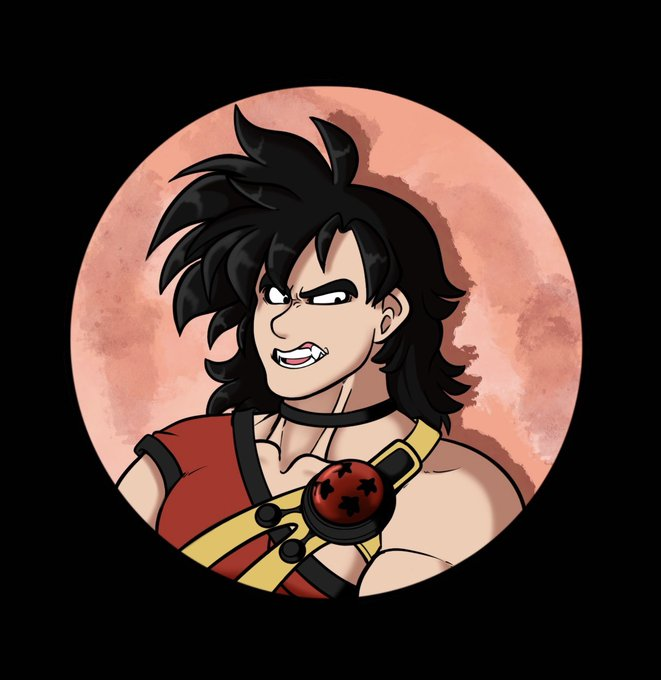
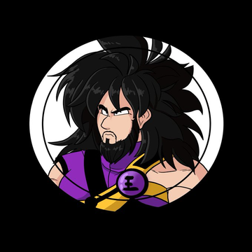
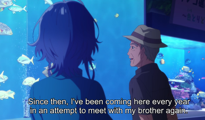
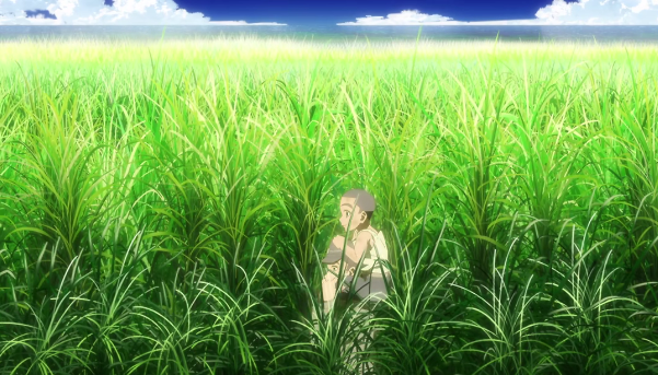
visuallyのTwitterイラスト検索結果。 3,310 件中 72ページ目


I need some help! What’s more visually appealing, horns or no horns?
#Vtuber #ENVtubers


After buying Granblue 3~ days ago and beating the main campaign, I gotta say the game's pretty alright.
I think it's my favorite ArcSys UE4 game visually. It has my favorite stages out of their 3 UE4 games, and it probably has my favorite iteration of their shader.


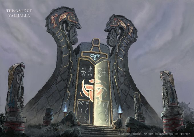
This is a term 2 assignment called the "Boss Gate." A fun exercise which requires students to visually connect the boss design to the architecture styling of the gate.


tw // blood // glitch
"I'm alive, I'm revived, I survived, you surprised?
Gonna cry about it? You should see the other guy"
bro I ran to draw this, what an AMAZING mv both visually and auditorily
#REVIVEDredraw #wilbursootfanart #dsmpfanart


Art directors are not visually illiterate! They are sophisticated designers and artists. But, you have to create a clear *visual gesture* of both concept and form, but in miniature. For instance, never use placeholder type or figures. /4


Garden of Life
I felt like playing with lines again, and I remember looking at the line-art and asking myself wether i’ll ever be able to color this piece properly. Luckily, everything turned out fine and i’ve made one of my most visually engaging pieces yet.
Enjoy the details!


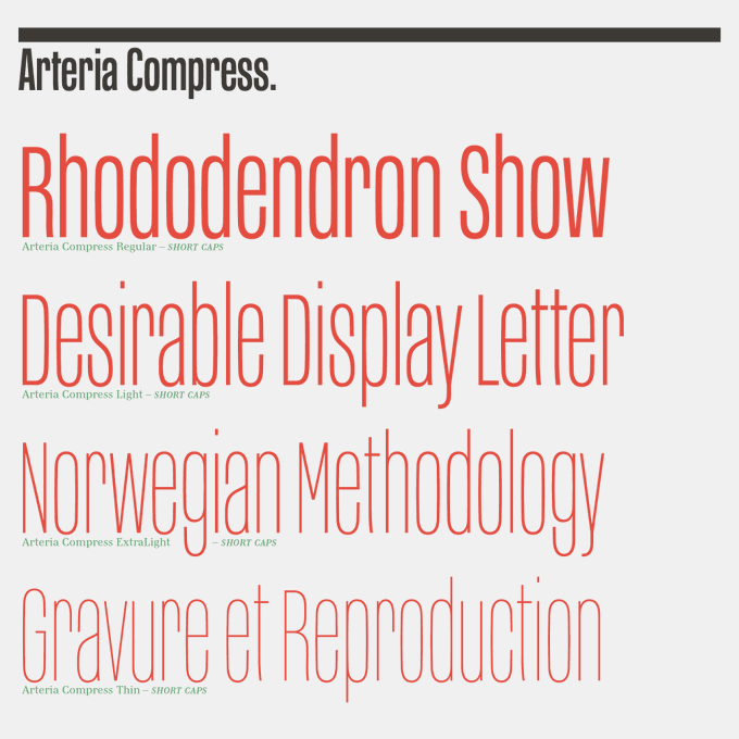
The whole weights of Arteria set in capitals is already good. But using short capitals with lowercases is even better and visually more fun. https://t.co/gmZieplR87
➽ Arteria Pro, 259 glyphs: from € 55
➽ Free Try-out version available


@DailyPuzzleGame "Rinka" from "Rinka and the Fairy Gems"
it may be a bit rough visually for some, personally I love the art. but in general the game is a fun if a bit anxiety inducing due to the format.


The images are so detailed that they bring the anime medium to a new height and show an astounding mastery of it. At very least, the movie is a jaw dropping technical achievement. Wille's assault on NERV is possibly the most visually arresting sequence ever achieved in anime.


//Look how this man's grown...
Kass captured his growth so well, visually!


Today's illustrator is Emily Brooks 🦖
Emily says, "I work mainly in gouache and pencil, with some digital techniques thrown in for good measure. Favouring dynamic compositions and bold colour choices, I aim to communicate warmth and humour in a visually playful approach."


the artstyle development between season 1 and season 2 is amazing, it gets very visually pleasing with more defined character designs!


HOLY SHIT I FOUND TWO VISUALLY SIMILAR ART FROM MY ART PAGE AND I'D SAY IM SO PROUD OF MY IMPROVEMENT


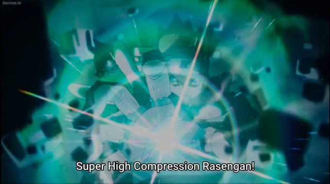

I'd argue this is still one of the best looking rasengans in the series aesthetically and visually #boruto


@ruins_of 19th like. Perhaps it is time to get to N/A. So, I show the 2nd drawing a lot as my "first concept art of N/A", but im actually lying and the 1st image is the actual first concept art of N/A. Guess it wasn't as visually striking. But the "stand-on-one-hand" thing was there!


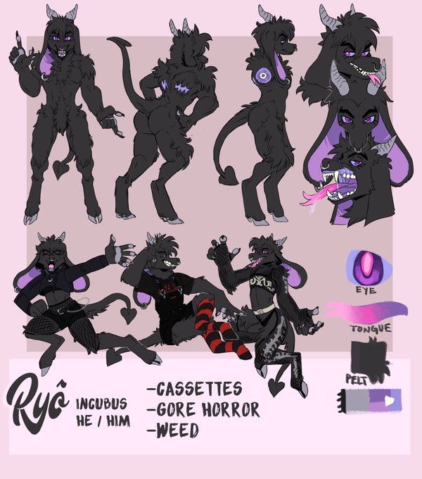
Fursona appreciation post ♡
Ryô is a Incubus Imp, he’s a really neat shapeshifter demon that can change overall height, appearance, and size.
He’s visually a hybrid of my favorite animal aspects and colors too! I love him to death U^ェ^U♡ https://t.co/CyDQ829Tmf


It’s the way Marvel visually Queer Codes Steve and I’m just supposed to pretend like I don’t see it?🙃 #CaptainAmerica #WhatIf #WhatIfMarvel #JCLEYENDECKER

