CONTRASTのTwitterイラスト検索結果。 10,536 件中 73ページ目


an earlier attempt at Gorou from my previous post. I detested how it turned out! 🙂 thank god for contrast adjustment #gorou #genshinimpact #inktober #mixedmedia


The darling in William-Adolphe Bouguereau's "La Perle" has a confident yet relaxed look to her, shapely nude body fair as alabaster contrasted wonderfully by her long raven-black mane, the sensual spray of the water completing a great beach girl vibe.


Oh it's #PortfolioDay ? (*¯︶¯*)
I like to draw soft edgy stuff, lots of contrasting things, dark/sparkley, blurry/crisp, bright/spooky. I also make cool clothing designs ! ! °˖✧◝(⁰▿⁰)◜✧˖°
🦐merch: https://t.co/iQNTxbTtZ3
🦀commissions: https://t.co/N8HbdodCIf


@AzurLane_EN Really love this outfit for Ayanami; nothing too fancy, looks practical, but still pretty damn cute.
Love the contrast of her calm expression and intense kick it nails her personality well; usually calm and collected but a demon in battle.
And once again, hooray for Aya Tummy!


Hello! I'm Hele, an artist based on Spain. I love to draw girls with contrast between colors, shadows and lights. I try to create interesting compositions and make people who see my drawings happy. I hope you like what I do 💖
#PortfolioDay


#invertober2022
Day 11
Common Buckeye Butterfly (Junonia Coenia)
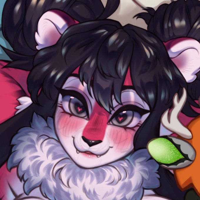
This came out cuter and fluffier than i expected. Although I like the contrast of the pinks and the browns on this one so i kept it that way.
#insects #bugs #butterfly


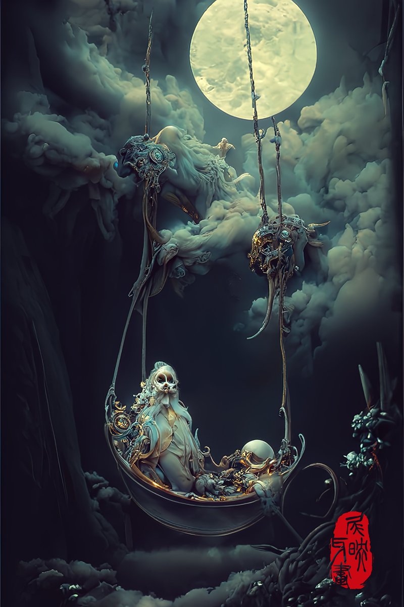
The Retirement of Hell Lords Swing
This is the last piece of this series, I try to find balance and unity in the horror of the dead and the innocence and joy of life, and present it through contrast.
#midjourney init,
#discodiffusion rendering
#characterdesign #ConceptDesign


If you remove "Van Gogh" from "oil-on-canvas painting, 1889, post-impressionist, 90x70, Museum of Modern Art:1 starry night:0.5" ... compare and contrast


In The Glass.
How to enhance the contrast like a cut glass? 💎 https://t.co/D3oVurBbyU
itg-221011022501
#processing #creativecoding #OpenSource


@yianniseinstein @BrindusaB1 @dianadep1 @edjlazar @1Atsuhimerose2 @angelicadisogno @marmelyr @neblaruz @ampomata @Spiros209 @peac4love @djolavarrieta @maluisa_3 @scastaldi9 @artmajcar @cristob45 @LunaLeso @CristianeGLima @kamabi @albertopetro2 @alleosa @bgv_online @ritamay1 @DavLucia @ceconomou56 @Rebeka80721106 @famartinez2001 @karmendida @JohnLee90252472 @mariatontini1 @AlessandraCicc6 @paoloigna1 @AnnaCountessK Giovanni Bellini
Contrasto tra Pigrizia e Perseveranza
(1490)
Gallerie dell’Accademia
Venezia


@itslightomg I think the contrast of how much rage Liam was feeling with the fact that Airy is just so, calm about this, was one of the reasons that made Liam just so much more ANGRY. He couldn't understand how Airy could be calm after all of this, he couldn't understand AIRY. +


add {high contrast}
remove {large breasts}
make it more comics look like
#NovelAIDiffusion


【VOCALOID4】The vocal synth of the hour is Masaoka Azuki.
Azuki is a cheerful girl who tends to act first and think later, in contrast to her best friend Kobayashi Matcha.
Originally released for VOCALOID2, her voicebank wasn’t public until her V4 release.


@ttunaartt The contrast in care... what's the point in saying you're gonna "appeal to players worldwide" if you actually arent


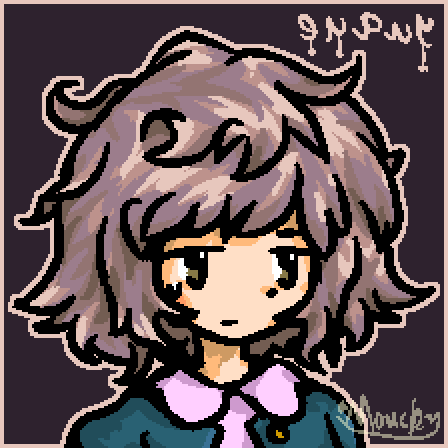
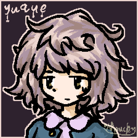
Reposting cause I’ve improved a few things (mainly the hands and the contrast)


For the spooky season! Here is a art piece by dying dreamer on WA, featuring their character; rat!
I love contrast of the background and the character! I also love the little spooky ghosts behind him as well as the candle and pumpkin 💕
– 👹👾
#cat #warriorcats #art


