ContrastのTwitterイラスト検索結果。 10,558 件中 74ページ目


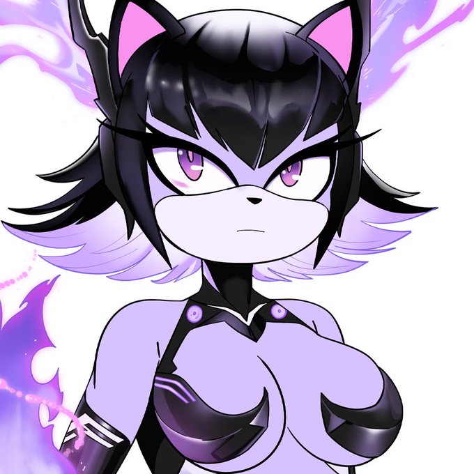
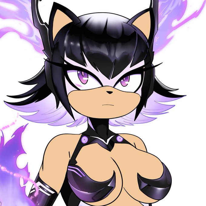
Reposting cause I’ve improved a few things (mainly the hands and the contrast)


For the spooky season! Here is a art piece by dying dreamer on WA, featuring their character; rat!
I love contrast of the background and the character! I also love the little spooky ghosts behind him as well as the candle and pumpkin 💕
– 👹👾
#cat #warriorcats #art


Day 8 of Shutober is Wilted! #YaminoArt
I want to try some monochromatic piece (with one contrast item) but I’m still learning about values 🙇🏻


Earth lines is inspired by ploughed fields but when I'm working on the foreground area, it becomes more about colour and texture interactions and abstract mark-making. The trees give focus, contrast and a sense of scale. Print sold out but cards available https://t.co/FDtE8nWKZr


Welcome to criticizing my own art.
2019-2022
My skills were extremely limited by 2019, this was literally the best I could do. But i like the creature vibes it gives bc of that.
2022 remake has a better notion of composition and contrast.
Much prettier but where's creature?


かっこいいハマくんズ
ひとつにまとめてみたらこんなかんじ。
秋ですね🎨
@hama_okamoto
#ハマオカモト #OKAMOTOS
#adam_beautifulcontrast
#adametrope #アダムエロペ
#イラスト https://t.co/KESMaoQvar


lore time before slepp
Atropos through the years
Her construct form needs a redesign! But as you can see she hasn't changed too much! Her very warm hair color is a complete contrast to her construct armor form. Although she can't hide her glowing eyes now can she?
⚠️OLD ART


“What characterises the hysterical position is a question which he addresses with all his being – how can one be either male or female? The hysteric’s 'either/or' contrasts with the obsessional’s response 'neither/nor'; neither male nor female."
Jacques Lacan, Seminar III

I dunno. Purple goes with it but the tan gives a nice contrast.
Based on Lola (Luminous Avenger) and Phantom (Artery Gear)


Here is the third and final version of Chi-Ji for Hearthstone Mercenaries. This one was a tough one to nail down. A lot of contrasting values and high levels of saturation to balance out.


@ViiMorteArt thank you for the thread!!✨
I'm Laz, I play with colors, contrast, abstractions. more likely to choose warm palette. lately learning to have more 'effective' and stylish lineart and better anatomy.
i made JRPG game (#Anuchard) with similar color tone!


Finally, I do the same process to create more elements from the player layer and the foreground layer, now I make them darker to make them contrast with the background and the player layer.


#Genshintober day 5: #Jean
I’ve started using a hella contrasted dumpling for eye highlights and it’s working wonders!
#genshin


@Cyberlord1109 I always called them "Soft Hulks" theyre strong and brutal, but are deceptively shaped somewhat like a friend. contrast to "Brute Hulks", such as the namesake of the Incredible hulk or Douglas Bullet from One Piece. The pokemon Bewear is another example of a Soft Hulk.


Inktober Day 5: Flame
trying to practice with contrasts and character design
#art #digitalart #inktober2022 #Inktober #artist


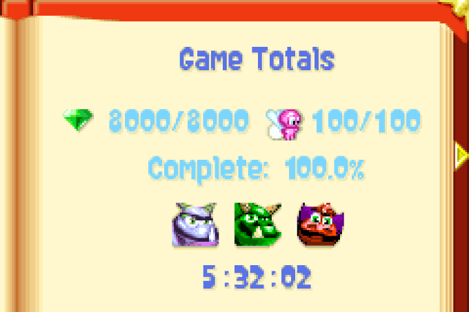
57) Spyro 2: Season of Flame (GBA, 2002).
Just take something that works just fine, add some small improvements (like a better contrast of ground/water/elevated platforms), get rid of the annoying Speedway levels and you have a great sequel.

