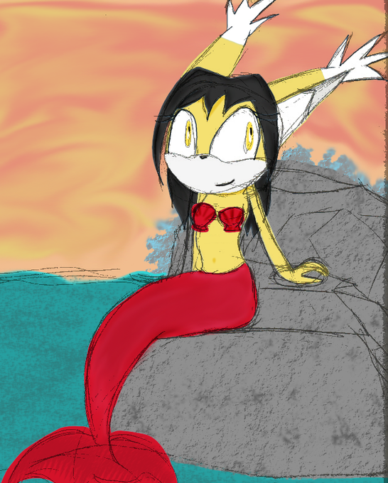
comparison.のTwitterイラスト検索結果。 74ページ目


I fucked it up and missed the watercolour layer off, which was the entire point of this exercise. So here's a side by side comparison.


If you aren't familiar with the SRB2 artstyle, here's Sonic's art for comparison.


I did a "Draw this again" meme. I tried to redraw something I drew back in 2018. Here's the comparison.


How to do character development and redemption vs. How NOT to do character development and redemption!
I know, I shouldn't put these two in the same tweet because there's no comparison.


So many people liked the preview that I felt kind of awkward posting the finished piece, I dunno my brain man XD ANYWAY here it is anyway + because people kept commenting, the famous line (!) and ofc the sketch for comparison. #SonicTheHedgehog #sonicx #SonicMovie


I drew Emma Frost once a long time ago so I wanted to do a progress comparison. Left is 2014, and right is 2020. I also took about 2.5 years off in between where I didn't do any art so it isn't a full 6 years of progress. More improvement to come!
#marvelcomics #artprogress


Vatista and Bronya comparison.
Similarity:
Both top tier in the current meta due to damage and other stuff.
Differences:
Vatista is execution heavy in combos and Bronya is a easy whale Valkyrie to get through gacha (RIP Wallet).
This the current timeline we’re living now.


presh and i are taking turns giving each other pokemon to draw from memory and i just did pansear and after the comparison. let me tell you. i am sobbing


The last one, for comparison. In retrospect, I prefer it, but I might as well stick with my mistakes.

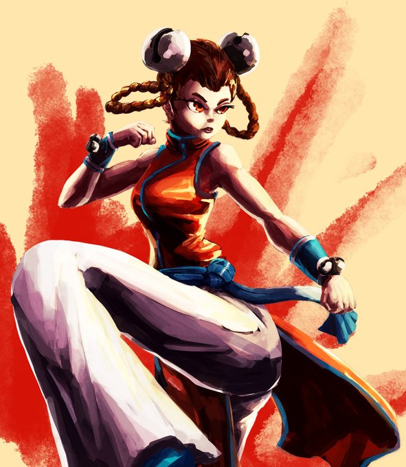


Rework of Li Xiangfei for Patreon! Old version show for comparison. Fullsize version available to patreons!
#snk #fatalfury


@VincentRodenya Aight!
Here's a comparison.
First image is with pure black, uncolored lineart >
Second image is with colored lineart! >
Imo it makes it look much nicer and cl e an

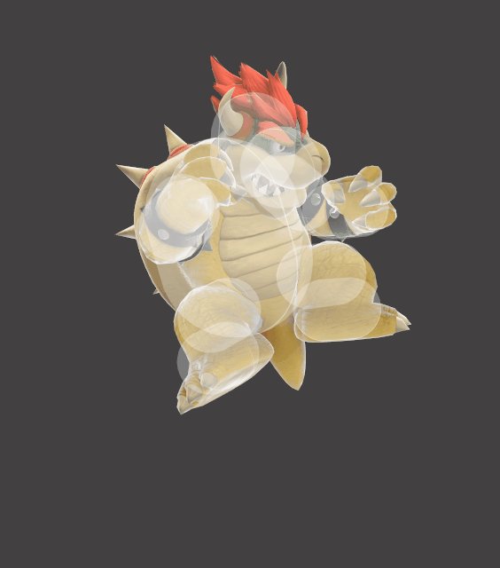
Here's DAir for comparison.
That's how, we guess, it's supposed to be on the other moves. Blue means you can't hit it.


i tried to redesign rouge from that sonic heroes mcdonalds commercial to look more like a sonic character.
i made her a rat since thats what she looked like in the commercial, ill probably call her Rona the Rat.
ill also add the original design as a comparison.
#SonicTheHedgehog

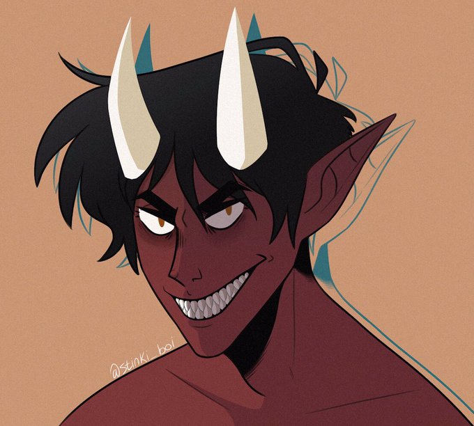
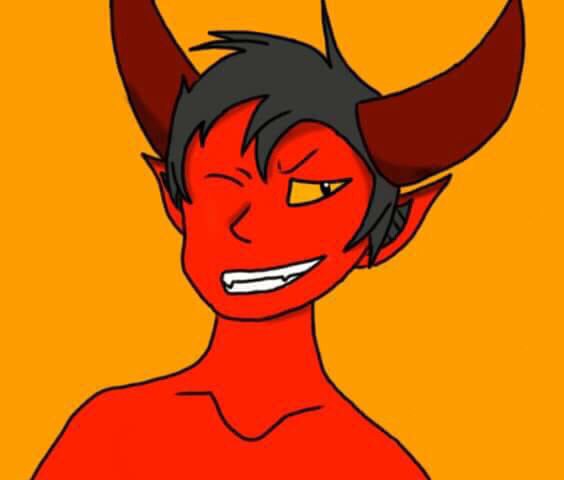
2020 and 2014 Dianite fanart comparison. I thought it’d be fun to relive my childhood and do a redraw of my mans 😔✌️#mianitefa @mianite @ProSyndicate

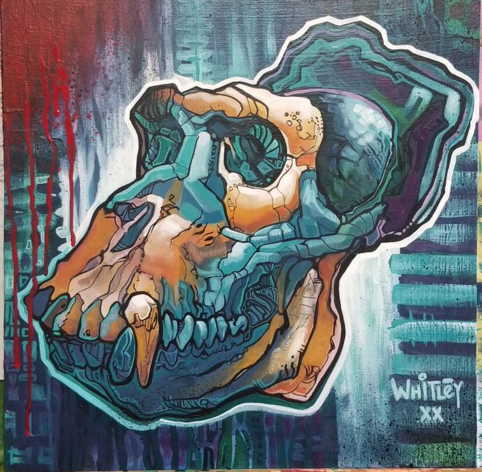
@jez_tuya I really love your illustration style. I'm a fan of Disney's Mary Blair's work. So fun and colourful and whimsical. Tge paintings I'm working on today are quite dark in comparison.

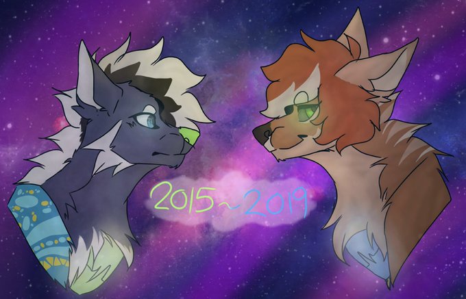
I remember when I posted on Tumblr my official goodbye to one of my oldest ocs, Nillie. His story grew so much and I found his old refrence sheet. So I felt like I had to draw the comparison. I love you so much you fluffy stardust mutt. They were a great 4 years.

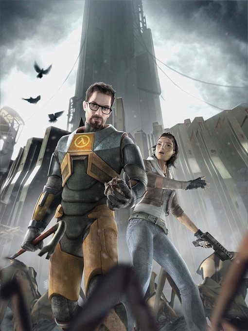


@MoriartySchemes (He looks positively enamoured at the white outfit, his own cream and gold embroidered suit paling in comparison.
He extends a hand toward him, smiling warmly.)
Oh you scoundrel!
...I must say white suits you, you know.
You should wear it more.