lightlのTwitterイラスト検索結果。 30,838 件中 74ページ目


Here's an advertisement we did for @Jmarcosart for his animated show Low Tier! You'll be able to find this somewhere in the OVA though it might be slightly different to fit. Thanks much for your support Marco! We're offering ads in the OVA at 50$ for small and 100$ for large


me omw to become slightly obsessed with drawing these little ghosties
#Doodles


With "nothing bad happened ever" in this AU, Lionheart is slightly less pathetic, so his cowardly lion basis manifests more in age-related seclusion.
He also has a semblance that explains why no one used their abilities in volume 5 lol


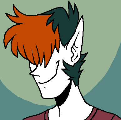
for almost 10 years i had this guy and the only thing ive changed about his design are the colors slightly


Absolutely unreal lockscreen art by @SkiaSkai! Thank you so much!
(Cropped slightly by me to defeat the Twitter crop)


@soggytommy But it’s so good even if I’m slightly allergic to pineapple it still slaps


🍆Different Strokes 😈 Different Folks
The new chapter of Darkland on #webtoons is getting even DARKER. But you know, it's not called Lightland, ya know.
https://t.co/HA9iDgP7es
@eshap @darkland_comic @frank_calico


Chapter 3, Page 19 of Walk With Me is now available on my Patreon and Subscribestar. Become a supporter and see it a month early. Links available on my website. https://t.co/6ByJ1BwBrx #WalkWithMe #WWM #comic #webcomic #cartoon #lightluxcollie #sabercolliestudios


-primarily blue
-has a super form with yellow energy
-speed is the main combat trait
-slightly cocky
-is all about being cool
-has a counterpart with a black white and red colour scheme
-has fans argue which version of him looks better down to the tiniest details


4. Amanda's shirt used to cover her butt, but as timed passed I made it shorter and slightly more form fitting.

2. When I first made her, her outfit was basically based of Hatsune Miku & Akita Neru's outfits. She had Miku's shirt w/o sleeves, Neru's shorts w/o the skirt, and her hair was slightly longer than it is now.
Also Amanda's tie was shorter than Miku's but longer than Neru's


@homuralillies OMG THX i hate drawing blood if its not traditional art or digital painting so im glad it looks good lol
1. make a shape with bright red & shade it
2. make a rlly dark red that looks more like black/brown & add to darker areas
3. slightly smudge parts then add white highlights


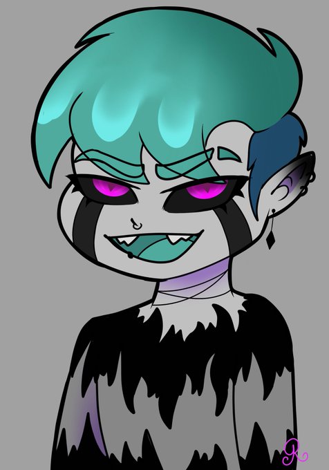


Decided to make myself- though slightly inaccurate lol. I have Microtia so my right ear is actually a deformed little nub hahaha https://t.co/tHhpXhiEQA