appealingのTwitterイラスト検索結果。 2,733 件中 76ページ目

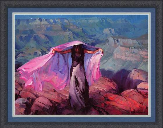
Fitting in to the crowd isn't so appealing when you consider all you have to give up -- namely, your personality -- to do so. For her, it wasn't worth it. She Danced by the Light of the Moon, framed art -- https://t.co/ReQHZagWgz
#beyourself #freedom #southwestart


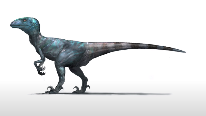
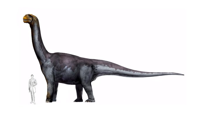
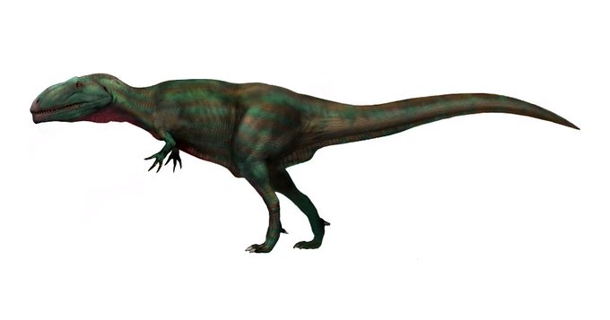
Well, this explains everything. Turns out the visually appealing designs/color schemes for Jurassic Fight Club were created by none other than Carlos Huante.
And we almost had a JFC Giganotosaurus, but I guess they wanted to keep the T. rex as the poster boy. https://t.co/uGHYIKuvXQ


@angie_gallery @potatodrawzz A method that is visually much more appealing is by extending the canvas and adding something that contrasts/has visual weigth, which is what I did in my latest post: https://t.co/Rt8cmYny1x
Or alternatively posting the same image twice unaltered or e.g. color & b/w.

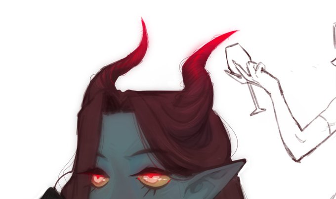

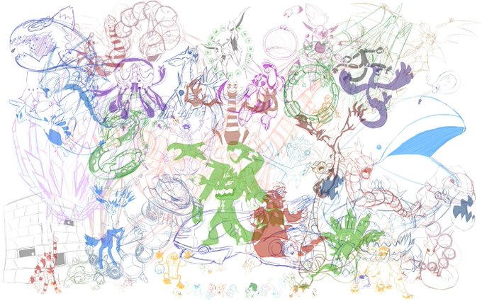
you guys can get a small WIP, but only a crummy low quality version from a screencap.
And yes I am planning to widen the canvas again and making it more banner-like. Helps with room and makes it more appealing.


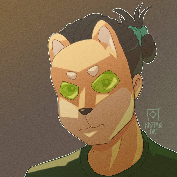
Which one is more appealing? The flat or idk whatever the other one is?


Yeah nah that's gonna be it for this one. I can't figure out how to make it look appealing and everything I try just makes it look worse. (It's also just taking up time I could be using for better drawings). At least it was a learning experience..?


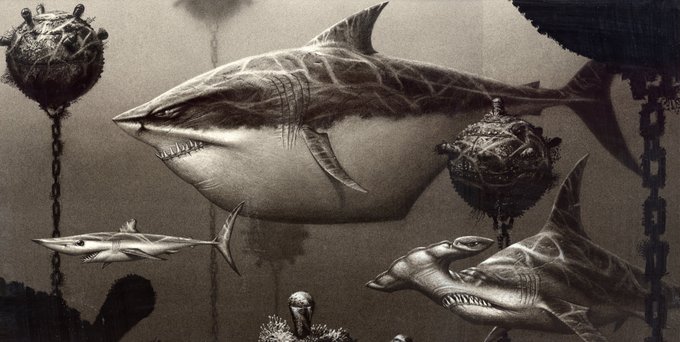
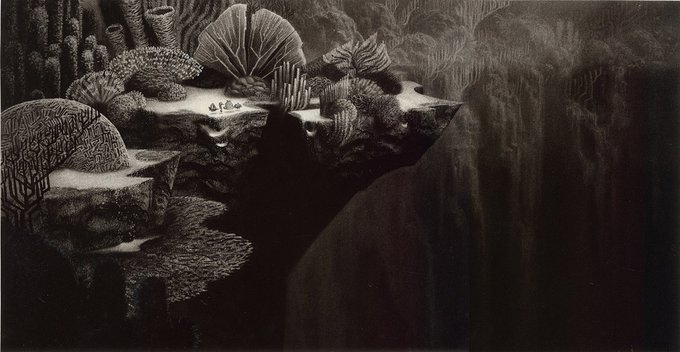
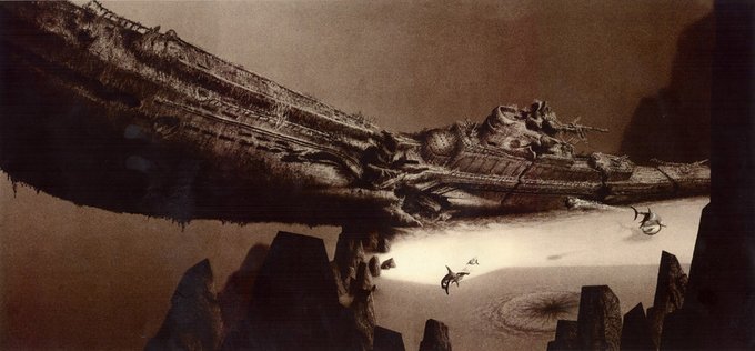
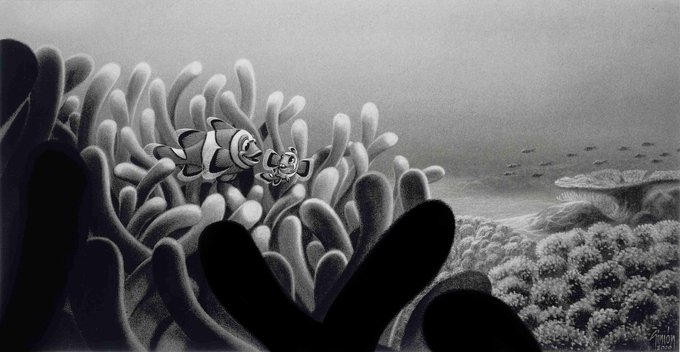
Some inspiration for your Friday...a small collection of some absolutely AWESOME Finding Nemo concepts by Simon Varela! The style and shape design is ridiculously appealing and atmospheric.
#animation #findingnemo #conceptart #pixar #characterdesign


went over the 2nd banjo sketch to practice lineart and see if i could make something look appealing without using shading as a crutch (as much) https://t.co/BlZ702RLeX


Felt like drawing some fanart for @CinnamonServal !! I love his art and his fursona is so unique and visually appealing ^__^
#furry #furries #furryart #furryartist #linelessart #digitalart #artistsontwitter #furryfandom


Most inactive artist coming back to request opinions and thoughts- There is a poll attached if you're interested!
Which is more appealing: the silver or the gold?
*Apologies if you're getting sick of seeing the her, I'm really trying to make the design work and not seem messy*


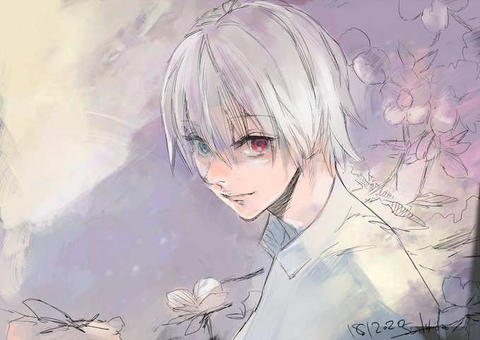
These will always be my fav official art of kaneki. the thin lineart and the sense of vibrant color palette, gives off a very soft yet appealing look and it’s just really pretty

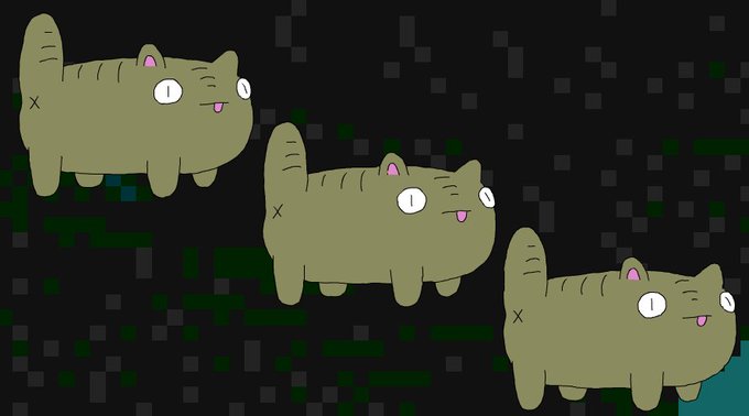
😱🙀🤯 A simple javascript file that makes your website appealing to stray internet cats... 😽
live demo: https://t.co/E1grwzKXNz
github download: https://t.co/D7pumyhXrI
Personality features include:
* Cuddly
* Likes being held
* Dead eyed stare
* Best on desktop, OK on mobile


Show me your fighting game mains, here are mine
I’m the type of dude to main characters I find appealing over how they play https://t.co/ImC4O94Jvm


@pennilessshark2 LOOK AT THE PLATE ON THE REACH HOG IT'S SO MUCH MORE APPEALING


the actual doodle i was doodling before i got distracted by tomoshika
just trying to remember how to draw appealing faces, think i still need to tweak how i do eyes