CONTRASTのTwitterイラスト検索結果。 10,536 件中 78ページ目


@GabeJamesGames Hello!
I'm adding specific (and some old-er!) styles and contrasts that fit those themes, but my Artstation has recent examples of my range — https://t.co/ImynPvDZAE
My rates start at $80! https://t.co/Sj10YcGfc3 Thank you for opening this space for us to post! ♥


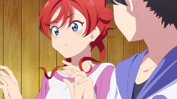
She looks so happy, her approach towards magic has changed and it shows her development! Such a contrast from the last volume featuring agott


son Érebo y Nix (Tinieblas y Noche), y su nombre en clave, Deimos, es el Dolor/Pena/Terror. Esto contrasta con Fobos (Miedo/Pánico), quien representa a Blightmon/Pandemmon. Por esto los Digimentals del Dolor y el Miedo tienen sus diseños.


I feel like i have to do this now since Bugs and I are basically married💍
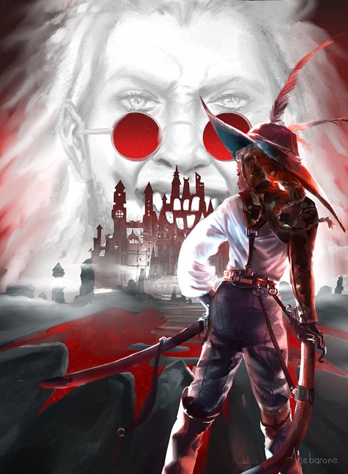
I loove stark contrasts but it often just doesnt work out..and then im too lazy to fully render 😀
@jakkenpoy @YohohoBao @mewiyev @landegart your art is always so amazing ily <<3 https://t.co/NuudQd7vi8


i drew her civilian form initially with dyed hair and decided i liked the contrast natural-to-blue better btwn the designs, and it makes her look more like the existing magical antiheroine characters that all have natural hair. i still like her dyed hair version though


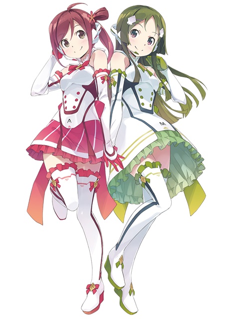
【VOCALOID4】The vocal synth of the hour is Kobayashi Matcha.
Matcha is a calm and collected girl who tends to hide her emotions, in contrast to her best friend Masaoka Azuki.
Originally released for VOCALOID2, her voicebank wasn’t public until her V4 release.


Another good ep. with the 1st years progressing.
Marugarete's song was super cool and dramatic.
Smile from Liella! was fun and light.
A nice contrast on the personalities between the two.
Nice to see Kanon more confident as a leader.
#lovelive_superstar #Liella #lovelive

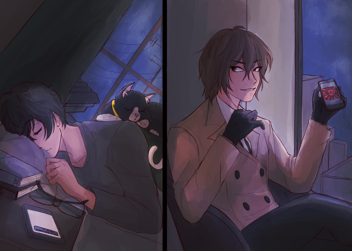
*jazz hands* another week another rtb fanart: this time the contrast between their nights…while akira studies for exams, goro dives headfirst into the metaverse to find his own justice
read Redressing the Balance by @ConvocatedElegy and get a front row seat to “akechi time”

in contrast to my earlier post i hope you will come to know and love what this is about in the future

Contraste entre os RPGs que eu mais gostaria de jogar: para quem não me conhece, isso diz muito sobre mim


🔱🔱🔱
Usha, the goddess of the dawn 🌅
Ratri, the goddess of the night 🌌
Contrasting characters, but both fighting for the Yoddhas 💪
https://t.co/4EF6a6xhKB
#NFTs #NFTCommunity #nftcollector #yoddha

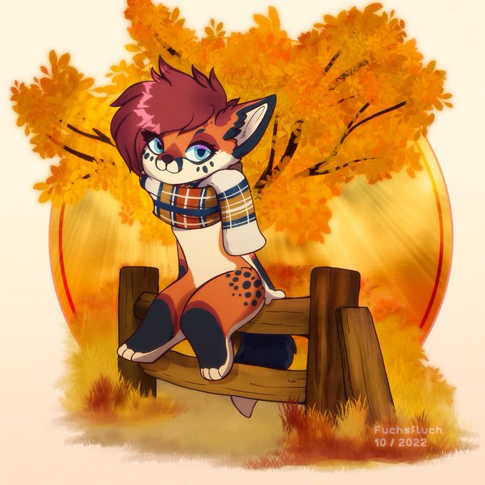
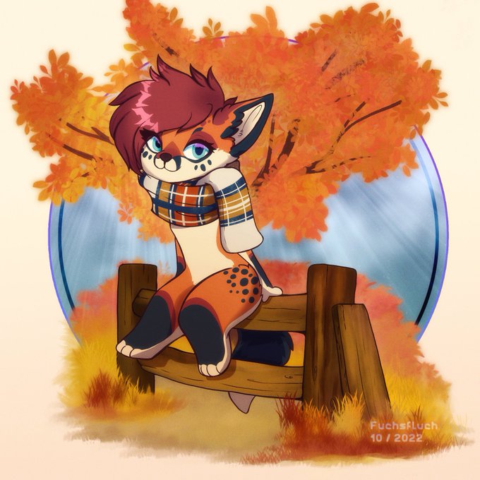
The autumn of the fox 🦊🍂🍁
Two variants as I couldn't decide which one I like more...
I like the golden uniform color which underlines the autumn but I also like the contrast of the blue background. What do you think?


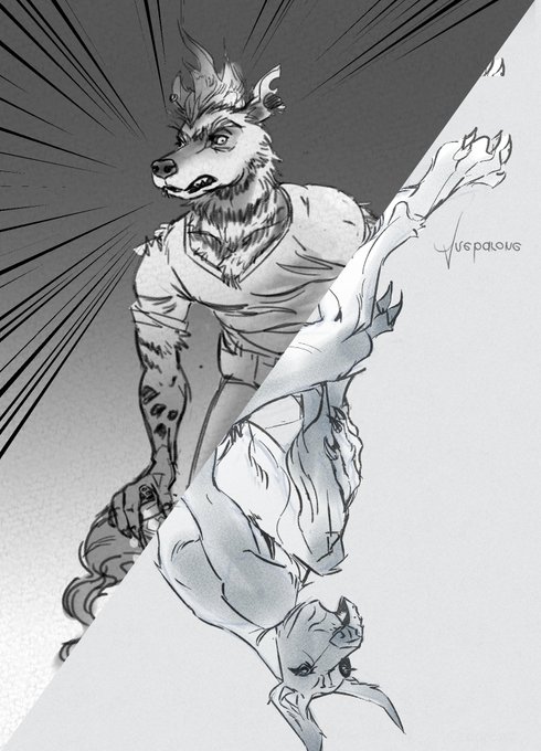
in other news revised their design a lil to add a gradient because i am Weak. made the hair contrast a lil more with the cloak so they didn't blend in as much


【VOCALOID4】The vocal synth of the hour is Masaoka Azuki.
Azuki is a cheerful girl who tends to act first and think later, in contrast to her best friend Kobayashi Matcha.
Originally released for VOCALOID2, her voicebank wasn’t public until her V4 release.


@Oak_Arrow Congrats bro! And gotchu!
CONTRASTING FEELINGS
.15 $ETH
https://t.co/XWBmx6yAup


The contrast in quality of Blade designs in XC2 is really funny

Loving the contrast in color on this one and the composition! ✨
Fractalz are instant reveal and generated randomly!