saturationのTwitterイラスト検索結果。 78ページ目

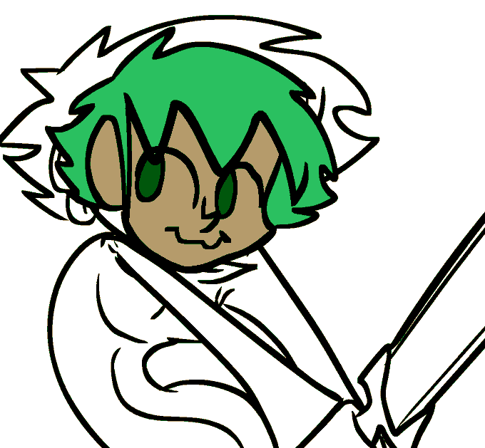
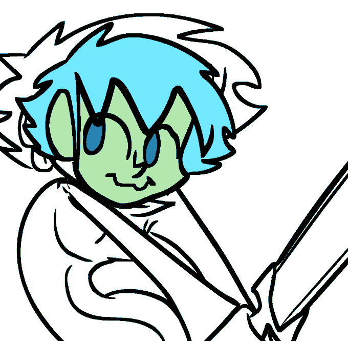
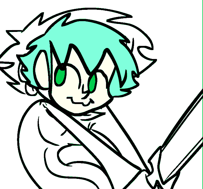
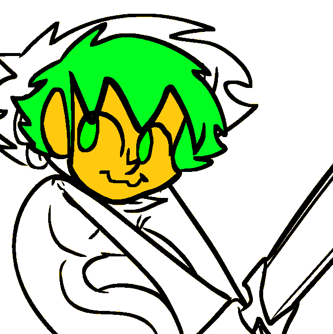

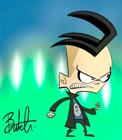
@womtoms I toned down the saturation a bit so it at least doesn't give the urge to rip my eyes out, still the art itself is really shitty


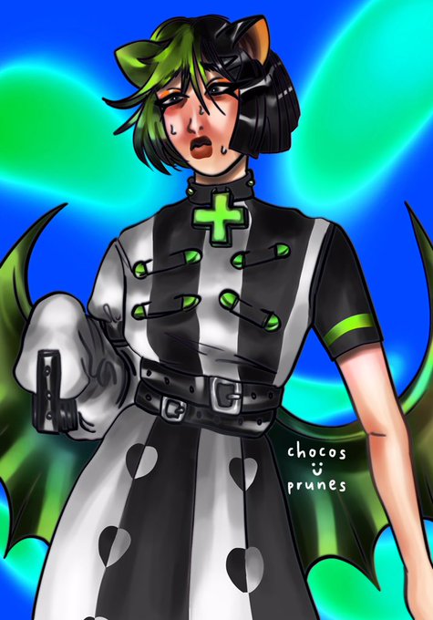
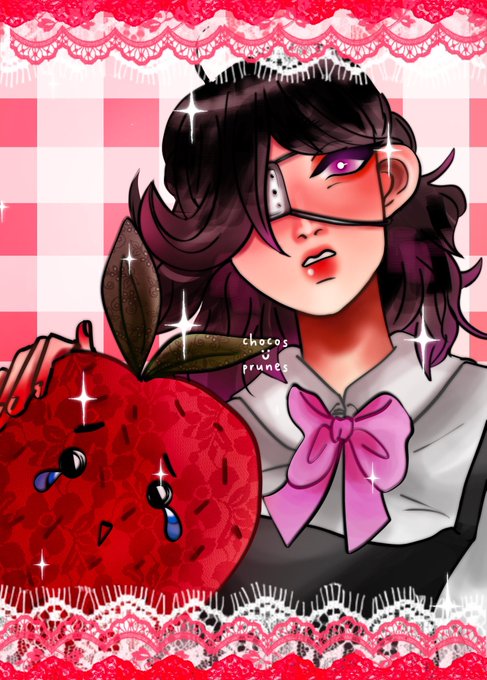
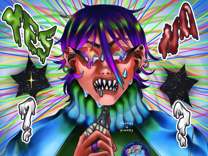
@ciaraturnerart Thank you sooo muchh ✨✨😭 For the post Here my art 🙆🏽♀️I love put the Saturation very High and made vary colorfull illustration ✨✨✨😗


@EmirichuYT I try to emphasize and match colours if that makes sense? Also saturation! Make some parts pop! Go crazy; instead of gray use blue, shade yellow with orange, go ham, the only one stopping you is yourself!


highkey really confused why the saturation for her face is so muted
the right is how the color is supposed to be...


bonus high saturation version bc @Vjenberi pointed out that this could be Much More Obnoxious

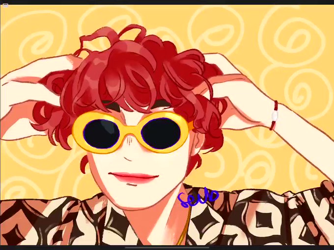
nylon takumi!! 😎😬
just imagine the saturation,, bc I cant edit the colors..
#kawanishitakumi #jo1 #川西拓実 #JO1fanart @official_jo1

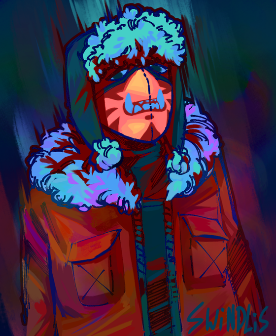
finally got to drawing @hawnting_'s sona!!!
once again i had to... hella boost the saturation of their colors... sorry hawn 😘💕💕

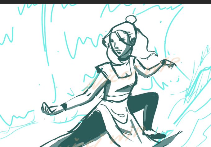

I adjusted the saturation cos it seemed a lil dull to me. anw here's a side by side of the sketch vs the final! I sketch rly messily ahsdfhsah


Another Midori no Hibi/Midori Days edit featuring Pipi Zola from BoBoiBoy. This one came out a lot better than last time, in terms of saturation edit

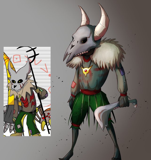

@asteRiesling @MrFry_ Yep! And also the use of shadows.
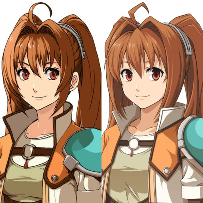
Here's a side-by-side comparison. EVO's colors are less saturated compared to Zero/Ao which I think makes the colors look really dead to me. Left one have heavier details in eyes and hair, colors have more saturation and looks lively 💕


And all the game is made using a customized 32 color palette.
One part for terrain/static objects with low saturation and contrast.
And the other with more saturation and contrast for interactive objects, players, enemies and items to pick #pixelart https://t.co/6Lp1UAw6Om


Another variant. For this one, the Saturation was bumped up to 2, Brightness to -1, and Contrast to 4 (via @acornapp's Color Controls) with a Color Posterization of 4 and then using a closest color algorithm to select the closest EGA color.


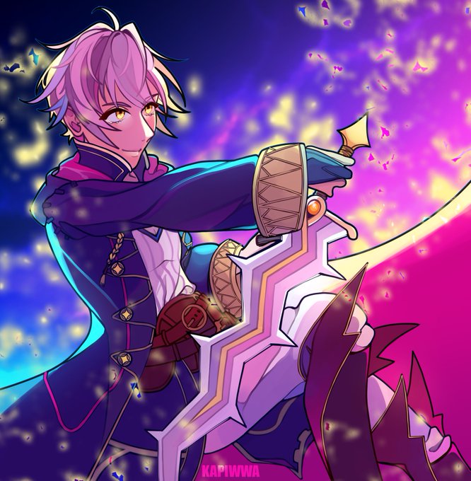


Henlo~ I'm Kiwa! I mostly draw fanart and am a huge fire emblem *cough*Robin*cough* stan! ✨ beware of gradients and oversaturation 👀‼️
#NobodyArtistClub
#under1kgang


Hello, I like drawing teeth and also turning the saturation to MAXIMUM SPEED when I draw.
#under500gang #Under1kClub #NobodyArtistClub


@neilswaab I’m Andrew. I love dynamic compositions and the saturation slider!
https://t.co/2tmsgk51Lg



#NobodyArtistClub
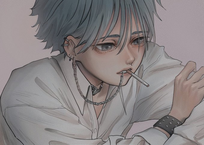
Hi I’m Mina and I love drawing with low saturation.