comparison.のTwitterイラスト検索結果。 80ページ目


Rework of Wicke for Patreon. Old version shown for comparison. #pokemon


Sixteen-year-old Ikkou Satonaka has raging hormones that make every other boy's look simply weak in comparison.
https://t.co/nb2p0VNS35
#nozomient #ahmybuddha #dvd #anime #fanservice


20 days of progress in direct comparison. Hair is still a huge pain in the a** though. 😂 I also noticed some unintended Orlando Bloom/ Legolas vibes in the latest one. #progress #CriticalRole


i wanted to draw his past, mortal, pre-vampire self from like a thousand years ago,
and then i got carried away and drew his current self as well because he deserves it. also for comparison.
i just really like my ancient viking bat


@sunplay456 Ikuya's is pretty big in comparison... to Hiyori's....... haha! WIDE!!!


Really sorry I constantly post WIPs of this, but it does keep me motivated! Another 2014-2020 comparison.


Almost done! Final adjustments and lighting effects to finish it up.
For now, base colors with pre and post-shading comparison. Quite the contrast!

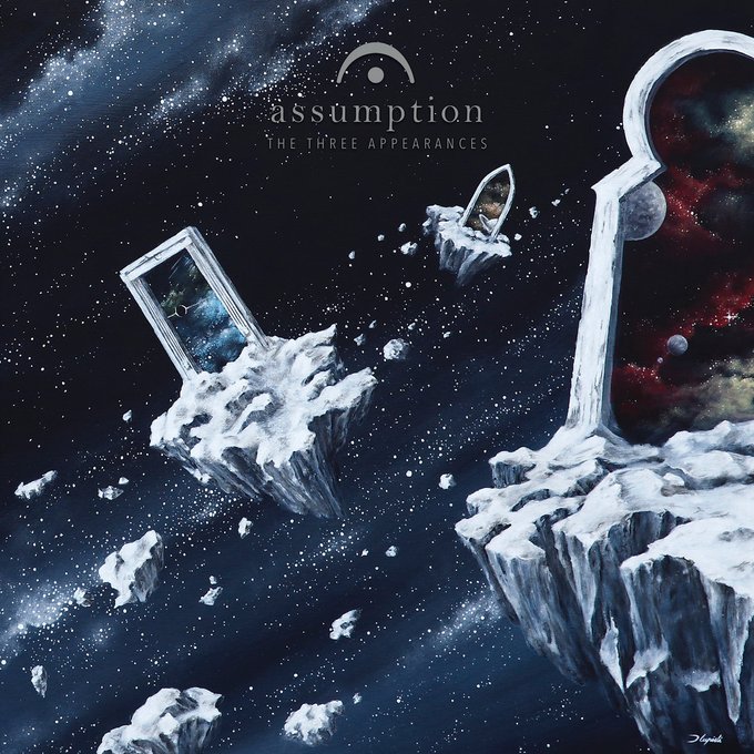
One does not compare many bands or particular records to THERGOTHON or DISEMBOWELMENT, but ASSUMPTION's 2014 magnum opus 'The Three Appearances' is worthy of said comparison. Sentient Ruin is now issuing a vinyl release for the first time:
https://t.co/ZPJwTYTvzH
#HeaviestofArt


That #hhcatastrophy made me want to draw my OC Iris as a cat for shits and giggles. I actually like how it looks so I'll place her here for comparison. #HazbinHotelOC #HazbinHotelFanart #hazbinhotel this was FAST maybe 30 minutes? Don't draw cats much but I think she looks cute.


I'm mostly sketching in the last days due to the lack of time and energy, so I thought I'd do a comparison... Both portraits are for @/ComfyZenny, the left one is from September 2018, the right one from 2 weeks ago. I'm happy to see my improvement! 🧡
#portrait


For comparison. (Almandine looks more like Shep but that’s the next project) https://t.co/6qhUGLqlzp


ok so I iterated a bit and the only one that needed tweaking was spear gal. changed her top to match bow gal more closely.
also tried a render test. I'm not 100% satisfied with it as I'm looking at Jeff Simpson's work on AC for reference. mine feels too cluttered in comparison.


Original Game Boy Version for comparison.
Keneth had hair and Enrico was green LOL
I made bald Kenneth and give his goatee back and give Enrico a skin color more reminiscent of his original also his classic stache.

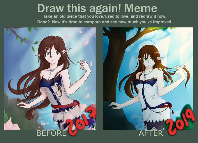
I figured I didn't post the finished comparison. Some adjustments were made this year, but I guess since I drew 95% in 2019, it still counts? xD See the whole picture on my website: https://t.co/3POxP28lBf

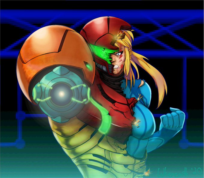

Tried something a bit fancier.
Tried for a more atmospheric look with the shading.
Based off of the very beginning of Super Metroid.
I'll throw up the regular colored version for comparison.
#metroid #supermetroid #nintendo #fanart #SMASHBROS #digtialart #drawing #samus

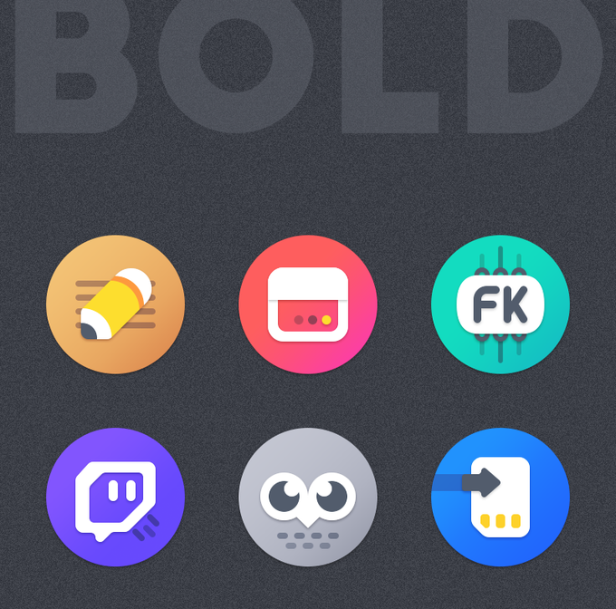
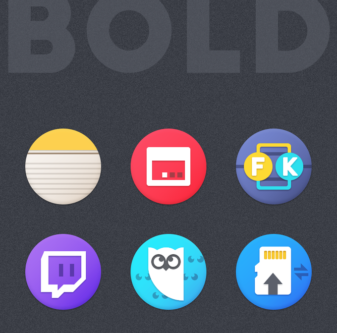
Update on #BOLD icon pack rework.
Most of the icons are redesigned from scratch.
Here are some different icons comparison.
NEW Vs OLD
530+ icons are redesigned already.
Stay tune for more updates :)


Equestria Daily is running an art progress event to show off your progress! You should all go enter it.
https://t.co/UlIJEdfp7K
Here's one I redrew earlier this year. I thought it was the best comparison. Also best bat.

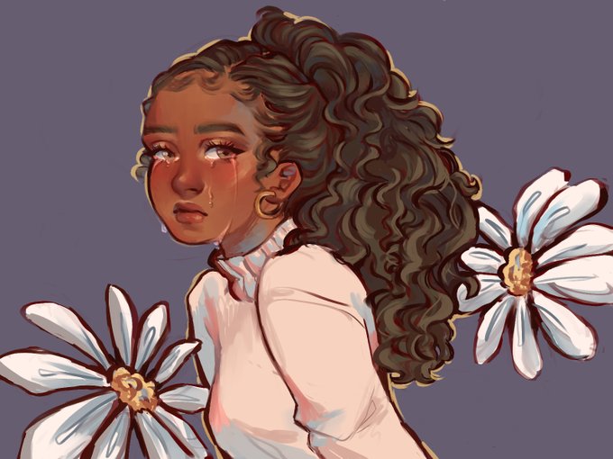

uhhh for comparison. both are my oc morgan (Tho I'm still fiddling with her face) and i kinda made them paralel to eachother. they're a year apart and i was in the same headspace while drawing both of em but!! i like to think that the new one is more hopeful c: <3


Did some pose study today. HaD poses on one monitor and then just did quick rough doodles on my tablet looking over. Afterward just placed the figures on top for a comparison. Pretty fun.