TypefaceのTwitterイラスト検索結果。 602 件中 9ページ目


Artwork:
Bespoke illustration graphic, with typography.
Typefaces:
‘Kern’ by @pizzatypefaces.
(O)’ Tenebras’ by Doménico Barreto.


@jeffbrutlag You could always make something with interesting typography. I put some samples below of what I mean. Colors, typeface, and texture to express the general vibe instead of illustrative imagery. And you could use accent icons or images as well but leave the type as the main focus.


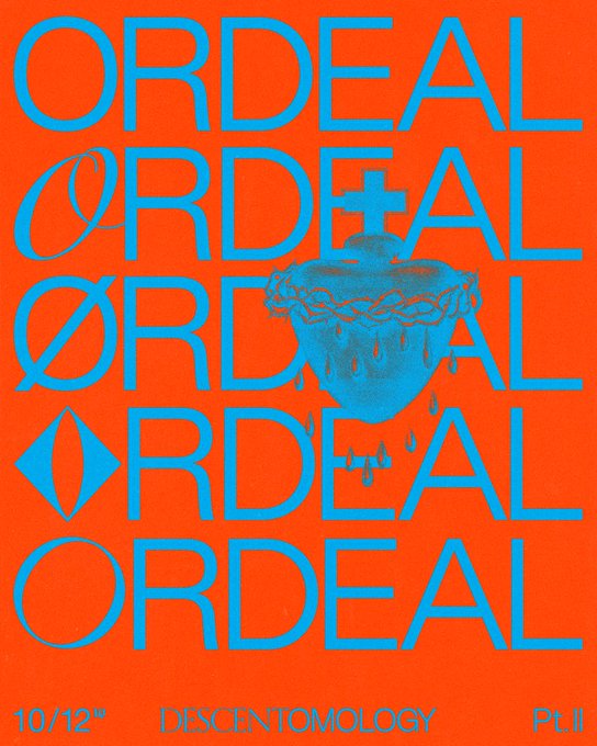
Artwork:
Modified existing imagery with typography overlay.
Image source ’239’ from ‘Tattoo Inspirations I’ by Vault Editions.
Typeface:
‘Kern’ by @PizzaTypefaces.


“Typography is my way to help words come alive when they're presented visually. And as someone who can't write well (even if I want to, haha), I like to think that I contribute meaning to words when they're presented using my typefaces.” — @aniciaclean #artph


+CYN Fonts: CYN BYRON #Free #Brushed #Handwritten OTF #Typeface https://t.co/pC6KQZ2nP8


SPECIES FONT MEGA COLLAB👽
Did this piece for the launch of this amazing font by 3xpyre.Species 100% Free typeface
Available on https://t.co/3Wyjm4710i
Check out the other pieces on this collab, by :
@MedaurT
@iamcvrsd
@iamsrrender
@progon314
Live free collective
Ttttiee


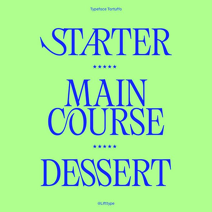

Our font : Tartuffo🎭🦹
Here is some pics presenting one of our last releases, a fresh typeface designed by Bouk Ra💫✨
We invite you to test it & share your creations with us!
Tartuffo is available on : https://t.co/UOFqrx15eR ❤️🙏🏼


typeface / text logo, assets and design exploration for Intervals.
So stupid proud of the first text logo I ever designed. Here’s to hoping I can make much more in the future!
New apparel will be available at the upcoming Intervals tour 🏃♂️💫


Fresh Free Fonts For Graphic Designers
Visit: https://t.co/qApUwhqyee
#newfreefonts
#freshfreefonts
#bestfreefonts
#freefonts
#downloadfonts
#commercialfonts
#fontsfordesigners
#graphicdesigner
#typeface
#typography
#lettering


One of the ideas of Anisette Petite is to incorporate non-typographic details that are found in the lettering of posters and signs. It's not easy to accept an inconsistency when designing a typeface that you want to be consistent!
https://t.co/0YsGMv2mcL


Detroit - Slab Serif Typeface https://t.co/NqKVoswgZr #slabfont #truetype #fonts #logofont #typography #label #badge #sea #college #woff #typography

Calvous - Slab Serif Typeface https://t.co/M862lun116 #sansserif #indian #fonts #typography #opentypefont #quote #woff #truetypefont #font #forests #invitation


september recap! some of my best typefaces + frames + layout ! thank you so much for your support♥♥


It’s been a while since I shared some good typography work. Luckily there’s @kiss_miklos, who makes something closer to art. His latest typeface is called Chloé and in his own words it’s “elegant, playful but sometimes behaves unpredictably”. Ligature nerds, rejoice.


Hey folks, trying to remake a low-res icon from a texture rip (first pic) and not sure which typeface looks best. Any thoughts? (poll in reply)


@Glass__Moon Right?? I've got even more! Even the logo is very clearly the Sailor Moon typeface.


https://t.co/O4G1Or5Vr1 — You know I'm a big fan of fun typefaces and CentralType does precisely that full time. Zero boring sans. All fun.

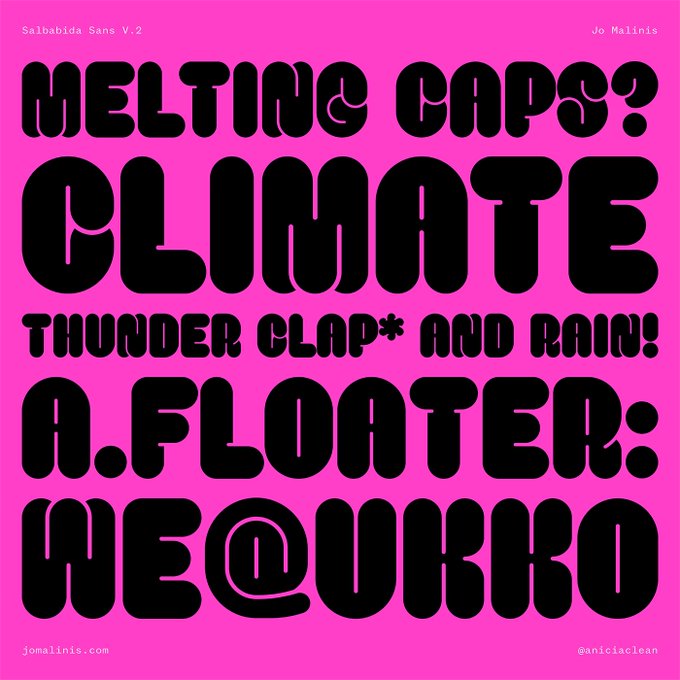


Perfect for bold display settings and strong titles, Salbabida Sans comes with Regular and Outlined styles to allow users to play freely with different typographic styles.
Test + buy 👀 https://t.co/XebTt9rXJx
#typedepartment #typedesign #typedesigner #typeface #typefacedesign