font,のTwitterイラスト検索結果。 257 件中 9ページ目
I have 250 downloads of my game? Thanks so much!
I am currently working on a bigger Quality-of-Life update:
New font, for easier to read text.
Reworking Bossfights, with easier-to-see Health-bar.
Navigation Dots, to show on which page of text you are.
More changes to come, soon.
SNOWMAN Display Font,Font Procreate,Font https://t.co/FzEi8hu5Ew via @EtsySocial #EtsySocial
Hi guys i want to ask suggestion for Hanbin Birthday Twibbon, which design??
*for font i used Cloister black font, the font 5gam used to write Hanbin's name on his bday perfume and 131vibe font.
A or B
Treva del Mar by Type Aliens
https://t.co/FclvmenuCW
#typography #freefont #font #decorativefont,
@HazbinLover @alastor_th :: I have so many projects that I accidentally look at it. Wrong font, I'm sorry, I knew when the drawing was finished, I hope you like it.😥😥🙏
@SSL_2004 @theDeppyFiles Maybe it's cause I do graphic design and also have a lot of experience with the font, but I can always tell. Here's it against forces. I could do the same with the old MC logo and you'd see other differences.
So @CediFonei realized the title font I've used for my ink drawing challenge books is, entirely by coincidence, the same one used for the Yakuza character intro/boss battle font, and
Starlight by Gilart Studio
https://t.co/4ZHRipIGB3
#typography #freefont #font #handwrittenfont #scriptfont,
Chariska by Terima Kasih
https://t.co/2wTTXdGuke
#typography #freefont #font #handwrittenfont #scriptfont,
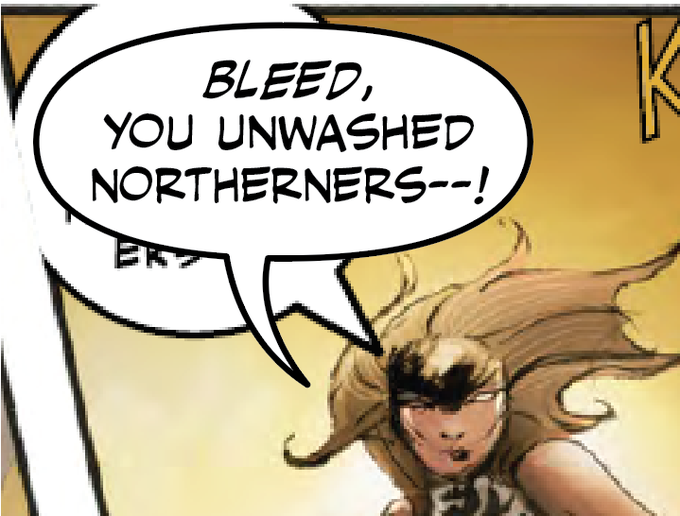
Another #lettering before/after! This time it includes a touch of (punctuation) editing, and I also revised some of the dialogue itself.
I originally wanted a more organic font, and to go all-out with foliage on the balloons...but time constraints OTL
https://t.co/bjFhVhf1k8
Mike Curato visits 7-Imp today to talk about his new graphic novel for teens, FLAMER. We chat about the design, the illustrations, the font, his childhood love of the X-Men and feeling like a mutant himself, and healing old wounds. — https://t.co/wbT1yEAiMQ.
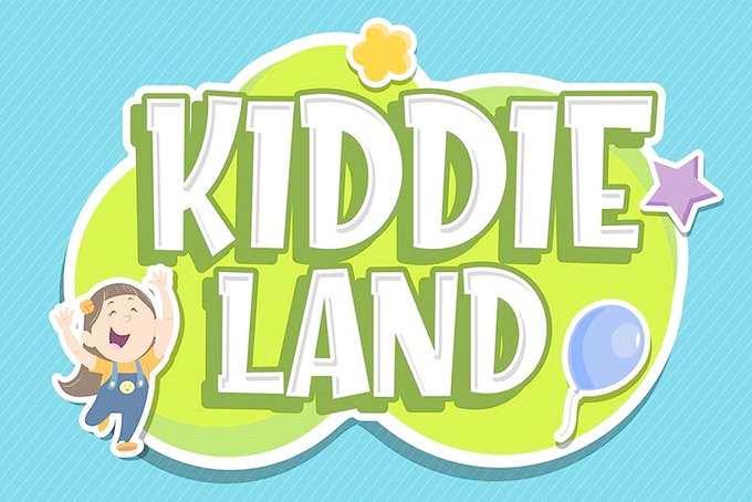
Kiddie Land by Figuree Studio
https://t.co/rDXTwhWzRH
#typography #freefont #font #comicfont #cartoonfont,
aah my money!!!! bought commission art
I think I shouldn't use fancy watermark (p2), even though the watermark creator said it's free to use
it's too garish, right? I'm gonna kill myself
the first one used a font, it's simple un-huh?
@babylovfes Thank youuu
Hi I’m Lucky! I recently started font, now I’m an artist and I have done some set concepts.
Baking Breads font is free to download and use! 🍞
🔎 https://t.co/8vAXCpzTt2
PLEASE DO NOT USE IT IN ANY COMMERCIAL PRODUCTS!
As long as you don’t sell things with this font, you’re doing good!
No need to credit but will be very appreciated 🌻
☕️ https://t.co/ktTszkukOe ✨
@WashingtonNFL With your font, we can use it in this possible name for the team!
@CapitolPR_World @Fsmoot21SeanT Oh yeah! Keep your eyes open! Because we supporters who are artists always make new designs and constantly improving the old ones! Like my wolf logo here with WSH's current font, and flat design of uniforms!
The film is a reference to the 2008 DreamWorks film Kung Fu Panda, as the poster uses a similar name and font, and the Lakitu is in the same pose as Po on the original poster.
And today I’m wearing my Aoba Johsai practice shirt! This was another purchase from the Jump shop 2016 trip. I am already bad at reading kanji and unsurprisingly it’s much worse with this calligraphy-style font, so if anyone knows what the back says I’d appreciate it 😂
@CriticalBlast @ZombiesPayCash There's usually a way.
I don't have the same font, but it's something that can be fixed. I'm guessing deadlines meant for a speedy job. Not every balloon is perfect.


