SaturationのTwitterイラスト検索結果。 2,270 件中 81ページ目
Got tagged by @Drokmars
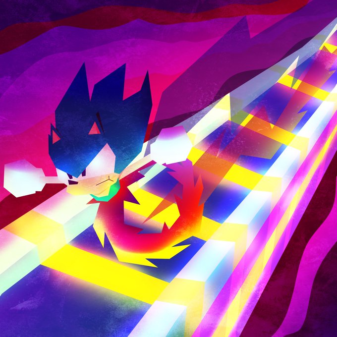
This is a fun piece I'm proud of. I had fun messing with the colours and making it vector art. Going mad with vibrancy and lighting, trying to be logical but still fun. My style nowadays is all about saturation
Taggin @Arcade_Woman and @BaconTactician https://t.co/Gy4EiAZZW2
more examples 🍄🌿 remember to change the exposure & saturation to suit your photo!
Dropping in with my #faceyourart . High saturation, and few characters.
Aminta the elf, character of mine. Im starting to love the process of color, but maybe I exaggerated a lil bit with saturation isn't?. Flat colors for comparison
I definitely have to check the color saturation on my tablet (pre and post color correction) #artistsontwitter
is it too late for #ArtistsofSEA🥺
hello i'm pai, an artist from 🇵🇭 who loves cluttered bgs and sliding saturation levels! my art HP is always super low but i try my best 😭✨
@FreiresArt @dannyuko Great !, I am going through a similar process too, in my case I am just starting to increase the contrast when drawing, (very slowly, they are a year and a half apart, haha) the next step would be to increase the saturation
Heyo #ArtistsofSEA!! I’m Mygel and I’m from the Philippines 🇵🇭! I illustrate + do 3D work. Pushing that saturation slider all the way up is my specialty 👁👄👁
📍https://t.co/ZIJ3jT1J3j
📍https://t.co/Ftc4pKEJnf
📍https://t.co/QgtFoZh5wg
✉️ mygeledoloverio@gmail.com
[tutorial-ish]
some notes on how I don't use pure greys for shading and instead shift the greys to have more saturation to them
(sometimes I wish I could elaborate better on stuff like this ;n;)
I lowered the opacity on the layer clipped on top, and changed the saturation and luminosity levels on the base colors to make it less oomph. It's nice having a 2nd screen to look at because I can see the slight different in color representation. BUT I think this is done now.
Massive saturation time!!!
Warning it'll hurt your eyes if you stare too long xD
#絵を彩度100にすると超派手
#絵を彩度100にすると超派手
S...so bright 😵 but I kinda love it
(100 saturation)
@Jeremia96160021 Generally, I do this:
1) pick some complimentary colors (in this case, neighbors)
2) adjust the lightness/darkness and the saturation in a descending order (the middle one is usually most saturated though)
There's a lot more to it that you can learn about, but this is quick.
@mofspades Hshsj in fact first I use very desaturated colors for the base and then I apply saturation+luminosity layer effects !!!
there's a "saturation up by a 100" trend going on and i wanted to try it out
基本彩度高い色が好きけど、100にしたら...どうですかね? (苦笑)
#絵を彩度100にすると超派手
Full saturation challenge haha. Turning up the saturation is a bit... much lol.


