comparison.のTwitterイラスト検索結果。 2,015 件中 81ページ目


ok so I iterated a bit and the only one that needed tweaking was spear gal. changed her top to match bow gal more closely.
also tried a render test. I'm not 100% satisfied with it as I'm looking at Jeff Simpson's work on AC for reference. mine feels too cluttered in comparison.
![[LeigiBoy]さんのプロフィール画像](https://pbs.twimg.com/profile_images/1797749458836307968/wHfKi9Nm_normal.jpg)


Original Game Boy Version for comparison.
Keneth had hair and Enrico was green LOL
I made bald Kenneth and give his goatee back and give Enrico a skin color more reminiscent of his original also his classic stache.

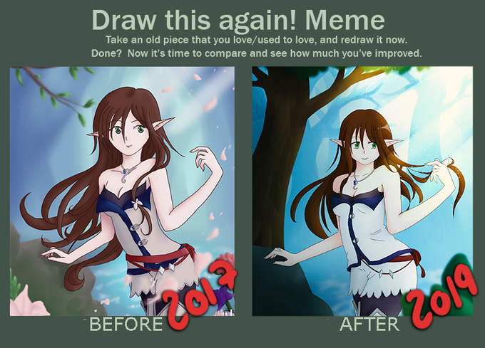
I figured I didn't post the finished comparison. Some adjustments were made this year, but I guess since I drew 95% in 2019, it still counts? xD See the whole picture on my website: https://t.co/3POxP28lBf

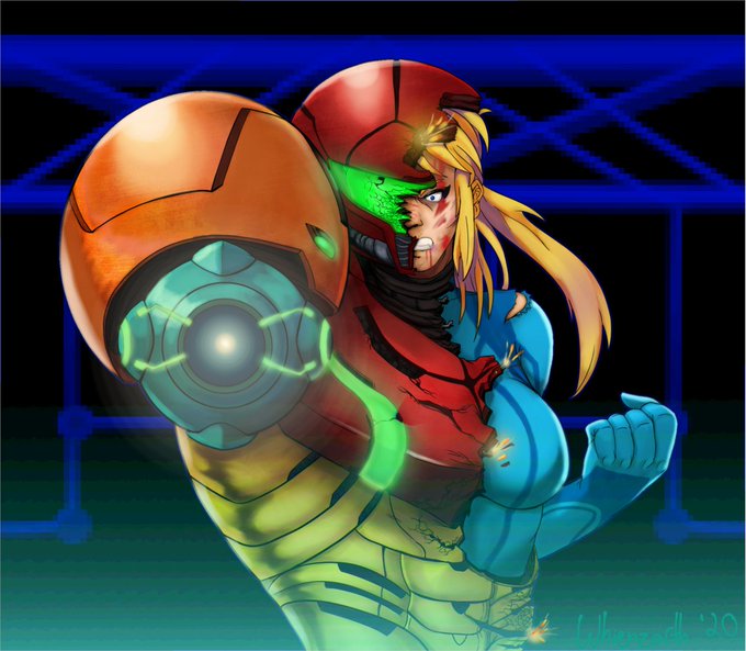

Tried something a bit fancier.
Tried for a more atmospheric look with the shading.
Based off of the very beginning of Super Metroid.
I'll throw up the regular colored version for comparison.
#metroid #supermetroid #nintendo #fanart #SMASHBROS #digtialart #drawing #samus

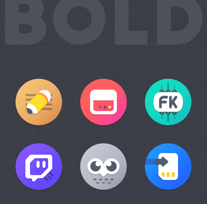
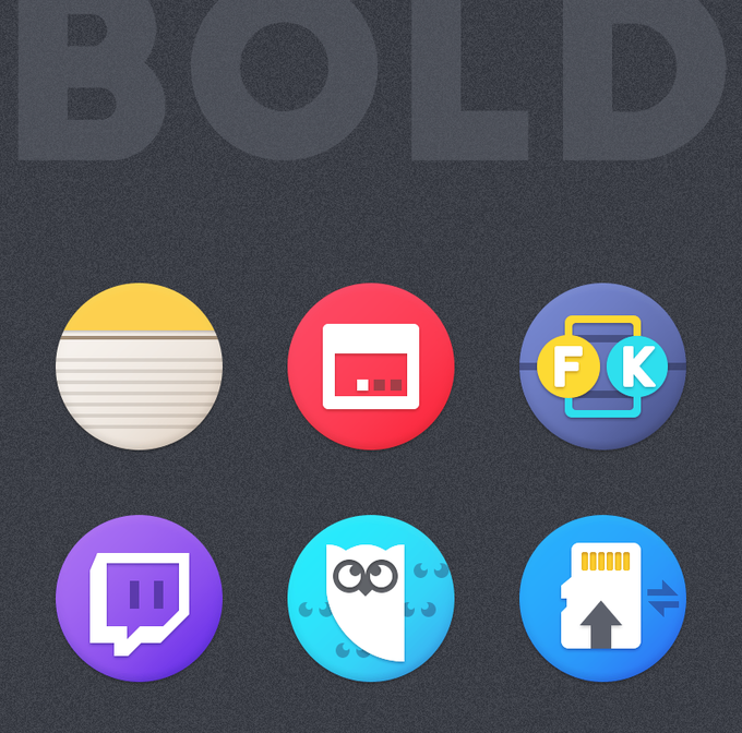
Update on #BOLD icon pack rework.
Most of the icons are redesigned from scratch.
Here are some different icons comparison.
NEW Vs OLD
530+ icons are redesigned already.
Stay tune for more updates :)


Equestria Daily is running an art progress event to show off your progress! You should all go enter it.
https://t.co/UlIJEdfp7K
Here's one I redrew earlier this year. I thought it was the best comparison. Also best bat.

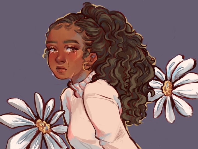

uhhh for comparison. both are my oc morgan (Tho I'm still fiddling with her face) and i kinda made them paralel to eachother. they're a year apart and i was in the same headspace while drawing both of em but!! i like to think that the new one is more hopeful c: <3


Did some pose study today. HaD poses on one monitor and then just did quick rough doodles on my tablet looking over. Afterward just placed the figures on top for a comparison. Pretty fun.


Also here is the bike with a colour I like better but wanted to keep the red for the post for the closer comparison.


A colored version of DB! Along with Dirty Bubble for a comparison. If I had the power to make this like, an acrylic charm...😤💖
#SpongeBob


I came across this piece of old artwork I done back in 2005 and Just had to do a "Then and Now" comparison. This picture was literally the first digital picture I ever drew back when I was 17. 😊
#blinx1287 #ayane #thenandnow #artcomparison #nostalgia #deadoralive #ecchigirl


Outfit comparison. I thought there were heels to the boots, turns out there weren't lol, but I let them stay there.


Alright, here's a bigger comparison.
A full color and sketch then VS. A full color and sketch now.


So I didn't have a benchmark for a 2009 v 2019 thing, so I'm gonna get started early for a 2019 v 2029 comparison. Alongside that, I started re-designing Joy as my first 2020 drawing!! Pretty happy with the 2019 piece, I'd say that's probably the best one to end the Decade on!

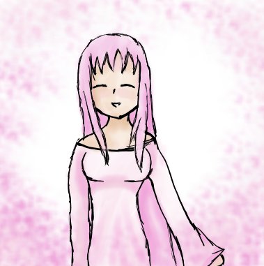


Joining the trend! #2009vs2019 art comparison. One of the few digital pieces I could find but pretty much sums it up from then ahahah


At the end of every year I redraw my 2 OCs, Pac and Lenny, to see how my style changed. Here's 2019 and 2018 for a comparison.


comparison... (op 2 vs ep 47) RIP IN PIECES,,,,,,,,
still love this ep but.........it deserved better........😔


I couldn't find a drawing from 2009 but this is prob the oldest digital drawing I have :3 2013/2019 comparison. Still a lot of stuff to learn but I'm proud of my latest stuff Q~Q I promise to try even harder next year~ #10yearchallenge #digitalart


