comparisonのTwitterイラスト検索結果。 22,164 件中 82ページ目


Art comparison of pieces I really liked from 2021, early 2022 and my most recent art piece ( and the back wip to show off the anatomy lol) !

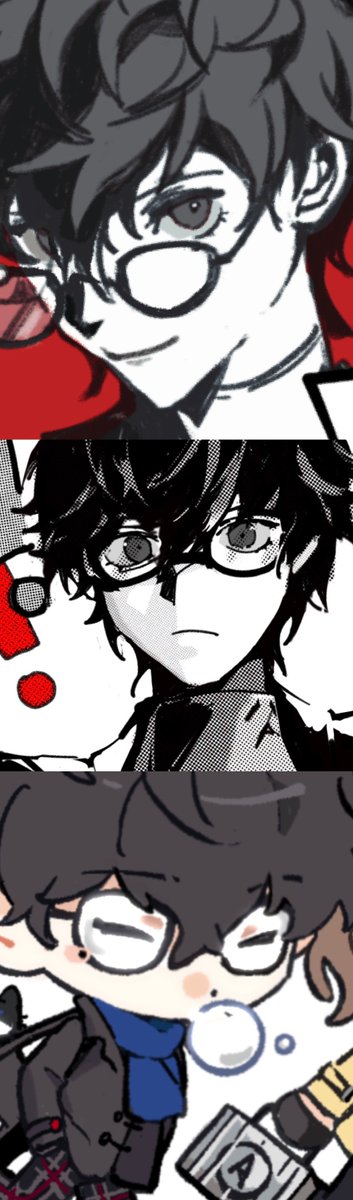
In comparison, i usually draw thin eyebrows for the protagonist, combined with the obvious lower lashes give him a bit of femininity


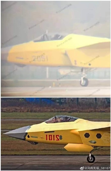


A little comparison between my first time drawing Movie Sonic, to my most recent.
First one was done in late 2020 and the Super Sonic one was done in December 2022


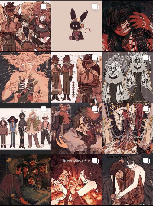


A comparison of the Flamechasers’ outfits from the anime poster vs anime trailer (🧵)


(old - new) this is a nice comparison 🤩 changed the title from “Daylight Sunflowers” to “Seven Leaf Clover” https://t.co/L2NamtPqrz


Just before the year ends I thought I'd sneak this comparison in here.
2022: vs. 2021:


No old reference this time as I never finished it but you can see the old design comparison.


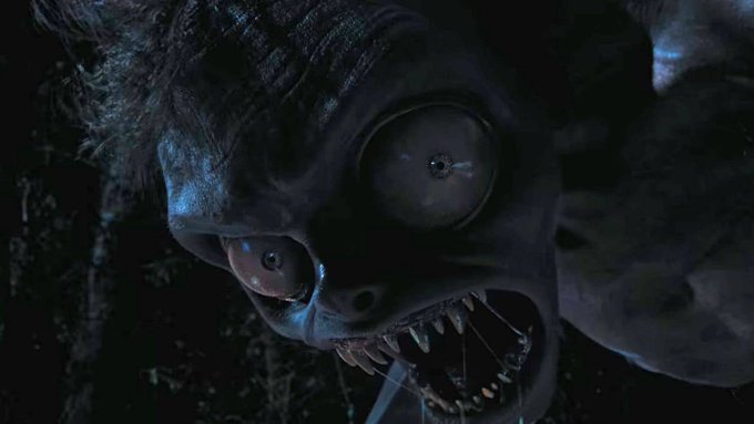


There he sat, ethereal and alluring. And though his voice pulls you into a world of vivid imagery, his picturesque charm and Adonis like smile pales in comparison to any art or written works he's described or spoken of. #VoxPopuLIVE
![Rc [ 狸キューブ ]さんのプロフィール画像](https://pbs.twimg.com/profile_images/1408316252343476229/ILpb8ZEO_normal.jpg)

Ok, I have to come to terms... I think I have a slight crush on Mirai/Koraidon...
However, my typhlosion obsession is wholly out of control and probably unhealthy in comparison though~ XD


i actually redrew my art from may, here's a side by side comparison LOL


So I mentioned before how I wanted to change my style abit starting with my eyes, I think I finally picked one thats looks way better and is more appealing. so heres the new eye style followed by the old for comparison.

