differencesのTwitterイラスト検索結果。 5,397 件中 88ページ目


My two precious TTRPG PCs have recently stumbled into a common conundrum, despite so many differences and 2 completely different settings. The truth remains: Goth Mage Pretty :-/ We likey


Here we have a 13 years differences.
I’m slow at growing but still proud I have improved so much anyway. 💜 https://t.co/x3UJqvPZj6




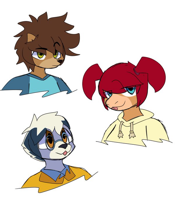
Although my content has been fnf lately, that doesnt mean I cant draw my own things sometimes
so now I give you guys a drawing of the mfs from alfred hedgehog, no I don't care if you know this show or not
don't mind the differences, did it in my artstyle :>


@k_stroyer QHAT
I hope both you and your PC survive. Maybe you can overcome your differences, become friends and add her to the Mari zoo


Some pre-release screenshots have slight differences in shading; more specifically, the terminator line was simplified in the final release. Also, some promotional renders don't even have the terminator line at all and just simply use two shades instead of four.


Reference of my characters and their body type💕
Plus a page of Dune👁👁 Also wanted to show the height differences!


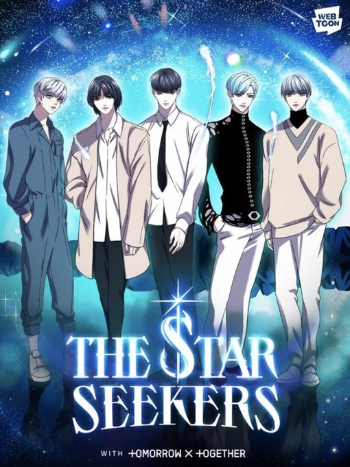
I just keep thinking abt how the lyrics to [REDACTED] 💧😅 talk abt how 5 stars w/different colors come together under one dream, despite their individual differences (서로 다른 너와나) to build a better TOMROROW and become ONE STAR. Get it?
It's basically STAR ONE's ANTHEM 🤡

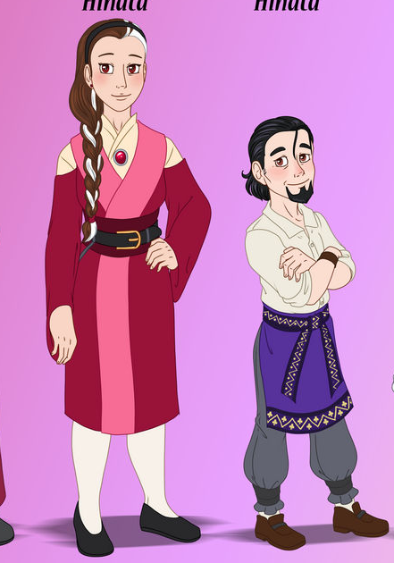
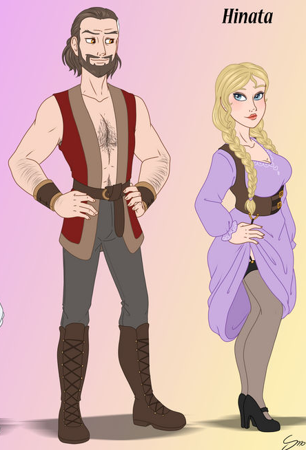
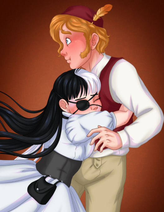
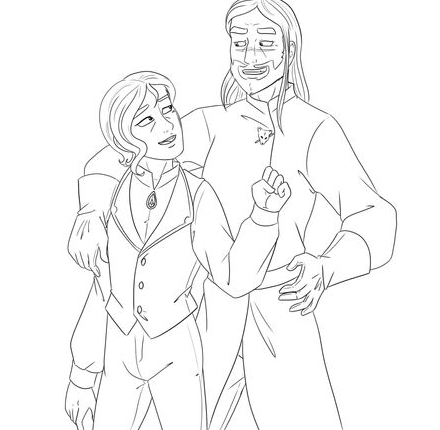
What do you mean I have a thing for couples with big height differences? XD I dunno what you mean! (Last artwork is old omg)


Concerning the differences between the Batch 07 and previous batches some interesting Tweets have been posted and even if there are some undeniable differences, the comparison to a Batch 02 J-10C is off, since it was in fact the first production batch.
So, what do you think? 🤔

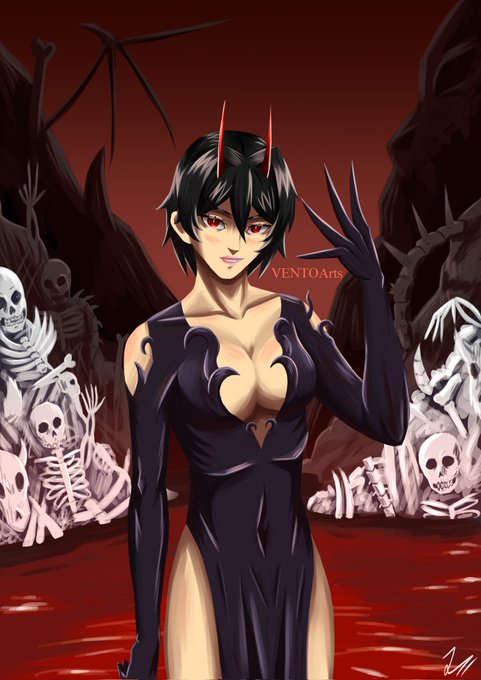

@pikachu0z This is Rea and Vento
I tend to imagine them being an unlikely duo that just works despite their differences


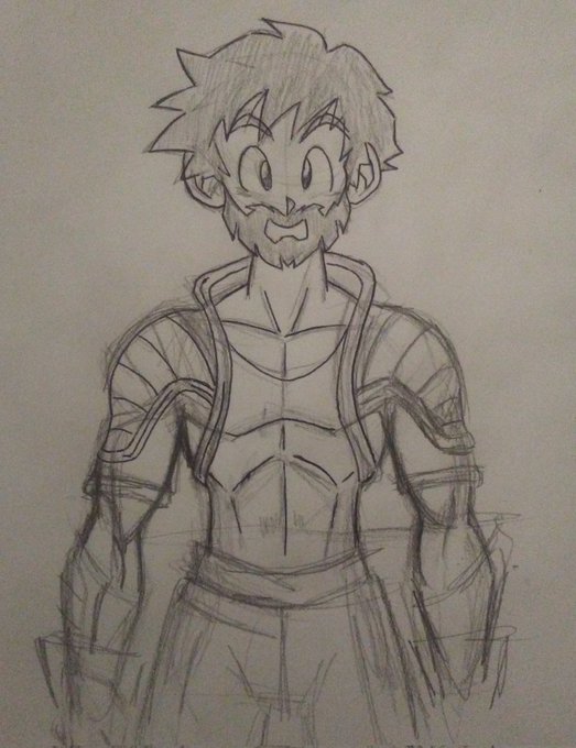
Time to explain some dumb multiverse concept. So essentially my characters feature in my own works, and the works of a friend. The "Zappyverse", and "Roccverse" as we call them.
This explains the design differences with Rada, and Kharatt shown here. As they were changed to fit


@RWezenaar FAMILY MATTERS
@opensea
#OpenSeaNFT
When we gather as a family we really come together as a family. No matter our differences, no matter where we stand, we're together in this. Mission accomplished, and after all this time.
#jtsstudios
1/1
0.05 #Polygon
https://t.co/tiutwJQckA


Humanization 💋😈💀🎭
Where we emphasize the differences of being human ❤️🔥
https://t.co/LFhegryJsK
#NFT #NFTs #NFTCommunity #nftcollector #NFTcollectibles #nftcollectors #nftcollection #NFTartwork #nftart #NFTartist #OpenSeaNFT @opensea

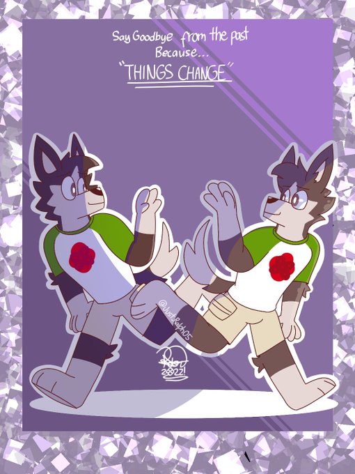
Here's Rawrf's new Appearance, I hope you can see their differences
#furry #furryart #furryfandom
@nftanothersigma @TDCartOfficial FAMILY MATTERS
@opensea
#OpenSeaNFT
When we gather as a family we really come together as a family. No matter our differences, no matter where we stand, we're together in this. Mission accomplished, and after all this time.
#jtsstudios
1/1
0.05 #Polygon
https://t.co/tiutwJQckA


"corporate needs you to find the differences between this picture and this picture"


@MonstersGo But back to the original topic:
Yup, the C64 has more muted colours than, say, the ZX Spectrum. 🤔 The Amstrad is in the middle. Then the Atari just shows off with its wide array of colours. That was the beauty of 8-bit machines: their arbitrary, rigidly-defined differences. 😄


Other versions because why not (there is slight differences from a face to another (but not always) lmao, GLORIOUS EVOLUTION)