BiSのTwitterイラスト検索結果。 89ページ目


3枠目(ここから投げ始める方)
もうすぐ 捨て星の時間ですよ^^
捨て星 18:378
#SHOWROOM #岡村茉奈
#ラストアイドル2期生アンダー
https://t.co/h3pLpTzSaN
よろしくお願いします^^
#ラストアイドル×『 #bis 』さん
レギュラーモデル争奪イベント https://t.co/Pf20cDMZq8


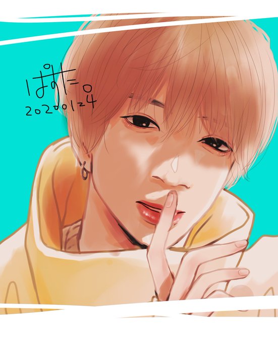
iPad Proで初めて描いたけど、描き心地は非常に良かったです‼︎
ただ、線画や筆圧がイマイチでした💧クリスタとi bis paintのソフトの違いだと思うので色々試してみたいと思います❕
#イラスト好きな人と繋がりたい
#RTした人全員フォロー
#いいねした人全員フォロー

もうすぐ 捨て星の時間ですよ^^
捨て星 16:15
#SHOWROOM #岡村茉奈
#ラストアイドル2期生アンダー
https://t.co/h3pLpTzSaN
よろしくお願いします^^
#ラストアイドル×『 #bis 』さん
レギュラーモデル争奪イベント https://t.co/hMXUe3nv0g


Soeben ist das 1. Bild für das Buch fertig geworden dass ich meinem kleinen Engel zum 3. Geburtstag schenken möchte. Mit @5weetBlack4ngel
Ich habe nur noch 4 Wochen bis es fertig gedruckt hier liegen soll, 10 Skizzen offen und keine Ahnung welche Geschichte ich daraus zaubere.


Derzeit läuft eine 3 Spiele für 2-Aktion bei Amazon, bei der unter Anderem Pokémon Let's Go, Evoli!, Schwert, Schild und Mystery Dungeon Retterteam DX ausgewählt werden können. Die Aktion läuft bis zum 24. Januar!
Zur Aktion: https://t.co/eVD2qdUErk
#affiliatelink #werbung



Bowser's hair in BIS is more, well, hairy. The PiT version kinda looks like a mohawk.
PiT Bowser has a wierd quirk with his spikes, where they have a yellow rim instead of a brownish orange.


Other notes:
I think they tried to add shading to Bowser's arm bracelets and collar in PiT. They are now pure black in BIS. It's hardly noticeable, so whatever.

Comparing the side views, there has been some proportion adjustments. BIS Bowser is rounder around the mouth, and generally speaking has more solid shapes. PiS Bowser is a little slimmer.

The difference is shell detail is interesting: There was an attempt at making the spikes cast shadows on the surface in PiT. This is probably why the shell lines are subtle; to make the shadows stand out. BIS remove the shadows and made the shell lines thicker.


Anyway, Let's discuss details.
As true for nearly all sprites in BIS, the amount of colors and detail is streamlined compared to PiT. Bowser had a ton of anti-aliasing in PiT, especially in the face. This has been heavily reduced in BIS, presumably for cleaner expressions.


昨日bisチャンネルで公開されたひなたんの毎日メイクを観た
今でもずっとメイクしないで活動をして
いつかここからメイクのことを勉強しようかな😳
でもね、やっぱりどんなひなたんが可愛いなぁ🥰すっぴんかメイク、どっちも好き😍
#本間日陽


@KingGeoshi64 The pre-existing M&L artwork being edited was not that big of an issue, aside from that one vector of Bowser for the BiS remake.
But that’s probably because they compensated and gave us some new artwork that looked even cooler.


Tons of details have been simplified in BIS, presumably to achieve a stronger cartoon look.
Eyes are simpler and lack the "brow shading" of PiT.
Any instance of highlights are reduced or removed in BIS.
The shading of the dress is much softer and less harsh in BIS.

For example, the PiT sprite has two sets of yellow palettes: a monochromatic palette for hair, and an orange tinted palette for the crown, totaling around a whopping 10 colors! BIS significantly reduces the yellow palette to 4 shades, and is shared across the hair and crown.

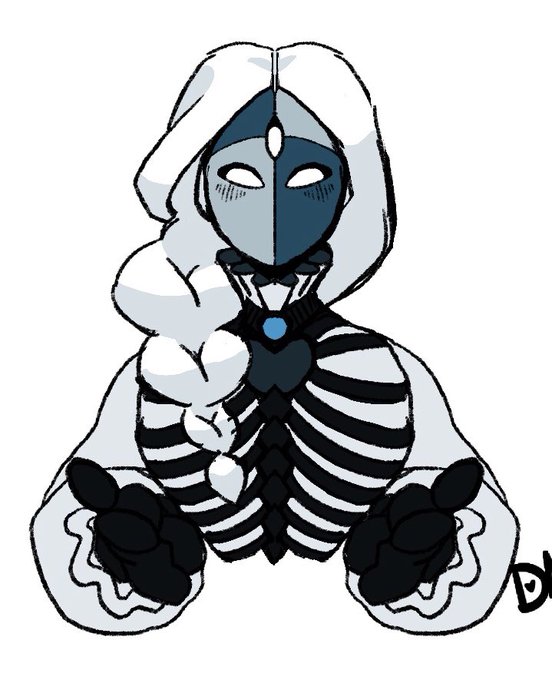
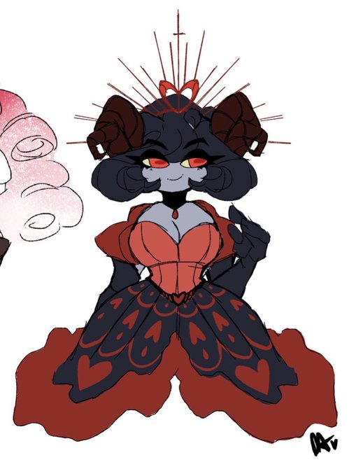
the only ongoing canon m/f ship i have out of my entire roster of ocs is these two bi4bis