ContrasのTwitterイラスト検索結果。 90ページ目


@caporione Although the character of Triangle Strategy reminds me of this painting, I think it doesn't have an emphasis on the setting in contrast to the character, and the art style is also different, it reminds me more of William Turner's paintings


@CuriosumArt 🟪🔷🟩
tbh I'm proud of this neon Jet Set Radio-esque style.
With the saturated contrasting colors and the comicbook-toned shaders✨


@CuriosumArt Hi!! 🦇✨️ ty for the thread!! 🕷 i'm Vil, enby latino & B&W illustrator of dark art and ocs 🖤🤍✨️ what i like the most about my work is how much contrast i'm able to show using b&w only 👉🏻👈🏻✨️


Recently i have been experimenting with the dark but warm energy of underwater ambience.
The contrast yet harmony of the feeling the pieces give got me hooked on this theme.. 🖤


Edited version of my fan art for "Solitary Lady" or "접근 불가 레이디"
Shadow and light were added to increase dimention and contrast
#kakaowebtoon #kakaowebtoonth #solitarylady #เลดี้ผู้ห้ามแตะต้อง #fanart #manhwafanart


Hooked on this peach and tangerine contrast story 😂😂 Luo is such a cute peach tho


11. Shuhei Matsui (Assassination Classroom, The Elusive Samurai)
2/5
Cute joke, but feels like something that would just be a panel in AssClass. Better than the Kochikame one, but ultimately an easy punchline that's less endearing than the original's Piccolo/Gohan contrast.
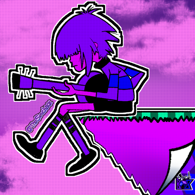

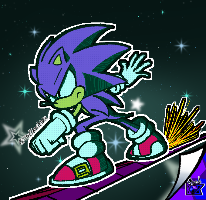

@tobios_art Hey, how are ya? I'm Sirch!😎
🟪🔷🟩
✨STICKERS + NEON + COMIC TONES + SATURATED CONTRASTING COLORS = My Style✨
💫Links:
2022: https://t.co/MtQvn4SHdq
2021: https://t.co/RX3LbV8BGv


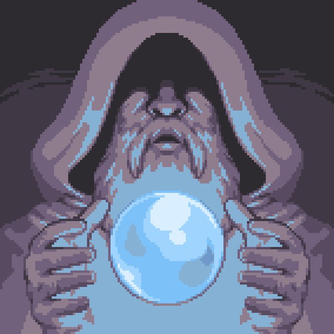
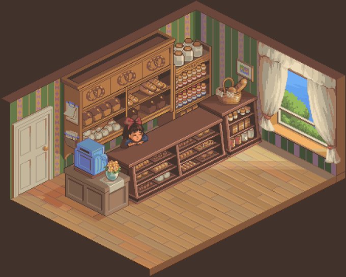

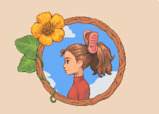
Monthly Spotlight- August
This month I am so excited to feature the magnificent work of @/cloudtrumpets. Check out the soft contrast and comforting colors! Can't wait to see some more of their lovely work. Go follow them! 💜


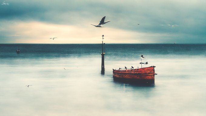
@ADuocrypto @ItsukiNFT Hey Duo 🙌✨ It's me again looking for a chance to be in your great collection!!
From "Memórias" my collection on ETH based in landscapes from my hometown, when the Chaos contrasting with the beauty in the landscapes


Paso a paso.
1: haz un dibujo a lápiz.
2: escanéalo y una vez en photoshop usa el modo "multiplicar" en la capa del dibujo. Elige un fondo y pégalo/píntalo debajo.
3: volúmenes luces y sombras.
4: ajustes de color, contraste, efectos y detalles.
Espero que os sea útil.


@Whonotme22 @LewdLucille @BumpstockBarbie @Maybe_not_a_Fed @protransfemnst These 'hundreds' of photos... are you aware that anti-abortion groups frequently publish mockups showing fetuses as being far more developed than they actually are?
In contrast, here's the NHS's depiction at 8 weeks


Me puse analizar este dibujo, mirando sus capas, que usé como luces, contrastes...y sabéis? no tengo ni puga idea de como cojones lo pinté.
NO ME SALE DE NUEVO!!