appealingのTwitterイラスト検索結果。 2,733 件中 90ページ目

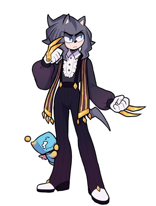

I dont draw Zelph and Seyjo enough. I love them and their designs but I just find humanoid design just so much more appealing.
I feel even more guilty about not drawing Seyjo because he's from a popular CS and i fear people might see it as me wasting him while many other want one


Felt like adding a lil color and a lightsource to make it look more appealing


I've been editing Arborria to make her look more natural. I shifted her horns to the right to make them look more appealing and natural and I removed the lines down the middle of her chest and belly. What do you think?
Before: After:


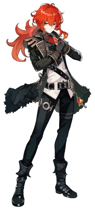


These are the most visually appealing characters to me so far and of course none of these show up early.

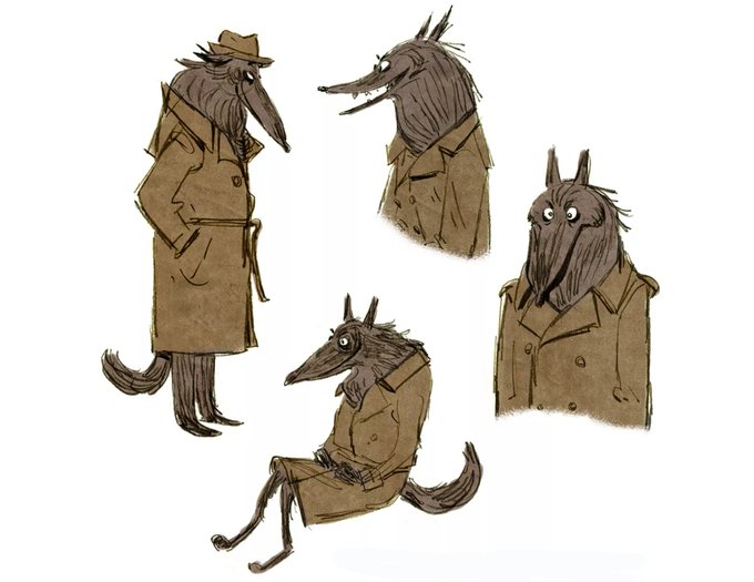


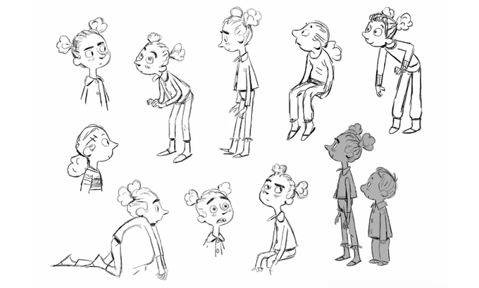
Character designs by Uwe Heidschötter for Revolting Rhymes (2016), dir. Jakob Schuh, Jan Lachauer and Bin-Han To, Magic Light Pictures
The team won a BAFTA and an Oscar nomination for this appealingly-designed film


I was originally going to sell this design. But I ended up liking it A LOT lol. This is my son 🥺 and a different style. Not a huge difference. But it’s more appealing in my eyes. 🤩
[ new VS “old”]


Featuring Rei rather than someone the lipstick would actually suit certainly fits the motto. Gotta admire the daring attitude, but the Ichiban Coffret Collection is definitely the more visually appealing Eva cosmetics promotion.


tw blood // fell in love with this game and its incredibly appealing protag! #hadesgame

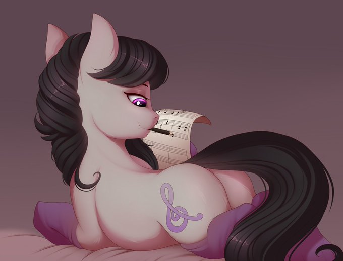
I think Tavi is my favorite earth pony. I don't really know what the reason is. Why is a pony with regular colors so appealing?
https://t.co/5CBJNJnCVI


Genuinely am not sure if Ash should have body hair if I update his design to be more appealing. Poll in the replies maybe?


#MoriartyThePatriot was probably my fave new #anime this week. While the look of the series isn’t my taste the idea of #SherlockHolmes enemy being the protagonist in a twisted narrative is very appealing. Loved the overall atmosphere & story. Good for adult anime fans. Thoughts?


The more recent speedpaint videos got their thumbnails updated. Something about more vivid colors seem more appealing than doing the "who's that pokemon" style. This is a before and after of the thumbnails.


Calling myself out on the characters that probably contributed to Sable looking the way she does. I didn't really watch Secret Saturdays and Xmen was only relevant to me during my earlier years, but my brain saves little scraps of design elements that it remembers being appealing


This is going to sound really fucking dumb but i love when characters hold hands like this .... its so appealing 2 me

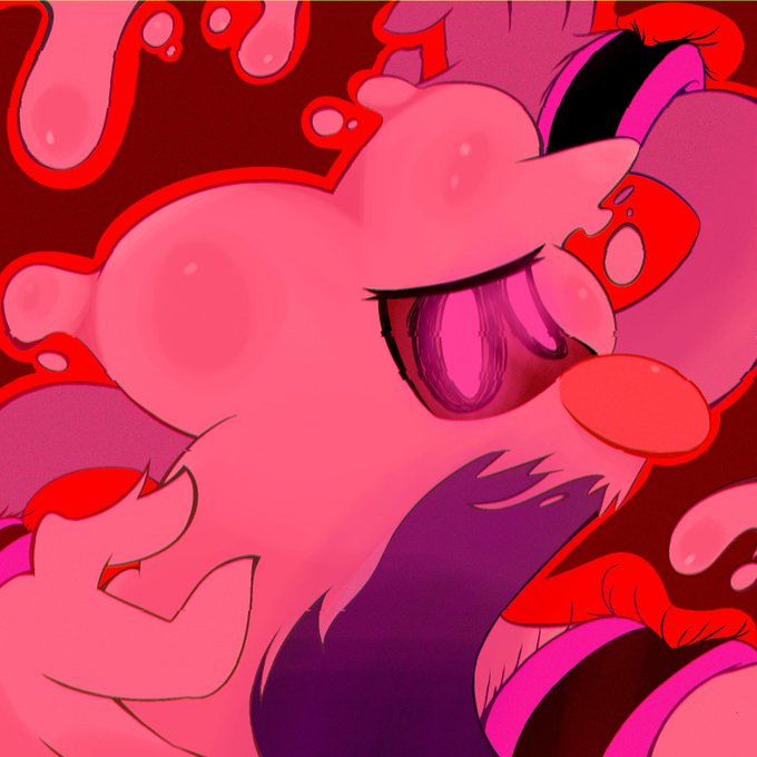


Venomized Thing
Or a gravel golem for the next Elder Scroll entry.
Been thinking about how approach venomized Hulk and find this concept really appealing.
-
-
-
-
-
#venom #carnage #antivenom #venomized #venomverse #thething #marvelfanart #joserealart #comicartist

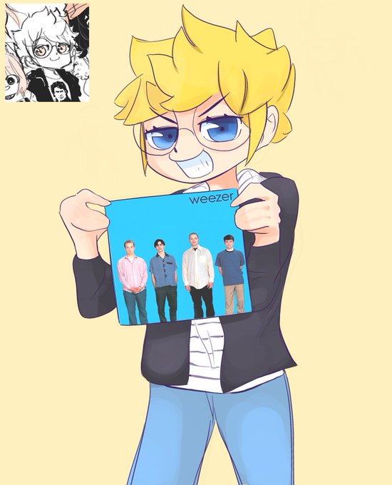
IM SORRY FOR DRAWING YOUR OCS SO MUCH @MADDOXFANX they just have such appealing designs and your style is so interesting the way you use detailed and varying line weight and stylized proportions and incorporate real life fashion and
teen esther is a weezerhead in my headcanon


Check out this commission of Didi I got from @KorHansMandel! His work is super sharp and so visually appealing, so I definitely recommend checking it out and maybe getting a commission too!


@AnimeAjay This is Shimanuki-level of unappealing hands.