TypefaceのTwitterイラスト検索結果。 605 件中 10ページ目

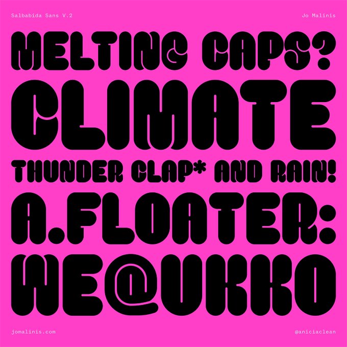


Perfect for bold display settings and strong titles, Salbabida Sans comes with Regular and Outlined styles to allow users to play freely with different typographic styles.
Test + buy 👀 https://t.co/XebTt9rXJx
#typedepartment #typedesign #typedesigner #typeface #typefacedesign


Sudanese Type Designer Fatima Abbas Makes A Staggering Typeface Debut 🔥🔥 Full article now live >> https://t.co/XWiyrUHgq3


Ladi - #Free #Display Font - https://t.co/0DpuDYdLAC via @insprade #inspirationde #Lettering #Type #Typeface #Typography


Holden explores texture and extreme weight ranges. Its curvy shapes, inspired by pointed brush aesthetics, are developed in six different weights – ranging from the lightly contrasted thin, to the fluid and rhythmic fat.
Test + buy ⭐ https://t.co/8G27Le7fmS
#font #typeface


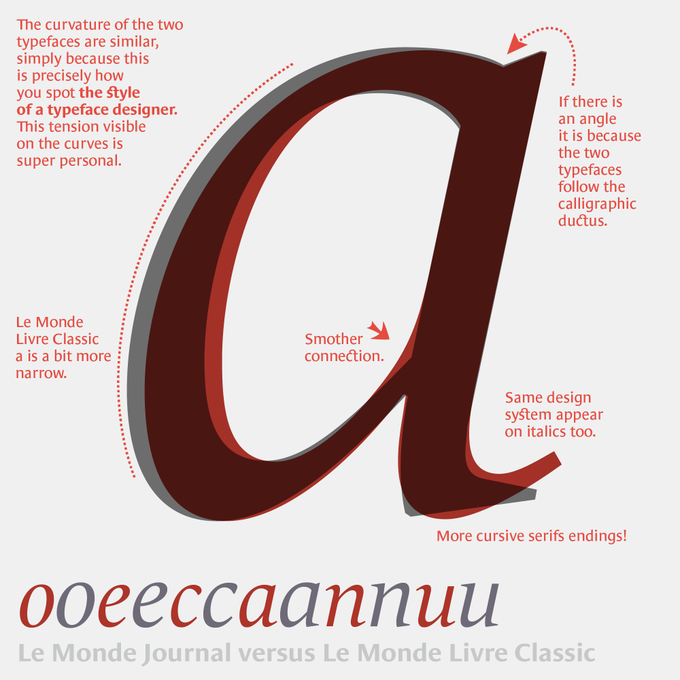

You know these two typefaces, but less in a finer comparison. The challenge of a super family is to establish common principles and structure, while looking for the difference: those nuances that will help the contrast. Le Monde Journal, intended for small sizes, is the base… 1/


Grandelo typeface by BurnTillDead https://t.co/0Ak6wG7qEL
For more inspiring graphic design and visual culture visit
⟶ https://t.co/NNYgziKQ6v


I also matched the typeface on bag to that sticker I made for the shop for "continuity" lol

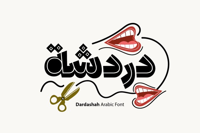


Dardashah - Arabic font is now available through HelloFont 👇👇
https://t.co/05WXEToNDY
#arabic #typeface #typography #graphicsdesign #font


Designed with beautiful contrasts and stylistic alternates, Ladybird Light new font has tons of potential and is hypnotic to use - perfect in branding settings, refined editorial layouts, or pretty much anywhere you can think of!
Test + buy 👉 https://t.co/QA2oSlTJKH
#typeface


Kotei Condensed is a sans serif display typeface, perfect for short-length titles. This typeface brings tons of charisma and a clean, dynamic personality to headlines but is fully adaptable to a whole range of applications.
Test + buy ✨ https://t.co/0B173YYWp3
#font #typeface


@DonatelloEsq @PA_Megacorp Noice.😏 For those who don't know, the typeface is "Blambot Casual" Meme on!


Today I would like to do a thread about 'counterforms.' They are a critical building block of typeface design... but what are they? How do they work?
I'll also talk about how I thought of the counterforms in Really Sans.

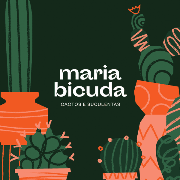
Maria Bicuda Brand Design
Interesting choice of typeface & suitable cool illustrations that make this brand stand out. Love this playful whimsy style. The small notches applied to the letters are smart. Don't miss that 'thank you note' & wrapping paper. https://t.co/XhWW4lj5rc


Roses Bolero typeface by MixJpg (@authen.type)
For more inspiring graphic design and visual culture visit
⟶ https://t.co/NNYgziKQ6v


Fortunelimes Script Font
https://t.co/VALN0Ztqz3
#typography #font #typeface #scriptfont,

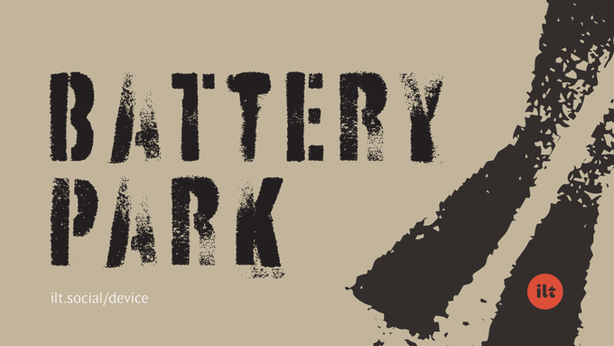
Weathered Wednesday: Some typefaces that appear beautifully worse for wear.
https://t.co/uN257TQ0QT
Including:
1. Battery Park, a gritty stencil font
https://t.co/Fajus29Byo